How to Set Up a Shopify Store for Digital Wall Art Prints: The Product Page Checklist That Converts

Setting up a Shopify store feels like it should be simple. You upload your art, write a quick description, set a price, and wait for sales. Then a week passes. Then a month. Traffic trickles in, but conversions stay flat, and you have no idea why.
The problem is almost never the art. It is almost always the product page.
Digital wall art is a trust-dependent product. Buyers cannot touch it, cannot hold it up to their wall before purchasing, and cannot return it in any meaningful way once they have downloaded it. Your product page has to do the heavy lifting that a physical store would do naturally. It has to answer every question, remove every doubt, and make the buyer feel confident enough to click that button.
This checklist covers everything that goes into a product page that actually converts, broken down by category so you can audit your existing listings or build new ones from the ground up.
Start With Images That Do the Selling For You
If you have spent any time reading about Etsy or Shopify conversion optimization, you have heard the phrase "the first image is everything." For digital wall art, this is even more true than in most categories. You are selling a feeling, a room transformation, a piece of someone's home. Your images need to make that tangible.
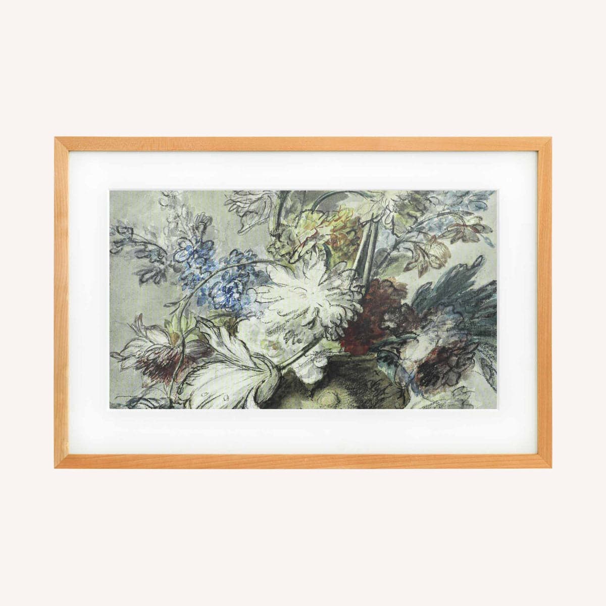
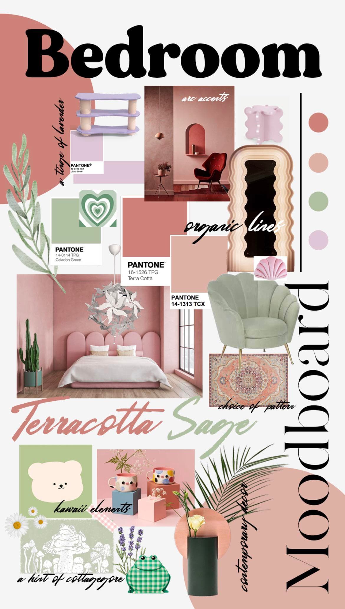
Use Lifestyle Mockups as Your Primary Image
Your first image should not be the flat file. It should be a lifestyle mockup that shows your print hanging in a realistic room setting. A bright living room. A cozy bedroom corner. A minimalist home office. Buyers need to see themselves owning this piece, and a raw JPG on a white background does not do that.
This is where a lot of sellers lose sales they should have won. They spend hours creating beautiful artwork, then present it against a blank background and wonder why nobody is buying. A well-placed mockup in a styled interior can justify a price two or three times higher than the same print shown as a flat file.
Creating these mockups used to mean hiring a designer or spending hours wrestling with Photoshop. Tools like Mockupanda were built specifically to solve this problem. You upload your artwork, choose from mockup scenes that are optimized for wall art and digital print sellers, and generate professional lifestyle images in bulk. If you have thirty prints to list, you are not spending thirty hours on mockup creation. You are done in minutes.
Actionable takeaway: For every listing, create at least one lifestyle mockup showing the print in a real room setting. Make this your primary image.
Build an Image Gallery That Answers Every Visual Question
Beyond the hero image, your gallery should work as a silent FAQ. Think about every question a buyer might have before purchasing and answer it visually.
How does the print look in a dark-walled room versus a bright one? Show both. What does the print look like up close, so buyers can judge print quality and detail? Add a closeup crop. Does this print come in multiple sizes? Show a scale reference image with the different size options labeled. Is the color palette versatile? Show it styled with warm tones and cooler tones.
A strong image gallery for a digital wall art listing typically has between four and seven images. That might feel like a lot, but each one is removing a reason not to buy. Shopify gives you space for up to 250 images per product. Use what you need.
For sellers running larger shops with many SKUs, generating multiple mockup variations per print can feel overwhelming. Bulk generation tools solve this. You can produce a complete image gallery for every listing without turning mockup creation into a part-time job.
Actionable takeaway: Audit your current image gallery against this list: lifestyle shot, closeup detail, size reference, and color context. Fill any gaps.
Do Not Overlook Infographic-Style Images
One image type that consistently improves conversion rates for digital products is the informational or infographic image. This is not a mockup and not a product shot. It is a clean, branded image that communicates key information visually.
Examples include a "What You Get" image showing file formats and size options, a "How It Works" image with three simple steps from purchase to printing, or a size comparison showing your available dimensions relative to common furniture.
Tools like Mockupanda include text overlay features that make these easy to create. You design them once for your shop, then adapt them quickly for new listings. They build trust, reduce buyer hesitation, and handle objections before the customer even reads your description.
Actionable takeaway: Create at least one infographic image per listing that explains what the buyer receives and how the download process works.
Write Product Descriptions That Convert, Not Just Describe
Most digital print sellers write product descriptions that describe. "This is a minimalist botanical print in soft green tones. Available in 5x7, 8x10, and 11x14." That is technically accurate and almost completely useless for conversion.
A converting description does not just describe. It sells the feeling, removes friction, and preemptively handles objections.
Lead With the Feeling, Then the Facts
Your opening paragraph should speak to the emotional outcome, not the product specs. Instead of starting with "This digital download includes," start with why someone would want it. What does this print do for a room? What mood does it create? Who is it for?
"Bring a sense of calm into your bedroom with this minimal botanical print. Soft sage greens and warm cream tones make it easy to pair with natural textures, wood furniture, and linen bedding. Whether you are styling a reading nook or refreshing a nursery, this piece fits quietly and beautifully."
Then move into the practical details. File formats included, sizes available, resolution, and print recommendations. Give buyers what they need to feel confident, but lead with what makes them want it.
Actionable takeaway: Rewrite your description opening so the first sentence describes the feeling or outcome, not the product format.
Handle the Most Common Objections in the Description Itself
Digital products generate specific anxieties. Buyers worry about file quality, printing at home versus at a print shop, color accuracy, and whether they are actually getting what they paid for. If you do not address these concerns, buyers will leave your page to research them elsewhere and many will not come back.
Build a short FAQ section directly into your description. You do not need to label it as a FAQ. Just address the questions naturally.
Explain your file resolution and why it produces sharp prints. Recommend print services like Staples, Office Depot, or local print shops for buyers who do not have a home printer. Mention that colors may vary slightly depending on monitor calibration, but that you design with print output in mind. Clarify your refund policy for digital downloads upfront, because Shopify and most platforms have restrictions here and buyers need to understand this before purchasing.
Actionable takeaway: Read your description and write down every question a first-time buyer might still have after reading it. Then add those answers.
Format for Skimmers
Most people do not read product descriptions. They skim. They look for bullet points, headers, and short paragraphs. If your description is a wall of text, most of it will go unread.
Use bullet points for your technical specs. Keep paragraphs to two or three sentences maximum. Use bold text sparingly to highlight the most important information, like file formats, sizes included, or your download process. Shopify's product description editor supports basic HTML formatting, so you can add structure without needing a developer.
Actionable takeaway: Format your description so that someone reading for ten seconds can still find the most important information.
Get Your Pricing and Variants Right
Pricing digital wall art on Shopify confuses a lot of sellers because the rules feel different from physical products. There is no cost of goods in the traditional sense. The file is infinitely reproducible. So how do you price it?
Price Based on Value, Not on File Cost
The file cost is zero, or close to it, once you have created the artwork. But the value to the buyer is not zero. They are paying for your design skill, your taste, your curation, and the convenience of instant access to professional-quality art. Price accordingly.
Look at what comparable prints are selling for in your niche. Browse Shopify and Etsy stores that are getting traction. Do not automatically price at the bottom of the range. Low prices do not always mean more sales. In fact, for art and design products, a very low price can signal low quality and actually reduce conversions.
For digital wall art, pricing between eight and twenty-five dollars per individual print is common, with bundles ranging from fifteen dollars into the sixties depending on how many files are included. If you have lifestyle mockups that present your work professionally, you can sit confidently in the higher end of that range.
Actionable takeaway: Check your prices against five to ten competing shops this week. If you are at the low end with no clear reason to be, test a price increase on your best-selling prints and monitor conversion rate for thirty days.
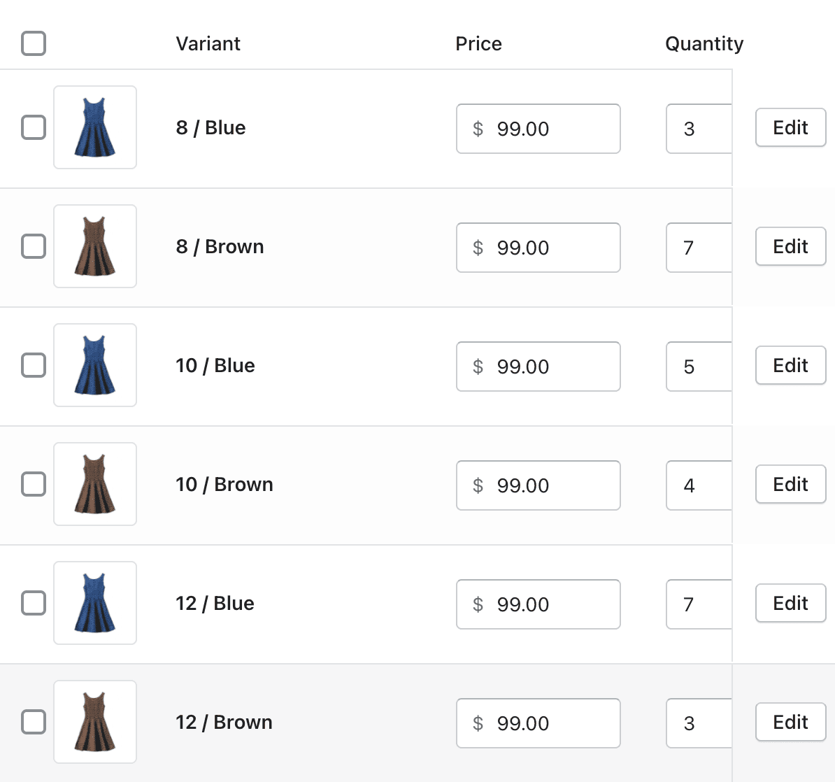
Set Up Variants Clearly and Logically
Shopify's variant system is powerful, but it can get confusing fast if you do not plan it carefully. For digital wall art, the most common variant types are size and file format.
If you offer multiple sizes, list them clearly and consistently across all your products. Use standard sizes like 4x6, 5x7, 8x10, and 11x14, or specify aspect ratios like 2:3 and 4:5 if buyers will be printing at custom dimensions. Make sure your variant names are self-explanatory. A buyer should not need to open a chat window to understand what they are purchasing.
Avoid overcomplicating your variant structure. If you have too many options, buyers experience decision fatigue and leave without purchasing. A clean, simple variant setup with clear labels converts better than a comprehensive but confusing one.
Actionable takeaway: Review your variant structure and remove any options that fewer than ten percent of buyers are likely to choose. Simplify to increase clarity.
Set Up File Delivery That Feels Seamless
One of the biggest trust-breakers for digital product buyers is a clunky or confusing download experience. If someone pays for your print and then spends twenty minutes trying to figure out how to access the file, they will request a refund, leave a negative review, or both. Your delivery setup needs to be invisible, meaning it should just work.
Use Shopify's Built-In Digital Downloads App
Shopify does not natively handle digital product delivery without an app. The most straightforward solution is Shopify's own Digital Downloads app, which is free and integrates directly with your store. When a buyer completes a purchase, they automatically receive an email with a download link. No manual fulfillment, no delays.
Set up the app correctly before you start selling. Upload your files, confirm the automated email is going out promptly, and test the download link yourself from a buyer's perspective. Make sure the file is named clearly so buyers know what they are opening.
For larger shops or sellers who want more control over the experience, third-party apps like SendOwl or Sky Pilot offer additional features like download limits, PDF stamping, and more customizable email templates.
Actionable takeaway: Purchase one of your own products using a secondary email address and experience your delivery flow as a buyer. Fix anything that feels unclear or slow.
Set Clear Expectations in Your Confirmation Email
The automated order confirmation email is an underused conversion and retention tool. Most sellers leave it as the default Shopify template, which says something generic like "Thank you for your order" and includes a basic order summary.
Customize this email to remind the buyer how to access their files, what to do if they have trouble downloading, what file formats they are receiving, and where you recommend printing. This is also a good place to mention your other collections or invite them to follow your shop for new releases.
A helpful, clear confirmation email reduces support requests, builds goodwill, and increases the chance of a repeat purchase.
Actionable takeaway: Open your Shopify notification email settings and customize the order confirmation email this week.
Optimize Your Product Page for Search
Shopify has its own internal search, but most of your organic traffic will come from Google. A product page that is not optimized for search is a page that exists only for people who already found you through ads or social media. That is leaving a significant amount of free traffic on the table.
Write SEO-Friendly Titles and Meta Descriptions
Your product title is not just what buyers see on the page. It is what appears in Google search results and in Shopify's internal search. It should include your primary keyword naturally, without stuffing.
For a botanical print, a strong title might be "Botanical Leaf Wall Art Print, Digital Download, Minimalist Home Decor, Sage Green, Multiple Sizes." This covers the product type, format, style, color, and a key attribute, all of which buyers search for.
Your meta description should be written for the person, not the algorithm. It appears in search results and needs to be compelling enough to earn a click. Describe what the buyer gets, mention the instant download, and highlight what makes this print worth looking at.
Actionable takeaway: Update the meta title and description for your five best-selling products this week using keyword-rich, buyer-focused language.
Use Alt Text on Every Image
Alt text serves two purposes. It helps visually impaired users understand your images through screen readers, and it gives search engines context about what your images contain. Most Shopify sellers skip this entirely.
For each product image, write a brief, descriptive alt text. For a mockup image, something like "minimalist sage green botanical print hanging in a white living room" is specific enough to be useful for both accessibility and SEO. Avoid keyword stuffing, but be descriptive and accurate.
Actionable takeaway: Add alt text to every image on your top ten product pages. Make it a habit to fill alt text whenever you upload new product images.
Build Trust Signals Into Every Product Page
Buyers who land on your Shopify store, especially for the first time, are making a judgment call about whether to trust you with their money. Every element on your product page either builds or erodes that trust. Do not leave this to chance.
Add Social Proof Where It Counts
Reviews are the most powerful trust signal for any e-commerce store. Shopify has several review apps, including the native Shopify Product Reviews app and third-party options like Judge.me, which has a generous free tier. Set one up and actively collect reviews from every buyer.
For new shops with no reviews yet, consider offering your first ten customers a small discount on a future purchase in exchange for leaving an honest review. A handful of genuine five-star reviews makes a dramatic difference in conversion rate for new visitors.
You can also display trust badges on your product pages, things like "Instant Digital Download," "High Resolution Files," or "Designed by a Professional Designer." These are simple visual cues that reduce buyer anxiety and cost nothing to implement.
Actionable takeaway: Install a review app on your Shopify store today if you do not have one. Email your last ten customers and ask for a review.
Make Your Policies Easy to Find
Digital products have specific refund limitations, and buyers know this. Being upfront about your refund policy before the sale builds trust rather than undermining it. Add a brief policy note directly in your product description, not just buried in your store footer.
Something like: "Because this is a digital product and files are delivered instantly upon purchase, I am unable to accept returns or exchanges. If you experience any technical issues with your download, please contact me and I will help you resolve it right away."
This is honest, it sets expectations, and the offer to help with technical issues signals that you stand behind your product even without a traditional refund policy.
Actionable takeaway: Check that your refund policy is visible on every product page, either in the description or through a collapsible policy section, not just in your footer.
Putting the Checklist Together
A converting Shopify product page for digital wall art is not built in one sitting, but it is also not as complicated as it might feel right now. The checklist breaks down like this:
Images: A lifestyle mockup as your primary image, a gallery that answers visual questions, and at least one infographic image explaining the download process.
Description: Lead with the feeling, handle objections proactively, format for skimmers, and include all technical specifications clearly.
Pricing and variants: Price based on value, keep variants clean and simple, and test pricing regularly.
File delivery: Set up seamless automated delivery, test it yourself, and customize your confirmation email.
SEO: Write keyword-rich titles and meta descriptions, and add alt text to every image.
Trust signals: Collect reviews, display trust badges, and make your digital product policy visible.
The sellers who convert well are not always the ones with the best art. They are the ones who present their art in a way that makes buying feel obvious. Start with your best-selling product, run it through this checklist, make the improvements, and then roll those changes across your shop systematically.
Your art deserves a product page that does it justice.
Keep reading
The Mockup Mistakes That Make Buyers Think Your Digital Print Is a Physical Product (And How to Avoid Refund Disputes)
How to Use Mockup Images as Pinterest Pins That Drive Traffic Back to Your Etsy Shop