How to Adapt One Design for Both Wall Art Prints and T-Shirts Without Losing Visual Impact
If you have ever spent hours on a beautiful wall art design only to slap it on a t-shirt and wonder why it looks completely flat and wrong, you are not alone. The instinct to repurpose designs across products is smart from a business perspective. One concept, multiple revenue streams, less time creating from scratch. But the execution is where most print-on-demand sellers run into trouble.
The truth is that wall art and apparel are fundamentally different canvases, and what works beautifully at 18x24 inches on a gallery wall needs thoughtful adaptation before it belongs on a chest print. This is not just about resizing. It is about understanding how each format is viewed, worn, and experienced, and then making deliberate creative decisions that preserve the soul of your original design.
Done right, adapting one design for multiple products is one of the most efficient ways to grow your catalog, test new markets, and increase your average revenue per design. Done wrong, it dilutes your brand and gives customers a reason to scroll past.
Here is how to do it right.
Understand Why Wall Art and Apparel Require Different Design Thinking
Before you touch your files, it helps to understand the core reasons why designs behave differently across these two product types. This is not just a technical issue. It is a visual communication issue.
How Viewing Distance and Context Change Everything
Wall art is typically viewed from across a room. A customer standing five to ten feet away from a framed print will see the overall composition first, the color relationships, the mood, the balance of negative space. Fine details like thin lines, small type, and subtle textures all have room to breathe because the piece has physical presence in a space.
A t-shirt is a completely different experience. It is worn on a moving, three-dimensional body. It gets viewed up close in conversation, caught in peripheral vision on the street, and photographed flat on a table in a product listing. The garment itself has a color, a texture, and a drape that all interact with your design. What reads as elegant on a white wall can look busy, awkward, or simply lost on fabric.
This means that any design element that relies on fine detail or large-scale composition to communicate its impact will need to be reconsidered for apparel.
The Psychological Difference Between Decorating a Space and Wearing a Statement
People buy wall art to set a mood in their home. They choose something that reflects their taste, fits their color palette, and makes them feel a certain way when they walk into the room. The design can be complex, layered, and even challenging because it has a fixed position in space and the viewer chooses when to engage with it.
People wear t-shirts to say something about themselves to the world. The message needs to land instantly, often without full context. A design that works as ambient wall art, say, a soft botanical illustration with muted tones and a lot of negative space, may communicate almost nothing on a t-shirt where impact depends on bold, immediate visual language.
Understanding this psychological difference will help you decide not just how to adapt a design, but whether a particular design is worth adapting at all.
Actionable takeaway: Before starting any adaptation, ask yourself two questions. What does this design communicate on a wall? What does it need to communicate on a body? If the answers are too far apart, you may be better off creating a new design inspired by the original rather than adapting it directly.
The Four Elements You Need to Evaluate Before Adapting
Not every element of your wall art design will translate directly to apparel. Running a quick audit of four key elements before you open your design software will save you significant rework later.
Color
Wall art prints are typically produced on white or near-white paper or canvas, which means your design is always sitting on a neutral base. T-shirts come in every color imaginable, and even if you intend to sell only on white tees, your customers may choose black, navy, or heather gray variants.
Light, pastel, or low-contrast designs that look beautiful on paper will often disappear on darker garments. Conversely, heavy dark designs that look dramatic on a white print can feel oppressive on a shirt. You need to evaluate your color palette with fresh eyes and ask whether it is versatile enough to work across garment colors, or whether you need a light version and a dark version of the same design.
Also consider that fabric printing technology, whether DTG or screen printing, can shift colors slightly compared to paper printing. What prints as a warm ivory on fine art paper may print slightly differently on a cotton blend. If color accuracy is central to your design, test it.
Detail Level and Line Weight
This is where most wall art designs run into trouble on apparel. Intricate illustrations with hairline details, delicate crosshatching, or fine typography may look stunning at large print dimensions but will print muddy or disappear entirely at t-shirt chest print sizes, which typically max out around 12 to 14 inches wide.
Go through your design and identify every element that is thinner than about 1pt at final print size. Those elements will likely not survive the transfer to fabric. You have two options: remove them, or use them as inspiration for bolder reinterpretations.
Composition and Negative Space
Wall art compositions are often designed to fill a rectangular frame. They may use the edges of the canvas intentionally, balance visual weight across a large surface, or rely on a lot of breathing room to feel premium. When you place a full-composition wall art design on a t-shirt, you are suddenly putting it on a garment with its own shape, buttons, seams, and a person inside it.
T-shirt designs generally work best when they have a clear focal point, work within a defined print area, and do not try to fill the entire garment. If your wall art composition is highly rectangular and relies on edge-to-edge arrangement, you will likely need to extract a hero element from it rather than use the full composition.
Typography
If your wall art design includes text, pay special attention to font size, weight, and legibility. Thin serif fonts that feel refined on a large print can become completely illegible on a shirt. Consider whether the typography is essential to the design or decorative. If it is essential, convert it to a heavier weight. If it is decorative, consider removing it for the apparel version and letting the illustration carry the work.
Actionable takeaway: Create a simple checklist with these four elements: color versatility, detail level, composition structure, and typography legibility. Run your design through each one before starting the adaptation process. This audit will tell you exactly how much rework is ahead of you.
Practical Techniques for Adapting Without Losing Impact
Now we get to the actual creative work. These are the techniques that professional designers use when adapting artwork across formats, simplified for print-on-demand sellers who may not have a formal design background.
Extract and Amplify the Hero Element
Most well-designed wall art pieces have a dominant visual element that carries the emotional weight of the design. It might be a central illustration, a bold typographic phrase, a striking botanical motif, or an abstract shape that anchors the composition. Your first step in adaptation is to identify that element and ask whether it can stand alone.
For a t-shirt, a single powerful element is almost always more effective than a full composition. Crop into it, isolate it, and then amplify it. Make it bigger. Increase the contrast. Bold up any lines that feel tentative. When you strip away the supporting elements and give the hero room to breathe, you often end up with a t-shirt design that feels bolder and more immediate than the original wall art without losing its essential character.
This approach also has a nice business side effect: you now have a design family. The wall art version and the apparel version are clearly related, but each is optimized for its medium. Customers who love one version may buy both.
Create a Light Version and a Dark Version
Rather than trying to make one adapted design work across every garment color, build two versions intentionally. A light version designed to sit on white, cream, or natural garments, and a dark version designed for black, navy, or charcoal shirts.
For the dark version, you will often need to invert or significantly adjust your color palette. Elements that were dark in the original become light. Backgrounds that were light become transparent so the garment color shows through. This is not just a technical flip: it is a new creative decision that should feel intentional and considered.
When you list the product, offer both colorways. Customers self-select based on their preference, and you double the appeal of the same underlying design without creating a completely new piece of artwork.
Simplify Without Flattening
Simplification is not the same as dumbing down. The goal is to preserve the emotional tone of the original design while removing the elements that will not survive the format change. Think of it like editing a long-form essay into a punchy paragraph. The core idea stays. The supporting details that do not add impact get cut.
A practical way to approach this is to step back and squint at your original design. The elements that still read clearly when the image is blurry or small are the ones worth keeping. The elements that disappear are candidates for removal or bold reworking. This squint test is a basic but surprisingly reliable filter.
Actionable takeaway: Start your next adaptation by isolating your design's hero element and placing it alone on a new artboard. Spend time with just that element before you add anything else. You will be surprised how often the isolated hero is already a strong t-shirt design with minimal adjustment.
How to Present Both Versions Professionally in Your Listings
Adapting the design is only half the job. How you present the two versions in your Etsy or Shopify listings has a significant impact on how well they convert. A great design with poor mockup presentation will always underperform.
Use Format-Appropriate Mockups for Each Product
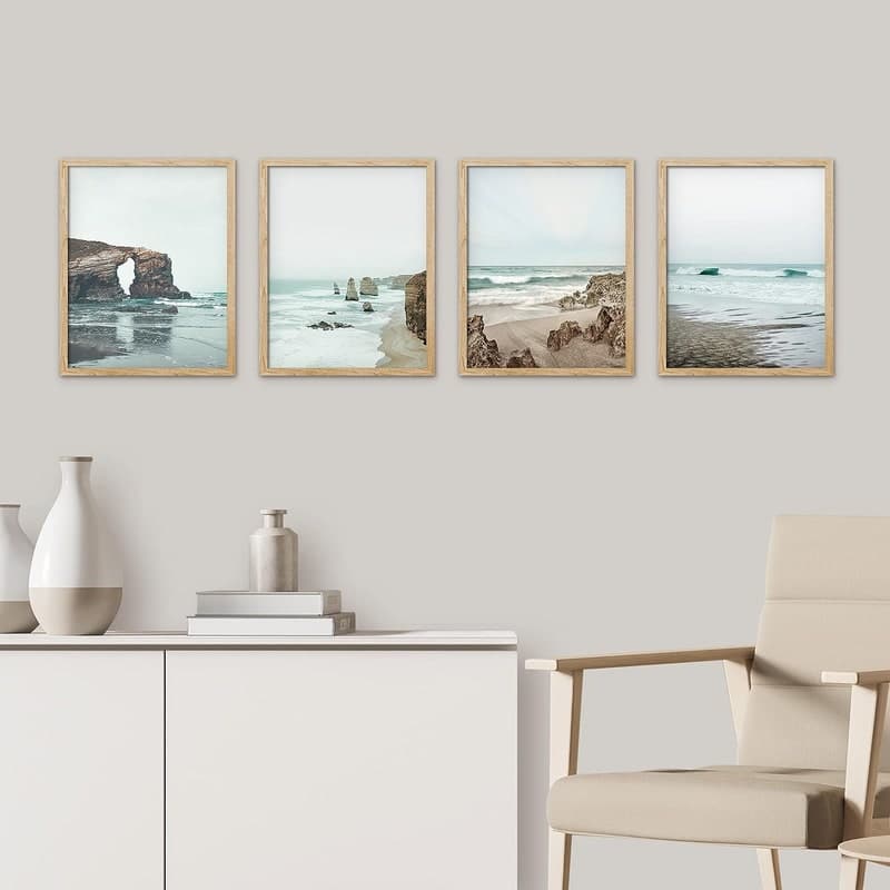
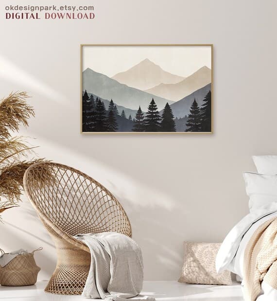
This sounds obvious but is consistently overlooked. Your wall art design needs to be shown in a room setting that communicates scale, quality, and context. A lifestyle mockup of a framed print above a linen sofa tells a completely different story than the same image dropped onto a generic white background.
Your t-shirt design needs to be shown on an actual garment, ideally in multiple colorways and on a model if possible. Flat lay mockups can work for Etsy, but lifestyle mockups showing the shirt being worn almost always convert better because they help the customer visualize themselves in the product.
Using the wrong mockup type, like presenting your t-shirt design in a frame mockup or putting your wall art design on a shirt just to show the connection, will confuse customers and hurt conversions. Each version needs its own presentation tailored to how that product is actually experienced.
Bulk Mockup Generation Saves You from Presentation Paralysis
One of the biggest reasons sellers skip proper mockup creation is the time it takes. When you have adapted a design across multiple products and colorways, you could easily need eight to twelve mockup images before you have adequate coverage for both listings. Doing that manually for every design in your catalog is genuinely painful.
This is exactly the kind of workflow that Mockupanda was built for. You can generate multiple mockups across different templates in bulk, which means adapting one design into a wall art listing and a t-shirt listing does not become a half-day project. It becomes something you knock out in a few minutes so you can get back to the creative work.
Having consistent, professional-looking mockups across your listings also builds brand trust. When a customer bounces between your wall art listing and your apparel listing and sees the same level of presentation quality, it signals that you are a serious seller and not someone who threw a file online and hoped for the best.
Consider Text Overlays for Ad-Ready Presentation
If you are running ads on Pinterest, Instagram, or Facebook to drive traffic to these listings, your mockup images are doing double duty as ad creative. A plain lifestyle mockup is fine for a listing, but an ad creative benefits from a clear value message layered on top.
Adding a simple text overlay like "Downloadable Print, Instant Access" or "Available in 3 Sizes" directly on the mockup image can meaningfully improve ad click-through rates because it answers buying questions before the customer even reaches your listing. Mockupanda has built-in text overlay functionality specifically for this use case, so you do not need a separate design tool to create ad-ready images from your mockup workflow.
Actionable takeaway: For every design you adapt across two product types, create at least three mockup images per product before listing: one close-up detail shot, one lifestyle context shot, and one image that would work as ad creative if you ever decide to promote it.
Building a Scalable Design Adaptation Workflow
Once you have adapted a few designs successfully, the goal is to turn this into a repeatable process rather than a one-off creative exercise. A documented workflow saves time and improves consistency across your catalog.
Create a Master File Structure That Supports Adaptation
If you are building designs in Illustrator, Affinity Designer, or Procreate, get into the habit of organizing your files in layers that separate the hero element, supporting elements, color fills, and typography. When everything is on one flattened layer, adaptation means starting from scratch. When your file is organized by element, adaptation becomes a much faster process of hiding, duplicating, and modifying layers rather than rebuilding.
Name your layers consistently. Use the same naming conventions across files. Build a folder structure that keeps your wall art source file, your adapted apparel file, and your exported print-ready files in one place per design. This sounds tedious to set up but will save you significant time when you are managing a catalog of fifty or more designs.
Build a Small Library of Proven Adaptations
As you adapt designs and watch how they perform, you will start to notice patterns. Certain types of wall art designs adapt brilliantly to apparel, while others consistently require too much compromise to be worth it. Start tracking this informally. Which original design styles tend to produce strong apparel versions? Which ones fight you every step of the way?
Over time this informal library becomes a decision-making tool. When you sit down to create a new wall art design, you can factor in upfront whether it has apparel potential and design it accordingly. Designing for adaptation from the start is significantly more efficient than retrofitting designs that were never intended for multiple formats.
Actionable takeaway: Set up your design file structure for the next project you work on as if you already know you will adapt it. Separate layers, consistent naming, organized exports. Treat it as a template for future projects. The first one will take extra time. Every subsequent one will be faster.
Common Mistakes to Avoid When Adapting Across Formats
Even with the right approach, there are a handful of consistent mistakes that sellers make when adapting designs. Knowing them in advance will help you avoid the most common pitfalls.
Treating Adaptation as Simple Resizing
The single most common mistake is treating this entire process as a sizing exercise. Download the file, resize it to t-shirt dimensions, export it, done. This produces weak results almost every time because it ignores the fundamental differences in viewing context, format psychology, and technical printing requirements that we covered earlier.
Adaptation is a creative act, not just a technical one. Give it the time and creative attention it deserves, even if that means spending an extra hour per design. The difference in quality between a properly adapted design and a resized one is immediately visible to customers.
Ignoring the Garment Color Variable
Designing exclusively for white garments is a missed opportunity. A significant portion of apparel buyers prefer dark garments, and if your design only works on white, you are cutting yourself out of that market entirely. Build the dark version into your adaptation workflow from the start rather than treating it as an optional extra.
Listing Both Versions Without Differentiating the Presentation
If your wall art listing and your apparel listing use identical or near-identical product images, customers will be confused about what they are actually buying. Make sure the presentation of each listing clearly communicates the product format, the use case, and the value proposition specific to that product type. Shared design DNA is a feature, but shared presentation is a problem.
Actionable takeaway: After finishing any adaptation, put both versions side by side and ask whether each one looks like it was designed specifically for that format. If one of them looks like it was retrofitted from the other, go back and make the format-specific adjustments before listing.
Putting It All Together
Adapting one design for both wall art prints and t-shirts is one of the smartest ways to grow a print-on-demand catalog without proportionally growing your workload. But it requires genuine creative thought, not just file manipulation.
Start by understanding why the two formats demand different visual approaches. Run a thorough audit of your design's color, detail level, composition, and typography before you start adapting. Use extraction, simplification, and colorway development as your core techniques. Present each version with format-appropriate mockups that do justice to the design and give customers the context they need to make a buying decision.
And build a workflow you can repeat. The sellers who scale successfully on Etsy and Shopify are almost never the ones with the most original designs. They are the ones who have figured out how to work efficiently and consistently, turning each creative asset into multiple products, multiple listings, and multiple revenue streams without sacrificing quality at any step.
Your designs deserve to be seen in their best possible form on every surface they appear on. Take the extra time to adapt them properly, present them professionally, and let the work speak for itself.
Keep reading
How to Create a Cohesive Etsy Shop Front Using Mockups With a Consistent Color Palette Across All Listings
How to Showcase Poster Sets on Etsy Using Gallery Wall Mockup Templates