How to Create a Cohesive Etsy Shop Front Using Mockups With a Consistent Color Palette Across All Listings
When someone lands on your Etsy shop, they make a judgment call in about three seconds. They are not reading your bio or counting your five-star reviews. They are looking at your shop front as a whole, as a grid of thumbnail images that either feel pulled together or scattered.
If your mockups are a mix of dark moody frames, bright white backgrounds, dusty rose staging, and cool gray walls, the overall impression is chaos, even if each individual listing looks decent on its own. Buyers do not consciously think "this shop lacks visual cohesion." They just feel slightly uneasy and click away.
The good news is that fixing this is not complicated. You do not need a graphic design degree or an expensive photography setup. You need a consistent mockup strategy and a clear color palette, and this guide is going to walk you through both.
Why Visual Cohesion on Etsy Actually Affects Your Sales
Before we get into the how, it is worth understanding why this matters beyond aesthetics. Visual cohesion is not just about looking pretty. It is a trust signal.
The Psychology Behind a Consistent Shop Aesthetic
When a shop looks intentional, buyers assume the seller is professional. And when buyers assume professionalism, they are more comfortable spending money, especially on higher-priced items. Think about the brands you trust most. Their product photography follows a clear visual language. The colors, the styling, the mood, it all feels like it belongs to the same world.
Your Etsy shop is your brand. Even if you are a one-person operation working from a spare bedroom, a consistent visual presentation signals that you take your work seriously. That signal is what allows you to charge more, because buyers are not just paying for the product. They are paying for confidence in you as a seller.
Studies on e-commerce UX consistently show that perceived professionalism and visual consistency directly influence purchase intent. On Etsy specifically, where buyers scroll through dense grids of competing products, your shop front is essentially your storefront window. If it looks curated, people walk in.
What Buyers See When They Visit Your Shop Page
Most Etsy sellers think about their listings individually. They optimize one product title, tweak one description, choose one mockup. But buyers who click through to your shop page see everything at once, as a grid.
That grid is your shop front, and it is worth thinking about it the way a visual merchandiser thinks about a retail window display. Every element should feel like it belongs. When your mockup backgrounds, frame colors, and staging props all pull from a shared color palette, the grid reads as one coherent collection rather than a random assortment of items.
Actionable takeaway: Open your Etsy shop front right now and look at the first two rows of listings as a single image. Ask yourself honestly whether it looks like one intentional brand or a collection of unrelated products. That honest assessment is your starting point.
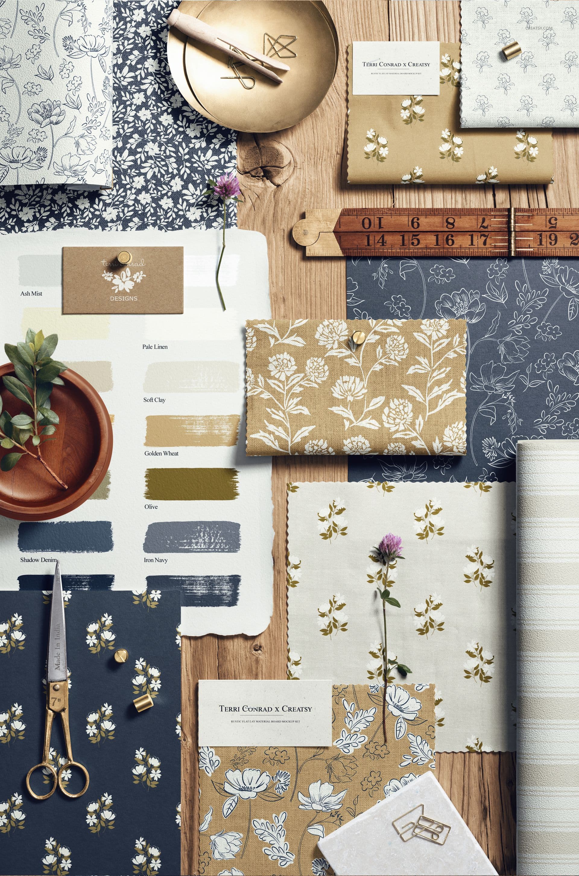
Building Your Shop's Core Color Palette
A color palette for your Etsy shop does not need to be complicated. Three to five colors is plenty. The goal is to define the visual vocabulary your mockups will consistently draw from.
How to Choose Colors That Match Your Brand and Niche
Start by thinking about your ideal buyer and the mood they are shopping for. If you sell minimalist Scandinavian wall art, your palette might be off-white, warm greige, muted sage, and natural wood tones. If you sell bold maximalist prints, you might work with rich jewel tones against a dark charcoal background. If your niche is nursery art, soft pastels and cream tones will feel right.
Your palette should reflect the emotional experience your products offer. Not just what looks pretty to you personally, but what resonates with the person spending money.
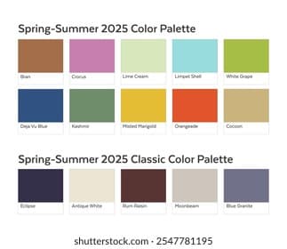
A practical way to start: pull five to eight images from Pinterest or Instagram that represent the aesthetic you want your shop to embody. Use a free tool like Coolors or Adobe Color to extract the dominant colors from those images. Look for the tones that appear most frequently across all your inspiration images. Those recurring colors are your palette.
Aim for one dominant neutral (the background or wall color in most of your mockups), one or two secondary tones (frame colors, props, or staging elements), and one accent color used sparingly.
Translating Your Palette Into Mockup Choices
Once you have your palette defined, every mockup you use needs to pull from those colors. This is where most sellers lose the thread. They find a beautiful mockup that happens to have a dark navy wall, but navy is not in their palette, so they use it anyway because the mockup is gorgeous. Then they find another stunning mockup with a terracotta accent pillow. And suddenly their grid is a color story with no coherent plot.
Be strict here. When you are selecting mockups, filter them through your palette first and ask whether this mockup's background, frame, and styling elements fit within your defined color range. If the answer is no, it does not matter how beautiful the mockup is. It does not belong in your shop.
With a tool like Mockupanda, you can generate mockups in bulk and maintain tight control over the settings you apply, which makes it significantly easier to stay consistent at scale rather than hunting for individual mockups one by one and hoping they match.
Actionable takeaway: Write down your three to five palette colors with their hex codes if possible. Pin this somewhere visible when you are working on listings. Before you use any mockup, check it against those colors explicitly.
Setting Up a Repeatable Mockup System for Your Listings
Consistency only works if it is easy to maintain. If your process for choosing mockups is ad hoc, picking whatever looks good in the moment, your shop will drift visually over time. You need a system.
Creating Mockup Templates You Can Reuse Across Collections
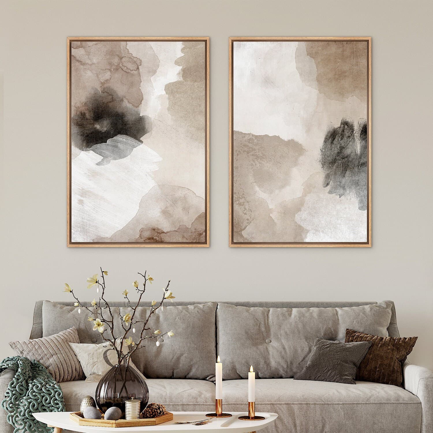
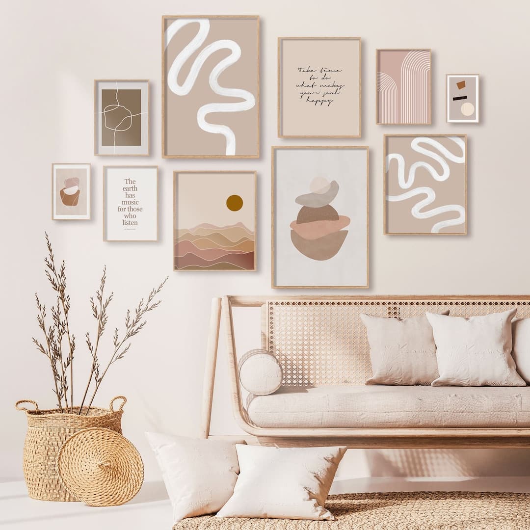
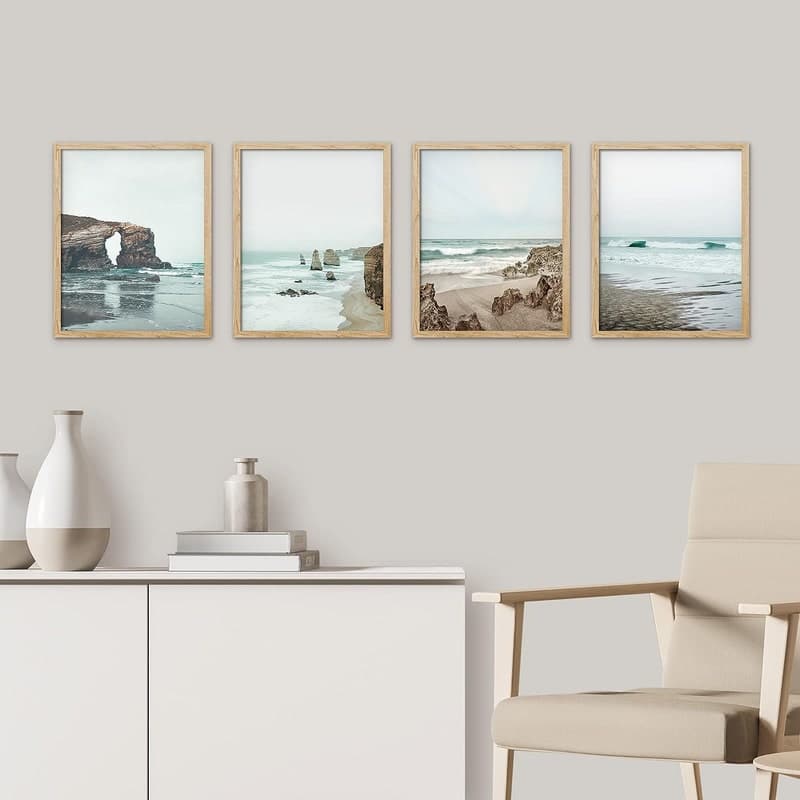
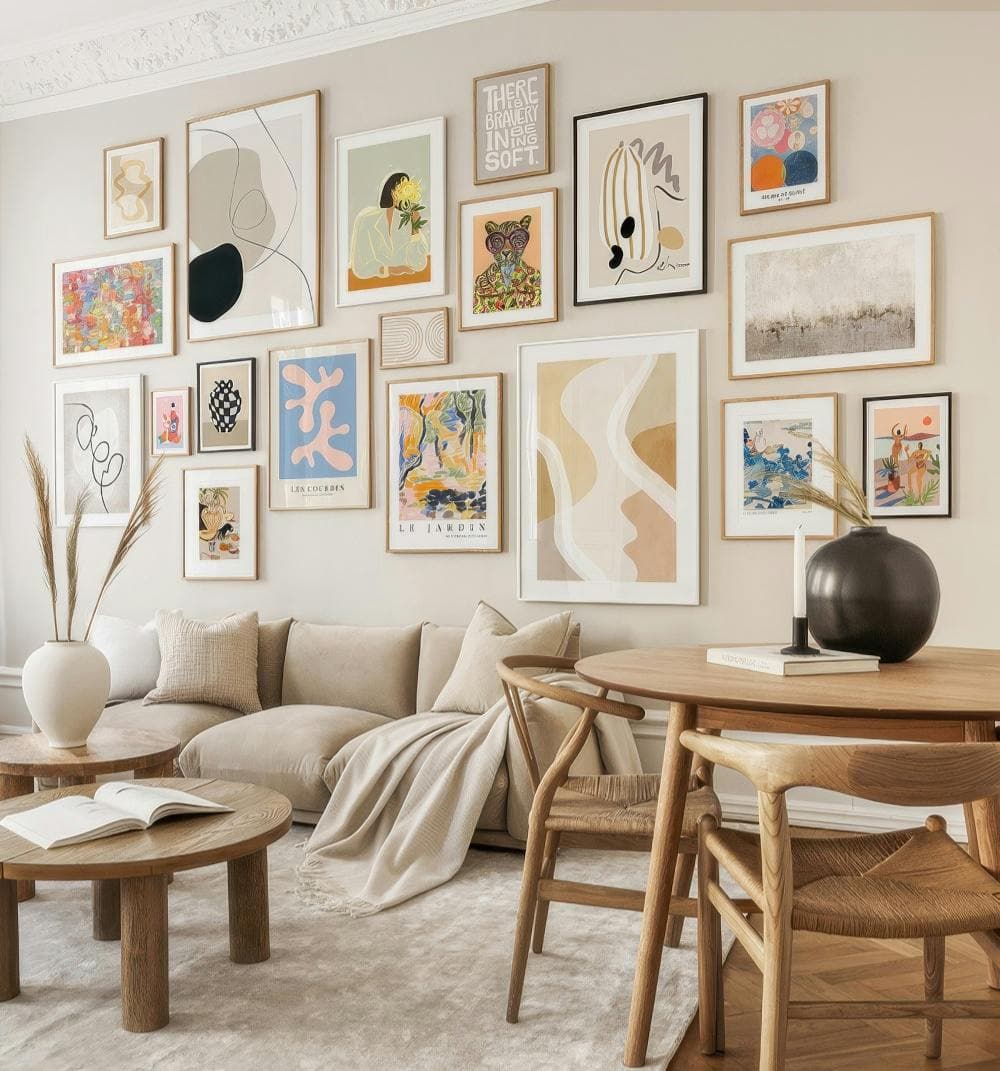
The most efficient approach is to define two or three mockup styles that become your default templates. For example, you might have a primary mockup that shows your print in a natural wood frame against a linen-textured wall, a secondary mockup showing the same print styled on a gallery wall with coordinating pieces, and a lifestyle mockup showing the print in a full room scene.
These three mockup styles become your formula. Every new product gets all three, generated in the same way, with the same settings. Your shop grid then has a natural rhythm. Buyers who scroll through see that visual repetition and read it as consistency and quality.
Bulk generation tools are essential here. Mockupanda was built specifically for this kind of workflow, where you have a set of templates you apply to new artwork quickly without recreating the process from scratch each time. For high-volume print-on-demand sellers adding new products regularly, manually setting up each mockup individually is simply not sustainable.
Organizing Your Mockup Files to Stay Consistent Over Time
One thing that derails visual consistency is disorganization at the file level. If your saved mockup templates are buried in downloads folders and you cannot find them when you are adding new products six months from now, you will start improvising, and improvisation kills cohesion.
Create a simple folder structure for your mockup assets. One folder for your approved mockup templates, one for your generated mockup images by product category, and one for your artwork files. Label everything clearly. When you add a new product, you pull from the approved templates folder, not from a random download you found that day.
If you use Mockupanda, your templates and generation settings live in one place, which removes a lot of this organizational overhead. But whatever tool you use, the principle is the same: your approved mockup styles should be something you can access and replicate instantly, not something you rebuild from memory.
Actionable takeaway: Designate three mockup styles as your official shop templates today. Write down exactly what they are, what background color, what frame style, what staging elements. Use only these for new listings going forward.
Handling Listings That Do Not Fit Your Palette
This is where sellers get stuck. You have an older product that is selling well, but its mockup does not match your new cohesive direction. Or you want to introduce a product in a totally different color scheme. What do you do?
Updating Existing Listings Without Disrupting Sales
If you have older listings with mockups that do not fit your current palette, updating them is worth the effort, especially for your best sellers, since those appear highest in your shop grid and set the first impression.
The good news is that updating a mockup does not require changing the listing itself. You are just swapping the images. You can do this gradually, prioritizing your top-selling and most-viewed listings first, then working through the rest over a few weeks. You do not need to redo everything in one sitting.
When you regenerate mockups for older products, use your established templates. Same background, same frame style, same color palette. The product artwork might be older, but it now exists within your current visual system.
What to Do With Products That Are a Different Aesthetic
Sometimes you genuinely have products that belong to different aesthetic worlds. Maybe you started with boho earthy prints and now you are moving into cool modern geometric art. Or you have a seasonal collection that uses different styling.
In this case, you have two options. First, you can create a sub-palette that still relates to your main palette. If your primary palette is warm neutrals, a seasonal collection might use slightly cooler but still neutral tones, so it feels like a natural extension rather than a jarring departure.
Second, some sellers choose to keep different aesthetics in separate shops entirely. This is a more drastic choice but it is worth knowing it is an option if your product range genuinely spans very different buyer personas.
Actionable takeaway: Identify your top five best-selling listings and check whether their mockups currently match your palette. If they do not, schedule time this week to regenerate those mockups using your established templates.
Using Mockup Text Overlays to Reinforce Brand Consistency
Beyond color, text overlays on mockups are an underused tool for building a cohesive shop identity. When used well, they can reinforce your brand voice and make your listing thumbnails recognizable even before a buyer reads the title.
When and How to Add Text to Your Mockup Images
Text overlays work best for promotional images, collection headers, or seasonal announcements. Think about the thumbnail for a bestseller listing where the overlay text reads something like "Digital Download, Instant Print" or a seasonal image that says "New Spring Collection." These cues help buyers understand what they are looking at quickly, which reduces friction and boosts click-through rates.
The key is to keep the text style consistent. Use the same font, the same size, the same color, the same placement in every mockup that includes text. If you use white lowercase text in the bottom left corner of your promotional images, that becomes a recognizable element of your shop's visual identity.
Mockupanda includes text overlay functionality specifically for this kind of use, so you can add consistent branded text to your mockups without jumping between tools or layering files in separate software.
Keeping Text Overlays Aligned With Your Color Palette
Your text color should come from your defined palette. If your palette is warm neutrals, your overlay text might be off-white or warm cream. If you work with darker tones, a muted ivory or light sage might work better than stark white. The text should feel like part of the mockup, not a label slapped on top.
Font choice matters here too. One font for all your overlays, full stop. Mixing fonts across your mockup images is another form of visual inconsistency that erodes the cohesive feel you are working to build. Choose a clean, legible font that suits your brand aesthetic and stick with it.
Actionable takeaway: If you use any text overlays in your mockup images, audit them right now for font and color consistency. If they vary across listings, standardize them to one font and one color from your palette.
Maintaining Cohesion as Your Shop Grows
Building a cohesive shop front is not a one-time project. It is an ongoing practice. As you add new products, run seasonal promotions, and evolve your offerings, the visual consistency needs to be actively maintained.
Building a Simple Brand Style Guide for Your Shop
A brand style guide sounds corporate, but for an Etsy shop it can be as simple as a single document or even a notes file on your phone. It should include your palette colors with hex codes, your approved mockup styles and where to find the templates, your chosen overlay font and when to use text, and any staging or prop preferences like always using greenery or always using neutral linens.
This document becomes your reference every time you add a new product. You check new mockups against it before publishing. It takes maybe twenty minutes to create and saves hours of second-guessing over time.
Doing a Quarterly Visual Audit of Your Shop Front
Every three months or so, take a step back and look at your shop front as a whole. Screenshot your listings grid and look at it as one image. Check for visual outliers, listings where the mockup does not fit the palette or the styling feels off. Those are your targets for updates.
Al also pay attention to how your shop front is evolving. If you have grown your catalog significantly, the listings that now appear at the top of your grid might be newer ones with your current aesthetic, while older listings are buried deeper. That natural shift can actually help consistency over time, but only if you are adding new listings consistently using your established system.
Actionable takeaway: Set a recurring reminder for every ninety days to screenshot your Etsy shop front grid and compare it to your brand style guide. Make a list of any listings that need their mockups updated and tackle them in batches.
Pulling It All Together
A cohesive Etsy shop front is not magic and it is not the result of a massive design budget. It is the result of making deliberate, consistent choices every time you add a new listing.
Define your color palette and write it down. Choose two or three mockup styles that become your default templates. Use a tool that makes bulk generation easy so consistency does not eat your entire week. Apply text overlays thoughtfully and consistently. Audit your shop regularly and update the outliers.
When buyers land on your shop and feel that sense of visual coherence, they stay longer. They browse more listings. They trust you more. And trust is what converts browsers into buyers.
Mockupanda was built by a designer who ran into exactly these frustrations with other tools. The goal was always to make it possible for print-on-demand sellers to generate professional, consistent mockups quickly, without needing a design background or spending hours per listing. If you are ready to bring real consistency to your shop front without the usual headaches, it is worth trying.
Keep reading
Why Etsy Buyers Judge Your Entire Shop Quality From the First Mockup They See
How to List a Diptych or Triptych Poster Set on Etsy Using a Single Gallery Wall Mockup That Shows the Full Set Together