The Right Way to Size and Align Multi-Panel Prints in a Gallery Mockup So Your Triptych Looks Like One Cohesive Piece
Triptych and multi-panel prints are one of the best-selling formats in the wall art category on Etsy. Buyers love the drama of a three-panel piece spread across a wall. Sellers love the higher price point you can justify for a set compared to a single print. But here is the catch: if your mockup looks off, if the panels are slightly different sizes, if the gaps are uneven, or if the art does not flow naturally across the panels, buyers will not trust that the real product will look any better. They will move on.
The good news is that getting this right is not about having advanced design skills. It is about understanding a small set of rules and applying them consistently. Once you know what to look for, you will start noticing these mistakes everywhere in competitor listings, and you will understand exactly why certain shops command premium prices while others struggle to convert.
Let's go through everything you need to know to make your triptych mockups look like one seamless, intentional piece of wall art.
Understanding How a Triptych Is Actually Structured
Before you touch any mockup tool, you need to understand what you are creating. A triptych is three separate panels that together form a single image or visual composition. The key word is together. The whole point of the format is that the eye moves across all three panels and reads them as one experience, not three separate prints that happen to be hanging near each other.
This means your decisions about sizing and spacing are not just technical choices. They directly affect whether the mockup communicates that idea of unity.
The Two Types of Triptych Layouts
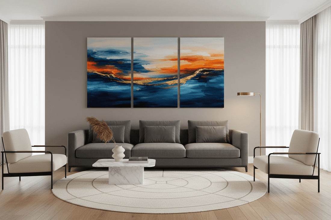
The first type is a split image triptych. You take one wide horizontal image, divide it into three equal vertical sections, and sell those three panels as a set. Think of a panoramic landscape or a city skyline cut into thirds. This format lives and dies on precise alignment. If the split is off even slightly, the image will not connect correctly across the panels and the seams will look wrong.
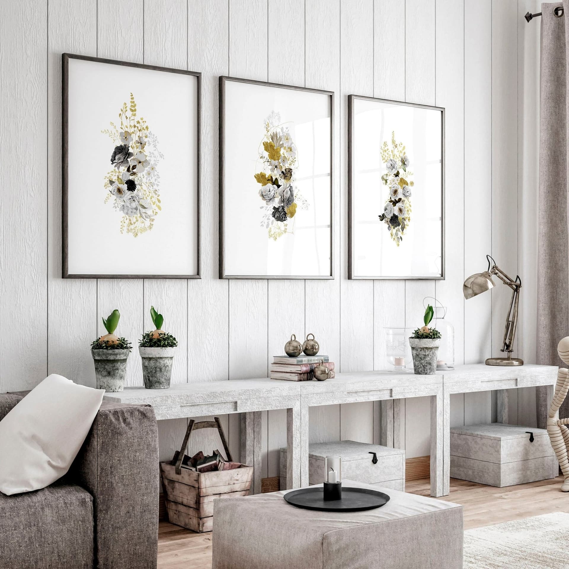
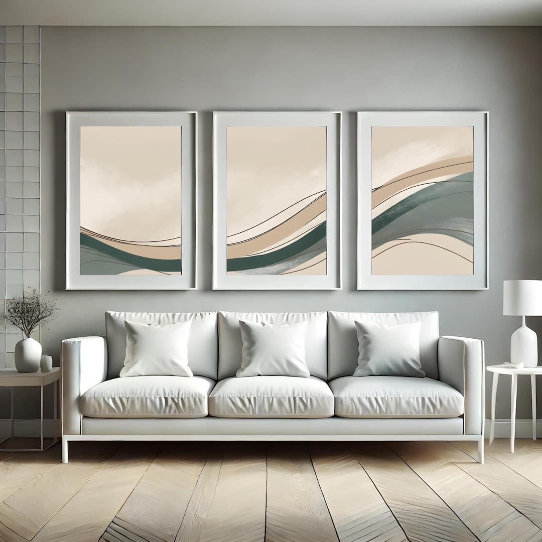
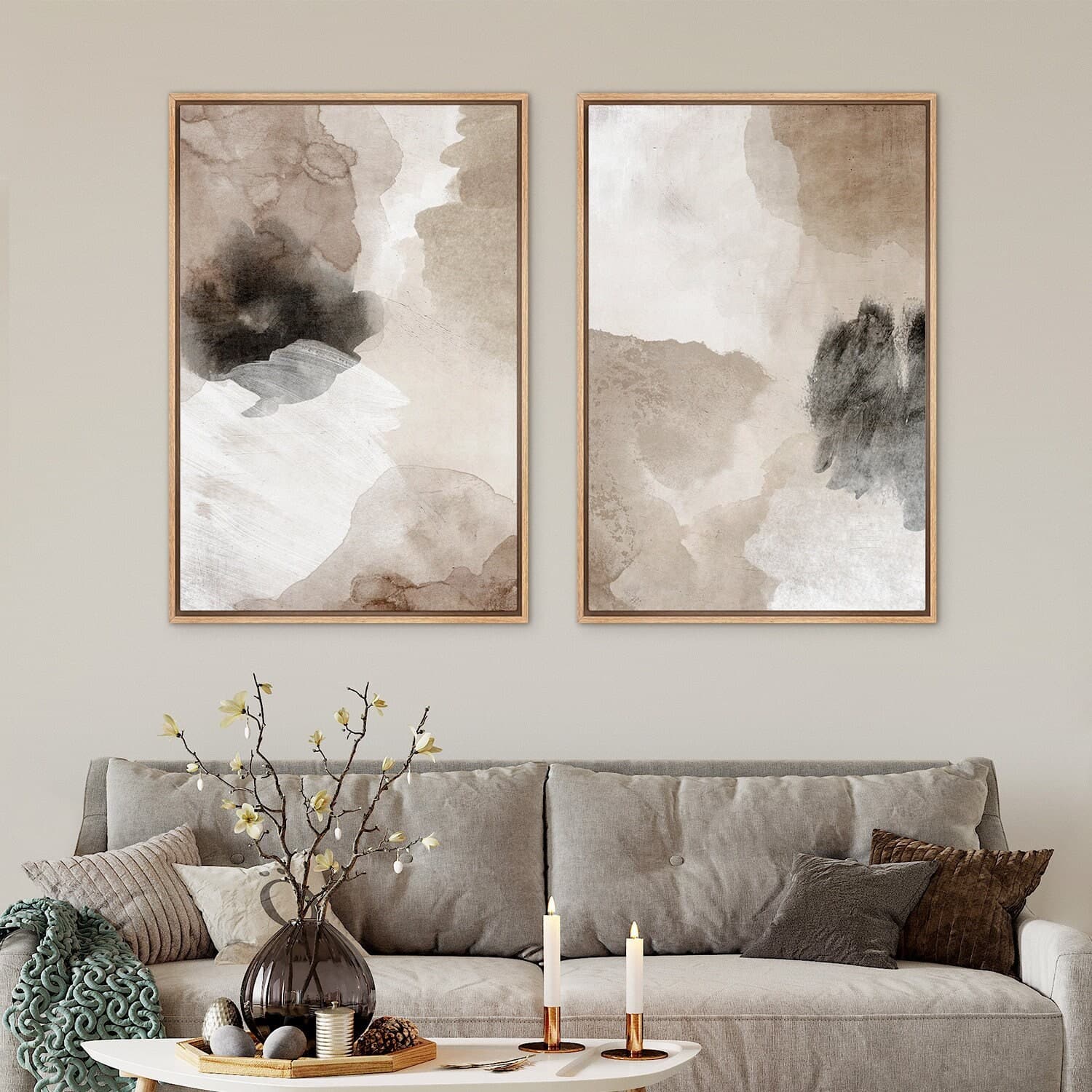
The second type is a thematic triptych. Each panel is its own image but they share a visual theme, a color palette, a subject matter, or a compositional style that makes them feel related. Botanical sets, abstract color block series, and quote collections often work this way. With thematic triptychs, the panels do not have to match pixel-perfectly, but they do need to share enough visual DNA that the eye groups them together naturally.
Knowing which type you are working with changes how you approach your mockup setup. A split image triptych demands exact technical precision. A thematic triptych gives you more flexibility but requires careful attention to visual consistency.
Aspect Ratio Is Everything
One of the most common mistakes sellers make is using panels with inconsistent aspect ratios. Let's say you are selling three 8x10 prints as a set. Each panel is portrait oriented, 8 inches wide by 10 inches tall. If your mockup shows one panel that looks slightly wider than the others, or if one frame appears taller because the mockup template scaled it differently, the whole set looks sloppy.
Always verify that every panel in your mockup is using the same aspect ratio. If you are using a 2:3 ratio for one panel, every panel needs to be 2:3. Do not mix 2:3 with 4:5 across a three-panel mockup because even a small difference will be visible, especially when the panels are side by side.
Actionable takeaway: Before creating any multi-panel mockup, write down the exact dimensions and aspect ratio you are working with. Treat this as your spec sheet and confirm every panel matches it before you finalize anything.
Getting the Spacing Right Between Panels
Spacing is the part that most sellers underestimate. The gap between panels is not just empty space. It is a design decision that affects how the overall piece feels. Too much space and the panels feel like three separate prints sharing a wall. Too little space and they feel cramped, like they are competing with each other. The right amount of space says: these belong together.
The Standard Gap Rule for Wall Art
In interior design, the widely accepted standard for hanging a multi-panel set is between 2 and 3 inches of physical space between each panel. In mockup terms, you are trying to recreate this visual proportion on screen. The gap should be large enough to be clearly intentional but small enough that the eye still groups the panels together.
A useful rule of thumb is that the gap between panels should be somewhere between 3 and 8 percent of the total width of a single panel. For a typical mockup showing three 8x10 panels, that works out to a very small but clearly visible gap. If the panels look like they are touching or overlapping, close the gap slightly. If the panels look like three separate pieces of art that happen to be on the same wall, tighten the spacing.
How Different Room Contexts Change the Gap
The context of your mockup matters here too. If you are placing your triptych mockup in a living room scene where the panels are mounted over a sofa, the spacing will appear differently than if you are showing a close-up flat lay mockup of three frames on a white wall. In a room scene, you are working with perspective and depth, which can make gaps look wider or narrower depending on the camera angle.
For room scene mockups, try to find templates where the wall is photographed relatively straight-on rather than at a sharp angle. Strong perspective distortion makes it harder to judge whether your spacing looks right because the panels closest to the camera will always appear slightly larger. A straight-on angle gives you the most accurate read on how your spacing actually looks.
For flat or minimal mockups with a simple wall background, you have much more control and can be very precise with your spacing. These templates are often better for communicating exact sizing and proportion to buyers who are measuring their walls.
Actionable takeaway: Pick one gap size for each collection and use it consistently across every mockup in that product range. Visual consistency across your listings builds trust and makes your shop look more professional.
Aligning the Art Correctly Across All Three Panels
This is where split image triptychs get technically demanding. When you divide a single image into three panels, you need the horizontal line to flow uninterrupted across all three sections when the panels are displayed together in your mockup. Any vertical misalignment, even a few pixels worth, will make the image look broken.
How to Prepare a Split Image File Correctly
The cleanest way to create a split image triptych is to start with a single wide canvas and divide it mathematically. If you are creating a 24x8 inch panoramic print, you divide the width by three to get three 8x8 panels. If you are creating a set of three 12x16 panels, your original canvas should be 36 inches wide by 16 inches tall, and you cut it into equal thirds.
Do not eyeball this. Use exact measurements or use a tool that does the math for you. If your original image is 3000 pixels wide and you try to split it into three parts by dragging a selection box, you might end up with panels that are 999, 1001, and 1000 pixels wide. That one pixel difference will not look like much in isolation but when the panels are displayed together in a mockup, the right edge of panel one and the left edge of panel two will not align perfectly.
Most design tools will let you input exact pixel values for your crop or slice dimensions. Use those input fields rather than freehand selection.
Checking Alignment in Your Mockup After Uploading
Once you have uploaded your three panels into a mockup, the alignment check is simple. Find a strong horizontal line or gradient in your original image, something like a horizon in a landscape photo, a clear color transition, or a geometric line in an abstract piece. Look at where that line hits the right edge of panel one and where it starts at the left edge of panel two. They should match exactly.
If they do not match, the issue is almost always one of two things. Either your source files were not cut to exactly equal widths, or the mockup template is scaling the panels at slightly different sizes. Both are fixable. For source file errors, go back and re-export with exact pixel dimensions. For template scaling issues, look for a mockup tool that locks panel dimensions to specific values rather than scaling each frame independently.
Actionable takeaway: Always do a post-upload alignment check by looking for a horizontal reference line in your art. If it does not flow cleanly across all three panels, diagnose whether the issue is in your source files or in the mockup template before publishing the listing.
Choosing the Right Mockup Template for Multi-Panel Sets
Not every mockup template is designed with triptychs in mind. Some templates that claim to be triptych mockups are actually just three independent single-frame mockups placed side by side with no attention paid to consistent sizing or proportional spacing. Knowing what to look for in a template saves you a lot of frustration.
What Makes a Template Actually Designed for Triptychs
A well-designed triptych template will have all three frames built from the same source, meaning the same perspective, the same lighting, the same shadow treatment, and the same level of realistic depth. When you upload your art, the frames should all respond to the mock environment in exactly the same way.
Look for templates where the frames share a shadow source. In real rooms, light comes from one direction and shadows fall consistently. A good mockup template replicates this. If panel one has a shadow on its right edge but panel three has no shadow, or if the shadows are going in different directions, the realism breaks down and the mockup starts to look assembled rather than photographed.
Also look for templates that include subtle wall texture or room context behind and between the frames. A completely flat white background between panels makes the spacing feel artificial. Even a slight texture or the faintest gradient helps the eye read the space between panels as realistic wall space rather than a digital gap.
Using Mockupanda for Multi-Panel Gallery Mockups
Mockupanda was built specifically around the needs of digital print sellers, and that includes triptych and multi-panel setups. The bulk generation feature is particularly useful here because you can upload your three panel files and generate a complete set of mockups without manually resizing and repositioning each frame in a separate editing session.
The text overlay feature is also useful for triptych listings. You can add overlay text showing the total set dimensions or a note like "set of 3 prints" directly on the mockup image, which helps buyers understand what they are purchasing at a glance. This is especially helpful on Etsy where thumbnail clarity is a direct driver of click-through rates.
Because Mockupanda is built by someone who came from a product design background and experienced these exact frustrations firsthand, the templates are designed with proportional accuracy as a baseline requirement rather than an afterthought.
Actionable takeaway: When evaluating any mockup template for triptych use, check the shadow consistency and lighting direction across all three frames before committing to it. A template with inconsistent lighting will undermine the realism no matter how well your art is prepared.
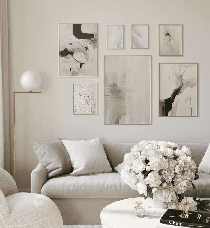
Making the Full Set Look Like Intentional Wall Art, Not Three Random Prints
Beyond the technical alignment work, there is a visual storytelling layer to great triptych mockups that separates the listings that convert from the ones that do not. You want buyers to look at your mockup and immediately see a finished interior moment, not a product on a white background.
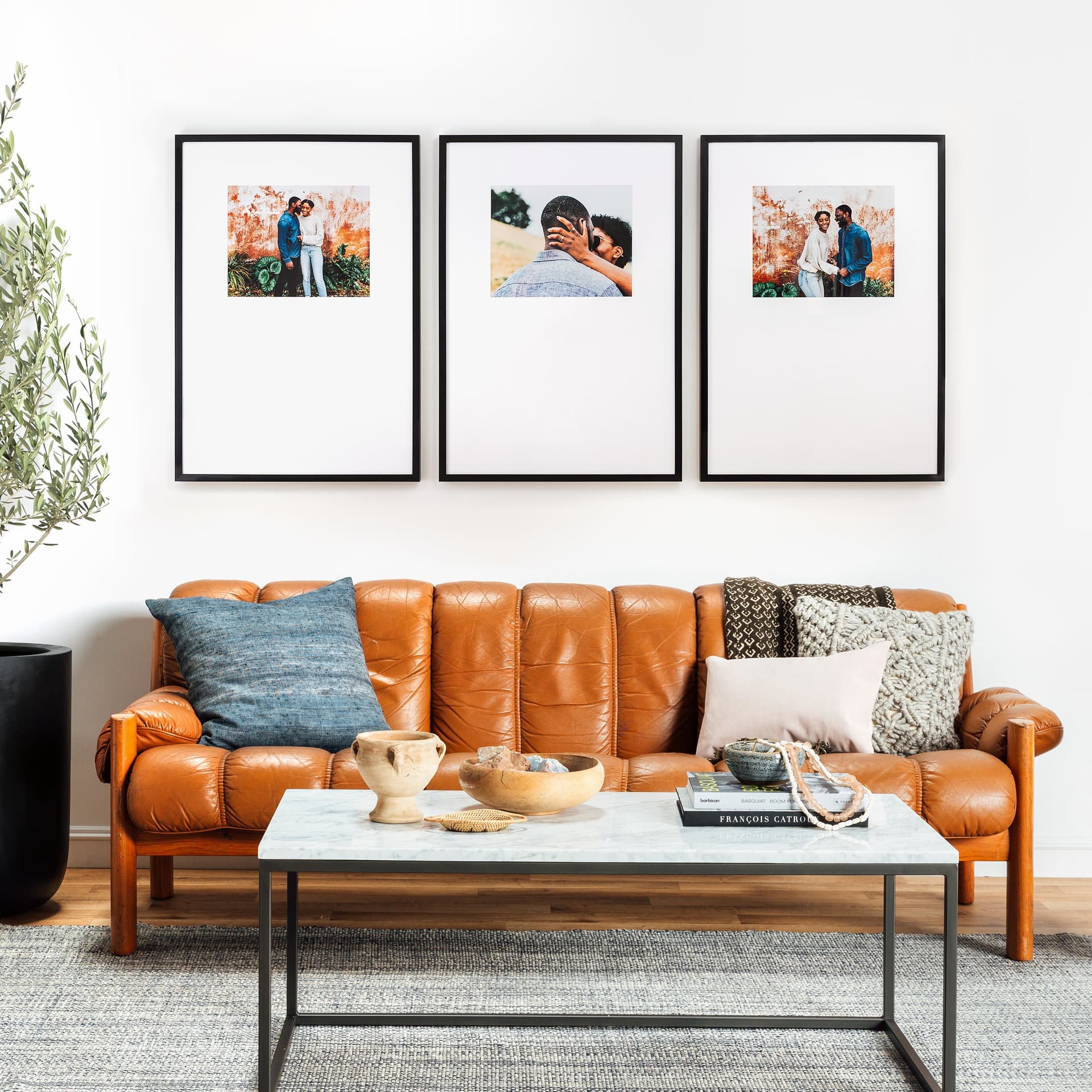
Showing Scale in Context
One of the biggest conversion killers for wall art listings is that buyers cannot tell how big the piece actually is from the mockup alone. A triptych that looks dramatic in your mockup might turn out to be three 5x7 prints that would look tiny on an actual wall. Or the buyer might not realize the set is actually quite large and worry it will not fit.
You can solve this with contextual mockups. Place your triptych in a room scene that includes recognizable furniture like a sofa or a sideboard. The furniture gives buyers an immediate sense of scale without you having to explain it in text. A three-panel set displayed above a standard sofa communicates size instantly and also shows buyers how to use the product in their own homes.
Include at least one close-up flat mockup showing the individual panels clearly, and at least one room scene mockup showing the full set in context. This two-mockup strategy answers both of the main buyer questions: what does it look like up close, and how will it look on my wall.
Color Consistency Across Panels in a Thematic Set
For thematic triptychs where each panel is its own image, the biggest visual challenge is color consistency. If your three botanical prints were designed in different sessions or pulled from different source files, they might have subtly different color temperatures. One might lean slightly warm, another slightly cool. In isolation each print looks fine, but side by side in a mockup the inconsistency becomes obvious.
Before finalizing your mockup, look at your three panels together and ask whether they share the same general color temperature and saturation level. If one panel feels brighter or warmer than the others, that is worth going back and correcting in your original files. Buyers will not consciously identify this as a color temperature issue, but they will feel that something is slightly off about the set, and that feeling will translate to hesitation.
Actionable takeaway: Always view all three panels of a thematic set together before generating your final mockup. Color inconsistency is much easier to spot when the panels are side by side than when you are reviewing each file individually.
Common Mistakes That Make Triptych Mockups Look Amateur
Even sellers who understand the principles above still make a few recurring mistakes that undermine their mockups. Here are the most common ones and how to avoid them.
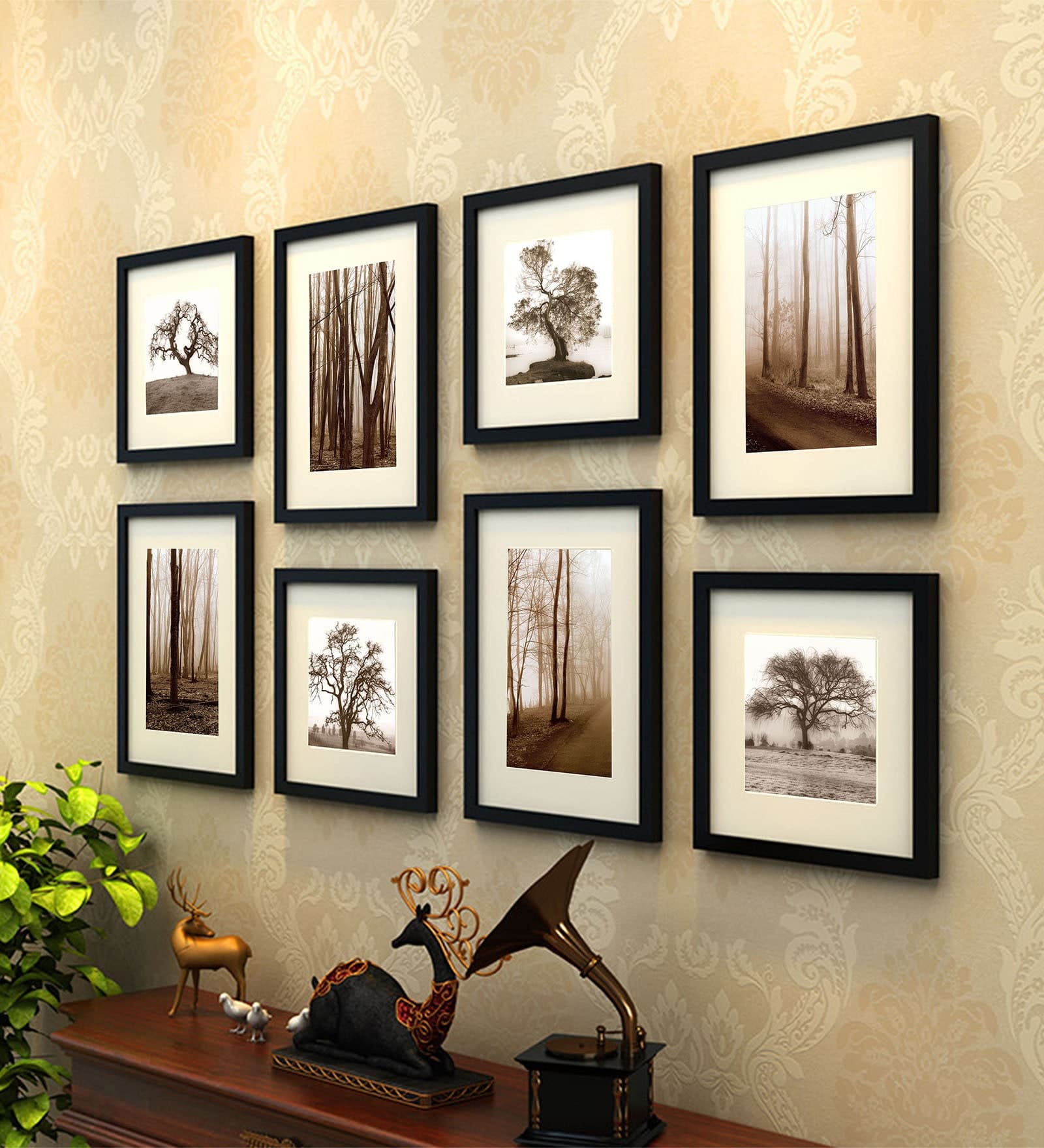
Using Different Frame Styles for Each Panel
This sounds obvious but it happens more often than you would expect. A seller uses a black frame for panel one from one template, a thin black frame for panel two from another template, and somehow ends up with panel three in a wood frame because they grabbed the wrong file. When displayed together in a listing, the set looks accidental.
For a triptych, every panel must use the same frame style, the same frame thickness, and the same finish. If you are showing the prints unframed as canvas wraps, every panel needs to show the same canvas edge depth. Consistency here is not optional. It is what separates a product that looks designed from one that looks assembled.
Scaling Panels to Different Sizes
If you are manually placing mockup images in a listing, it can be easy to accidentally resize one panel thumbnail larger or smaller than the others. This happens a lot when sellers are building mockup collages in Canva or similar tools. One frame gets nudged slightly and suddenly panel two looks 5 percent larger than the other two.
Always use locked, equal dimensions when placing panels side by side in any composition tool. Set a width value, lock the aspect ratio, and apply the exact same dimensions to every panel. Do not drag corners freehand.
Ignoring the White Space Around the Full Set
The margins around the outside of your triptych mockup matter as much as the spacing between the panels. If your three frames are pushed all the way to the edges of the mockup canvas, the composition feels cramped and the set looks larger and less elegant than it is. Give the full set breathing room. There should be noticeably more white space or wall space around the outside edges of the full triptych than there is between the individual panels.
This follows the same logic as good graphic design. The outer margin is the visual frame for the entire composition. It tells the eye where to look and creates the sense that the set exists in a real environment rather than floating in digital space.
Actionable takeaway: Run through this quick three-point check on every triptych mockup before publishing. Are all three frames the same style and size. Is the gap between panels consistent and proportional. Does the full set have sufficient outer margin to breathe. If all three answers are yes, you have a professional mockup. If any answer is no, that is your fix.
Applying This to Your Listings Right Now
The difference between a triptych mockup that converts and one that does not usually comes down to a handful of small, fixable decisions. Panel sizing, gap consistency, alignment precision, and frame uniformity are all things you can control without any advanced design skills. They just require attention and a clear process.
Start by auditing your existing multi-panel listings. Look at each triptych mockup and ask honestly whether the set reads as one cohesive piece or three separate prints. If you see uneven gaps, misaligned art, or inconsistent frame styles, those are your priority fixes. A better mockup on an existing listing can improve conversion without any change to the product itself.
For new listings, build the process described in this guide into your standard workflow before you upload anything. Define your panel dimensions in advance, cut your split images with exact pixel values, verify alignment on a reference line, and choose mockup templates that treat all three frames as one unified composition.
The buyers who are willing to pay premium prices for multi-panel wall art sets are paying for the vision of what it will look like on their wall. Your mockup is the closest thing they have to seeing that vision. Make it worth the price you are asking.
Keep reading
How to Showcase Poster Sets on Etsy Using Gallery Wall Mockup Templates
How to Use Lifestyle Mockups to Sell Abstract Art to Buyers Who 'Don't Get It' Yet