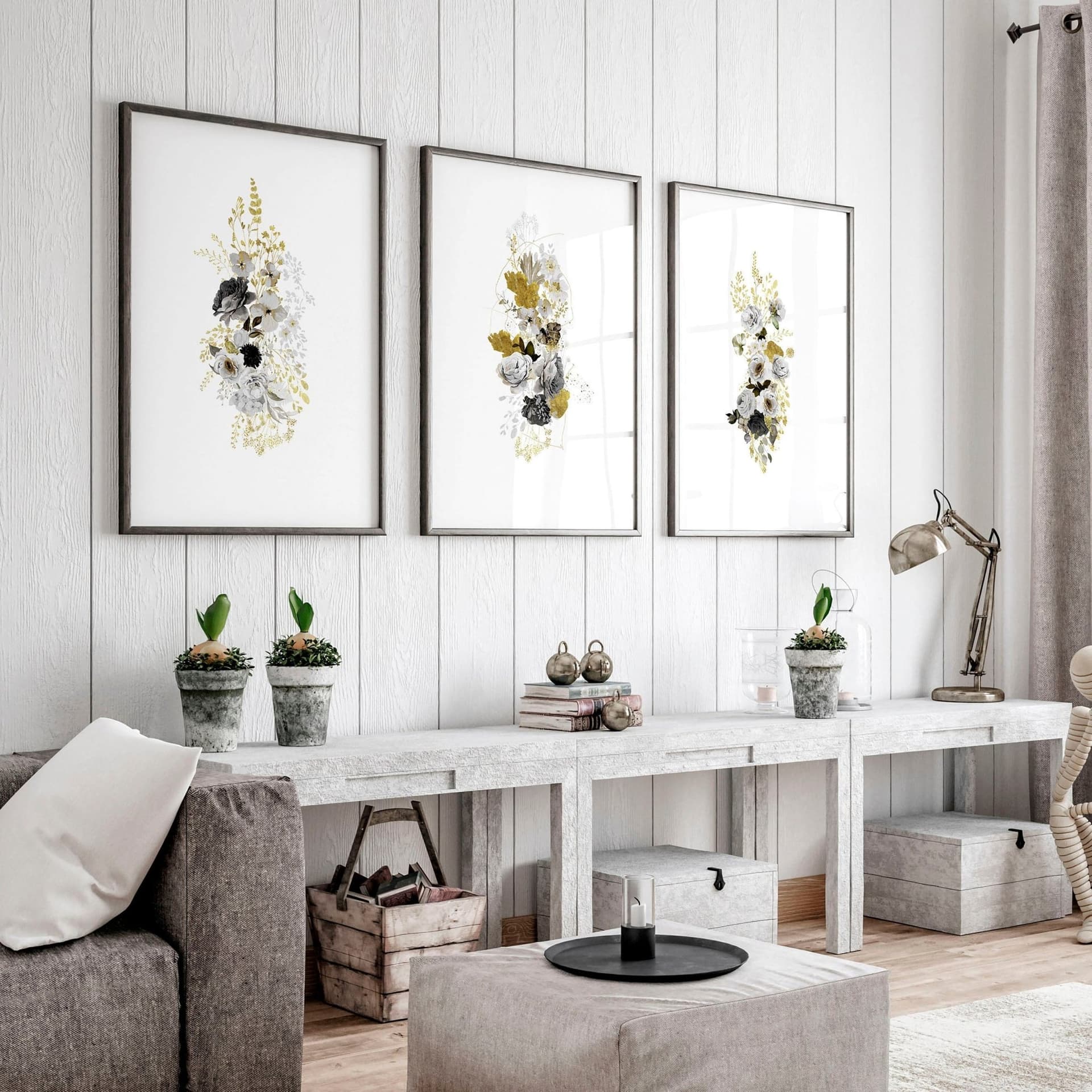
How to Choose the Right Mockup Style for Your Etsy Niche: Boho, Minimalist, Maximalist, and More
When a shopper lands on your Etsy listing, they are not just looking at your print. They are looking at the whole picture, literally. The room, the furniture, the light, the frame, the plants on the shelf. All of it adds up to one quick emotional judgment: does this belong in my home?
If your mockup environment clashes with the vibe of your actual artwork, that judgment comes back as a no. Not because your print is bad, but because the presentation told the wrong story.
This is why choosing the right mockup style for your niche matters as much as the design itself. And it is something a lot of Etsy sellers are still getting wrong, often by accident. They grab whatever mockup looks nice without thinking about whether it matches the aesthetic their target buyer already has in their head.
This guide is going to change that. We are going to walk through the most popular interior aesthetics on Etsy right now, explain what each one communicates to buyers, and give you a clear framework for deciding which style fits your shop. By the end, you will know exactly what kind of mockup environment to use, and why.
Why Mockup Style Is a Conversion Decision, Not Just a Visual One
Your Mockup Sells the Fantasy, Not Just the Product
People do not buy wall art in a vacuum. They buy it because they can picture it in their home. Your mockup's job is to make that picture as vivid and emotionally resonant as possible, without requiring the buyer to do any imaginative heavy lifting.
When someone who loves cottagecore finds a print displayed in a sleek, all-white modern loft, they have to mentally translate the product into their own space. That extra mental step creates friction. And friction kills conversions.
When that same print appears in a warm, linen-toned room with dried flowers and wicker accents, the translation is already done. The buyer sees their home. They feel the connection. They click Add to Cart.
Your mockup is not just showing the print. It is confirming to the right buyer that this product was made for them.
The Mismatch Problem and How Common It Is
Here is something worth sitting with. You might have genuinely beautiful designs with a loyal aesthetic, but if your mockups look like they were pulled from a generic stock library, your listing might be speaking the wrong language entirely.
A lot of sellers, especially when they are starting out, choose mockups based on what looks professional or polished in isolation. They do not ask whether the room in that mockup actually reflects the lifestyle their customer is living. The result is a visual disconnect that buyers can feel but cannot always name. They just move on.
Before you even think about which mockup to use, get specific about who you are selling to. Not just demographics but aesthetic identity. Does your buyer follow boho decor accounts on Instagram? Do they have a gallery wall with black frames and serif typography? Are they decorating a nursery with muted pastels? The answers to those questions should drive every mockup decision you make.
Actionable takeaway: Before choosing any mockup, write one sentence describing the interior aesthetic of your ideal buyer's home. That sentence is your filter for every mockup decision going forward.
Breaking Down the Core Etsy Interior Aesthetics
Boho and Organic Modern
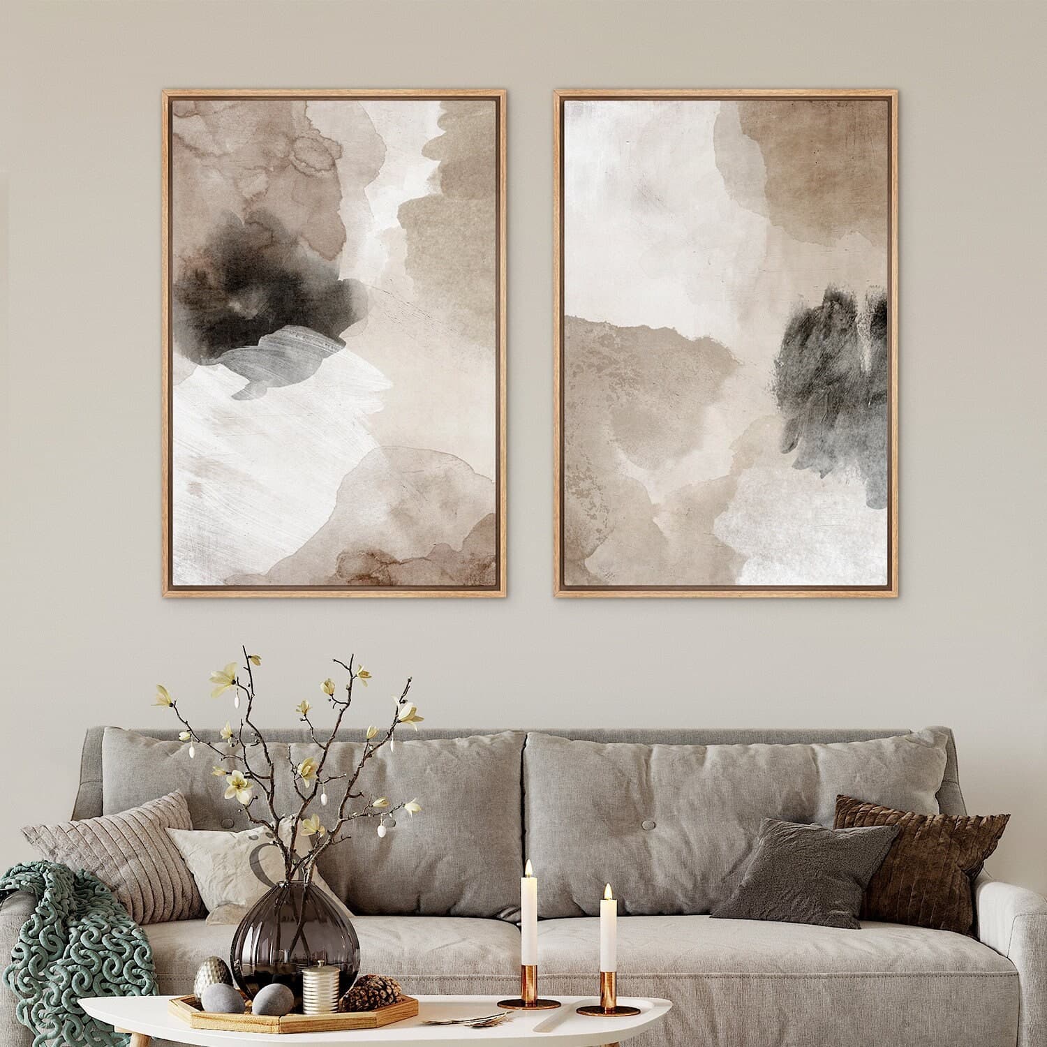
Boho is one of the most consistently popular aesthetics on Etsy, and it covers a pretty wide range. At its core, it is warm, layered, and natural. Think rattan furniture, macrame wall hangings, terracotta pots, linen throws, and wood tones everywhere. There is texture and pattern but it does not feel cluttered, it feels collected.
Organic modern is the slightly more refined cousin. It keeps the warm neutrals and natural materials but strips back some of the pattern-mixing. Think Japandi crossed with Californian earthy tones.
If you sell botanical prints, abstract earthy art, celestial illustrations, or anything with a handmade or artisanal feel, boho or organic modern mockups are going to resonate deeply with your audience. You want rooms with warm lighting, natural wood frames, and surfaces that have a lived-in, intentional quality.
Avoid overly sleek or stark white mockup environments for this niche. They strip the warmth out of your product and make it feel clinical.
Minimalist and Scandinavian
Minimalist buyers are a very distinct personality. They are deliberately choosing less. Their homes are curated, calm, and intentional. White walls, light wood, clean lines, and a restrained color palette. Nothing is there by accident.
Scandinavian, or Scandi, sits right inside this space with the addition of hygge, cozy textures like sheepskin throws and candles, but still within a very pared-back color story.
If you sell typographic prints, abstract line art, monochrome photography, or simple geometric designs, minimalist mockups will speak your buyer's language perfectly. Think bright, airy rooms. White or off-white walls. Simple frames, often black or natural wood. No distracting props.
The mistake sellers make in this niche is choosing mockups that are so empty they feel cold or sterile. Minimalism is not absence, it is curation. A single plant, a simple shelf, a perfect beam of light through a window. That is the difference between minimal and bare.
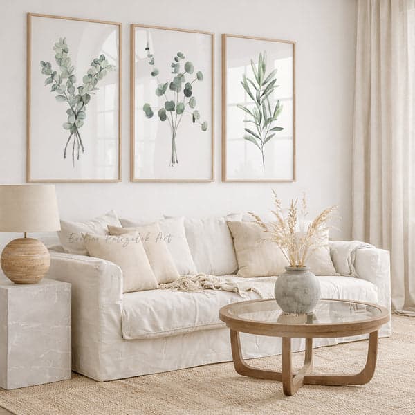
Actionable takeaway: If your niche is minimalist, test your mockups by removing every prop mentally and asking whether the remaining room still has warmth. If not, find a different mockup.
Maximalist, Eclectic, and Gallery Wall Aesthetics
The Maximalist Buyer and What They Need to See
Maximalist buyers are the ones building gallery walls with sixteen frames, mixing patterns across every surface, and leaning hard into color. They collect things. They layer things. They do not worry about matchy-matchy.
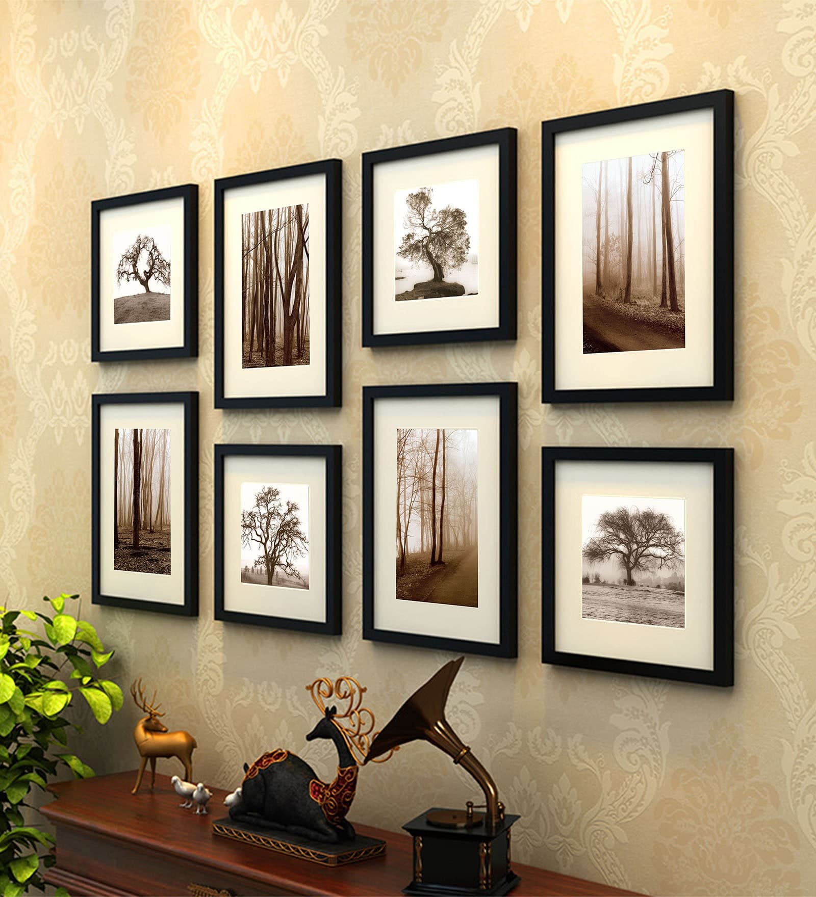
For sellers targeting this audience, your mockup needs to show the print living in abundance. A single art print on an empty wall might not land with this buyer. They need to see how it fits into a layered environment. What does it look like as part of a gallery wall? How does it hold its own next to pattern-heavy wallpaper?
Showing the same print in multiple styled environments is especially powerful for this niche. It demonstrates versatility and invites the buyer to imagine where their own version of abundance might include your work.
Eclectic and Vintage Vibes
Eclectic is related to maximalist but has a stronger emphasis on mixing eras and influences. Vintage furniture, retro color palettes, grandmillennial patterns, and a general sense that the room has been assembled over a lifetime rather than curated in an afternoon.
If you sell vintage-inspired prints, retro typography, antique botanical illustrations, or anything with a nostalgic or heritage feel, eclectic mockups will work brilliantly. Look for rooms with warm-toned walls (deep green, mustard, terracotta), ornate frames, and a mix of wood tones.
Brown and gold frames tend to perform extremely well in this niche, while black frames can feel too modern and white frames too generic. Frame color choices have more impact than most sellers realize, and in the eclectic space, the frame is almost as important as the print itself.
Actionable takeaway: For maximalist and eclectic niches, prioritize mockups that show your print in context alongside other decor elements. An isolated print on a white wall undersells the product for this buyer.
Nursery, Kids, and Family-Specific Niches
The Softness Standard in Nursery Mockups
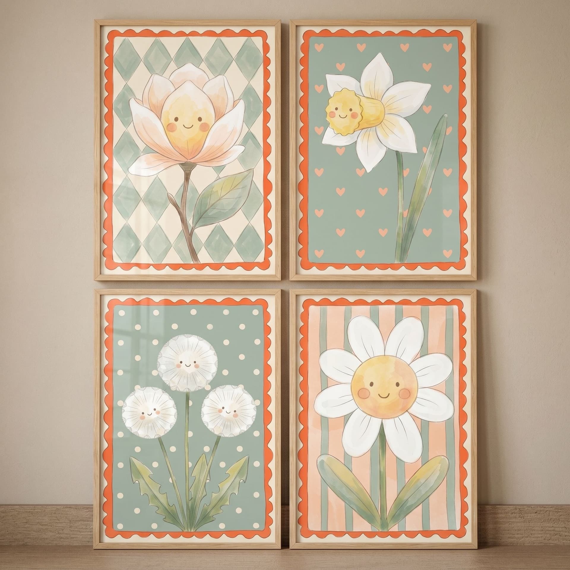
Nursery and children's room buyers have a very specific visual vocabulary. Soft, muted, or pastel tones. Safe and warm materials. Round shapes. Nothing harsh or cold.
If you sell nursery prints, children's alphabet art, custom name prints, or educational wall art, your mockups need to reflect this world. Think soft white or sage green walls, light pine or white furniture, gentle natural light, and age-appropriate styling details like stuffed animals or small plants.
Bright, saturated room mockups can work for more playful children's art, but for the popular muted nursery aesthetic that dominates Etsy right now, you want a palette that feels soothing rather than stimulating.
One thing to avoid in this niche is using adult-oriented room mockups for children's prints. It happens more often than you would expect, and it breaks the spell immediately. The buyer cannot picture the print in a nursery because you have not shown it in one.
Custom and Personalized Products
Personalized prints sit across several aesthetics but share a common mockup need: the buyer needs to see where this would actually go and how it would look in a finished, styled room. Generic or overly sparse mockups do not do justice to personalized products because personalization is inherently emotional.
For custom family prints, anniversary gifts, name prints, and similar products, choose warm, inviting rooms. Lifestyle environments where the print looks like it has been hanging there for years. The goal is to make the buyer feel the emotional payoff of gifting or receiving this piece.
Actionable takeaway: Match your mockup's emotional temperature to the emotional intent of the product. Gifts and personalized items need warmth and context, not sterile white backdrops.
How to Audit Your Current Mockups Against Your Niche
The Three-Question Test
Before we get into the practical how-to, here is a simple audit framework. Look at your current listings and ask three questions for each mockup:
First, does the room in this mockup look like a space my target buyer would actually live in or aspire to live in? Not just a nice room. Their room, or their dream version of it.
Second, does the mockup environment enhance the mood of my print, or is there a disconnect between what the print is saying and what the room is saying?
Third, would a buyer in my niche look at this listing image and immediately feel that this product belongs in their home?
If you are getting yes, yes, yes, your mockup is doing its job. If any of those answers is a hesitation or a no, that listing is probably underperforming relative to its potential.
Consistency Across Your Shop
One of the most overlooked aspects of mockup strategy is consistency. Individual listings matter, but your shop front is what a lot of buyers see first. If your mockups use wildly different room styles, lighting, and frame colors across listings, the shop looks disjointed and the brand trust drops.
Your mockup style should work as part of a cohesive visual system across all your listings. That does not mean every mockup needs to be identical. It means there should be a clear thread running through them. A consistent color temperature, a recurring frame style, a shared aesthetic vocabulary.
When a buyer scrolls through your shop and every listing feels like it belongs to the same world, they are seeing a brand. And brands command more trust and higher prices than random collections of products ever will.
Actionable takeaway: Run the three-question test on your five best-selling listings this week. If two or more fail, prioritize regenerating those mockups before touching anything else.
Putting It Into Practice With the Right Tools
Speed and Volume Matter More Than You Think
Knowing exactly which mockup style you need is only half the battle. The other half is being able to generate those mockups quickly, consistently, and without spending hours in software that was not built for your workflow.
This is the gap that Mockupanda was built to fill. As a print-on-demand seller, you are not running a design studio with a full team. You have dozens or hundreds of listings to manage, new designs dropping regularly, and a constant need for fresh, on-brand mockup images. Doing that manually, one by one, in tools built for professional designers, is a productivity nightmare.
With bulk mockup generation, you can apply your chosen aesthetic style across an entire collection at once. Consistent lighting, consistent framing, consistent room environment, all generated at the speed your shop actually operates at.
Matching Aesthetic to Mockup Inside the Tool
When you are inside Mockupanda, the process of applying your niche-specific aesthetic becomes systematic rather than ad hoc. You are not hunting for the right room scene each time or manually checking whether your frame color matches your brand. You build that system once and apply it at scale.
This is especially valuable when you are selling across multiple aesthetics, for example, if you have a minimalist collection and a boho collection within the same shop. You can define the mockup environment for each collection separately and generate them in batches, keeping each collection visually consistent without any of the collections bleeding into each other.
The result is a shop that looks intentional at every level, from the individual listing image to the overall shop front. And that intentionality is exactly what separates the top-performing Etsy shops from everyone else.
Actionable takeaway: Once you have identified your niche's mockup aesthetic, define it as a system: frame color, room temperature, lighting style, key props. Then use a bulk generation tool to apply it consistently rather than making individual decisions listing by listing.
Staying Current as Aesthetics Evolve
Trends Move and Your Mockups Should Too
Etsy interior aesthetics are not static. What dominated search results three years ago is not necessarily what is dominating now. Cottagecore had its massive moment. Dark academia had a surge. Quiet luxury has been rising steadily. The specific prop combinations and color palettes that signal each trend shift over time.
This does not mean you should chase every trend. It means you should stay loosely aware of what is performing in your niche and be willing to refresh your mockup library periodically. What is actually working in the top wall art shops right now is always worth knowing, not to copy blindly, but to understand the current visual language your buyers are swimming in.
A good habit is to do a mockup audit every quarter. Pull up your best-performing listings, compare them to what is trending in your niche on Pinterest and Etsy, and identify whether any of your core mockup environments are starting to feel dated.
Developing a Signature That Transcends Trends
The goal is not to chase trends forever. It is to build a signature mockup style that is recognizably yours while staying within the broad aesthetic territory your buyers occupy.
Think about the shops you admire on Etsy. The ones with hundreds of reviews and loyal return customers. They tend to have a very clear visual identity. You can tell a listing is from that shop before you even see the shop name. That consistency is not accidental. It is the result of deliberate, repeated choices about how to present products.
Your mockup style is a huge part of that identity. Get it right for your niche, build it into your workflow, and apply it consistently. That is how individual listing decisions compound into something much bigger than any single sale.
Actionable takeaway: Schedule a quarterly mockup audit in your calendar right now. Treat it like any other business review. Fifteen minutes looking at your mockups against current niche trends will keep your shop visually relevant without requiring constant day-to-day attention.
---
Choosing the right mockup style is not a one-time decision. It is an ongoing practice of understanding your buyer, speaking their visual language, and making sure every listing image confirms that your product belongs in their world. Get that alignment right, and everything else in your Etsy shop gets easier.
If you are ready to start generating niche-matched mockups at scale, Mockupanda is built exactly for this. Fast, simple, and designed around the real workflow of print-on-demand sellers.
Keep reading
How to Showcase Poster Sets on Etsy Using Gallery Wall Mockup Templates
How to Use Lifestyle Mockups to Sell Abstract Art to Buyers Who 'Don't Get It' Yet