

How to Present Multiple Print Size Options in a Single Etsy Listing Using Comparison Mockups

If you sell digital wall art on Etsy, you almost certainly offer multiple size options within a single listing. An 8x10, a 16x20, maybe an A3 for your European buyers. It's efficient, it consolidates your reviews, and it keeps your shop tidy.
But here's the problem nobody talks about enough: most sellers handle size variants with a dropdown menu and a vague description that says something like "available in multiple sizes." Buyers are left guessing. They pick a size, download the file, print it, hang it on the wall, and then realize it looks nothing like they imagined. Cue the negative review about the print being "too small" or "way bigger than expected."
Comparison mockups solve this. They're mockup images that show two or more of your size options in context, side by side, or against a reference object, so the difference is immediately obvious. When you do this well, you dramatically reduce buyer confusion, increase confidence at the point of purchase, and naturally push buyers toward your larger, higher-margin sizes.
Here's how to do it right.
Why Size Confusion Is Costing You Sales (and Reviews)
The Dropdown Problem
A dropdown that says "8x10 / 11x14 / 16x20" communicates nothing about how those sizes actually look in a real room. Most people don't have a strong intuitive sense of what 16 inches by 20 inches looks like on a wall. They're comparing abstract numbers, not imagining real outcomes.
This disconnect is where purchase anxiety lives. A buyer who isn't sure whether to get the 8x10 or the 11x14 often does one of two things: they default to the cheaper, smaller option to "play it safe," or they abandon the listing entirely and look for something where the decision feels easier.
Neither outcome is good for you.
The Return and Review Problem
When buyers guess wrong about size, they can't return a digital file. So the frustration lands in your reviews instead. Even buyers who aren't angry enough to leave a negative review might not come back to your shop, and they definitely won't refer friends.
Showing print scale accurately in your mockups is one of the most direct ways to reduce this kind of post-purchase disappointment. When someone buys the 16x20 having seen it on a wall next to a sofa, they have a realistic expectation of what they're getting.
Takeaway: Before you build your comparison mockup strategy, go through your existing listings and identify which size options are most commonly misunderstood. Those are the ones to prioritize first.
What Makes a Comparison Mockup Actually Work
Context Over Numbers
The most effective comparison mockups don't just show two frames of different sizes floating on a white background. They place those frames in a real environment, with real furniture and real context. A human eye understands scale intuitively when there's something familiar nearby to compare it to.
A 16x20 print next to a standard three-seater sofa reads immediately as a substantial piece. The same frame floating alone on a white background could be anything.
This is why room-scene mockups beat flat-lay or studio mockups for size comparison purposes. When you're specifically trying to communicate how different sizes look in a real space, the room is doing half the work for you.
Side-by-Side vs. In-Context Comparisons
There are two main formats for comparison mockups, and the best listings use both.
Side-by-side comparisons show two or three frames of different sizes placed next to each other in the same image, ideally labeled with the size below each one. This makes the proportional difference visually clear and instant. You can see at a glance that the 16x20 is roughly twice the area of the 8x10.
In-context comparisons show each size option as it would actually look installed in a room. You might have one mockup showing the 8x10 on a small bedside wall, and another showing the 16x20 as a statement piece above a console table. These don't directly compare the two sizes in the same frame, but they give buyers a realistic sense of how each one performs in a real environment.
Used together, these two formats cover the full spectrum of what a buyer needs to feel confident: the relative difference, and the real-world result.
Labels and Text Overlays
A comparison image without labels is a missed opportunity. If you're showing three frames of different sizes in the same image, tell your buyer which is which. A simple text overlay below each frame, something like "8x10" or "16x20 (most popular)," removes any ambiguity and doubles as a gentle nudge toward your preferred option.
Text overlays on mockup images can do a lot more than just label sizes. You can add notes like "fits standard IKEA frames" or "ideal for gallery walls" to help buyers self-select based on their actual use case. This kind of context transforms a mockup from a pretty picture into a genuine shopping aid.
Keep the text clean and minimal. One or two pieces of information per image is enough. You're adding clarity, not writing a spec sheet.
Takeaway: For your next listing update, create one side-by-side comparison and one in-context room scene for each size tier. Label everything clearly with size and one short contextual note.
How to Structure Your Listing Image Sequence
The First Image Is Not the Place for Comparisons
Your hero image, the first one buyers see in search results and at the top of your listing, should be your strongest, most beautiful single mockup. Its job is to stop the scroll and make someone click. A side-by-side comparison with labels is useful, but it's not gorgeous, and gorgeous wins in search.
Save your comparison mockups for images two through five or so, once the buyer has already clicked in and is now evaluating the product. That's the moment they need help making a decision, and that's exactly when a good comparison image earns its keep.
If you're unsure how many total images to include in a listing, thinking through the full picture of how many mockup images each listing should have can help you build a sequence that covers discovery, consideration, and conversion without overwhelming the buyer.
A Sequence That Converts
Here's a structure that works well for digital print listings with multiple size options:
Image 1: Hero mockup. Your print in a beautiful room scene, styled well, no labels, purely aspirational.
Image 2: Side-by-side comparison. All size options shown in one frame, clearly labeled. This is the buyer's first moment of decision-making.
Image 3: Your most popular size in a full room context. Show it large, show it styled, make it look like the obvious choice.
Image 4: Your second most popular size in a different room context. Smaller space, different aesthetic, speaks to a different buyer.
Image 5: A scale reference mockup. A person standing near the print, or the print shown next to a common object like a light switch plate, to give buyers an intuitive sense of actual physical size.
Image 6 onward: Lifestyle images, close-ups of print quality, any additional size options or aesthetic variations.
This sequence moves a buyer from "I want that" to "I know exactly which size to get" in a logical, low-friction path.
Thinking About Multiple Buyer Personas
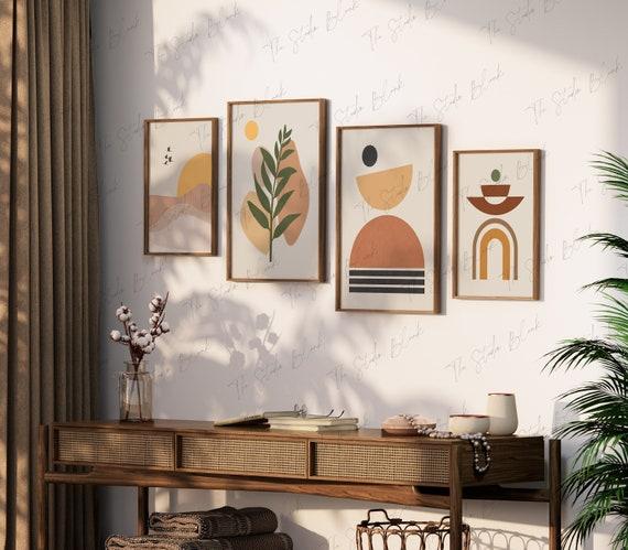
Not every buyer has the same wall, the same taste, or the same budget. Your 8x10 buyer might be furnishing a small apartment. Your 24x36 buyer might be decorating a wide open living room. These aren't the same person, and a single mockup image isn't speaking to both of them.
Showing the same print in different room styles helps your listing speak to multiple buyer personas at once. A minimalist bedroom scene might resonate with one buyer, while a warm, eclectic living room might be exactly what someone else is picturing. If you're not already thinking about your mockups this way, the logic of interior aesthetic mockups targeting different buyer personas is worth exploring in depth.
Takeaway: Map out your listing image sequence on paper before you start creating. Assign a specific job to each image slot and make sure the comparison mockup lands in slot two or three, not buried at the end.
Creating Comparison Mockups Without Starting From Scratch Every Time
The Batch Approach
One of the biggest reasons sellers skip comparison mockups is the time cost. If you have 30 designs and each one comes in four sizes, the math feels brutal. That's potentially hundreds of individual mockup images to create, all needing to be composited into comparison layouts.
The solution is to build a reusable workflow rather than approaching every design as a fresh project. The key insight is that your comparison layout, the arrangement of frames in a single image, stays the same for every design. Only the artwork inside the frames changes.
If you're already using a tool that lets you apply your designs to multiple size templates in bulk, you can generate all the individual size mockups for a design in one pass, then drop them into your pre-built comparison layout. Generating mockups for multiple size variants in a single batch is exactly the kind of workflow that makes this manageable at scale.
Mockupanda is built specifically for this kind of high-volume, systematic mockup creation. Rather than manually compositing each comparison image from scratch in Photoshop or Canva, you can generate your size variants quickly and build a consistent workflow around them. For sellers with large catalogs, that difference in time adds up fast.
Keeping Your Comparison Layouts Consistent
Consistency across your listing images builds trust and makes your shop look professional. If your size comparison layout changes from listing to listing, it creates a subtle sense of disorder that buyers notice even if they can't name it.
Create a standard comparison template for your shop and stick to it. Same frame arrangement, same label font, same background. When you roll out a new design, your comparison mockup looks like it belongs in the same family as everything else in your catalog.
This is also where a tool purpose-built for print-on-demand sellers pays off versus trying to hack together a workflow in a generic design app. Mockupanda lets you generate mockups that are consistent in framing, lighting, and style across your entire catalog, so your comparison images look intentional rather than cobbled together.
Takeaway: Build one reusable comparison layout template this week and test it on three listings. Once you see it working, roll it out to your entire catalog systematically rather than one listing at a time.
Pricing Strategy and Comparison Mockups
How Better Visuals Justify Higher Prices
This is one of the parts people don't talk about enough. Your mockups aren't just there to prevent confusion. They're there to make your product feel worth more.
When a buyer sees your 16x20 print displayed beautifully in a well-styled room, hanging above a credenza, next to a lamp, in a space that looks like a design magazine, they're not just evaluating a piece of paper with ink on it. They're imagining that lifestyle in their own home. That emotional response is what justifies premium pricing.
A flat, uncontextualized mockup of the same print conveys no such thing. It's just an image in a frame. You could find a dozen similar listings charging half your price, and the buyer has no reason not to just pick the cheapest one.
Comparison mockups specifically help with upselling to larger sizes. When a buyer can see the 8x10 and the 16x20 side by side in a room context, the larger one almost always looks more impressive. You've made the visual case for the upgrade without writing a single word of sales copy.
Anchoring With Your Most Premium Size
Pricing psychology has a concept called anchoring: when buyers see a high-priced option first, subsequent options feel more reasonable by comparison. The same principle applies visually.
If your comparison mockup leads with your largest, most striking size shown in a beautiful room, and then shows the smaller options alongside it, buyers are anchored to the impression of that larger size. The smaller option starts to feel like the budget choice, which is exactly what you want if your goal is to nudge buyers toward the middle or top tier.
Order your comparison images with intention. Lead with the most aspirational size, then show the range.
Takeaway: Review your pricing alongside your mockup sequence. If your largest sizes aren't selling proportionally to your smaller ones, check whether your comparison mockups are doing enough to make the upgrade feel worthwhile.
Common Mistakes to Avoid
Showing Too Many Sizes in One Image
If you offer six size options and you try to squeeze all six into a single comparison image, you end up with a cluttered, confusing frame that helps nobody. Keep comparison images to two or three sizes maximum. If you have more options than that, use multiple comparison images or group your sizes into tiers: small, medium, large.
Forgetting Mobile Buyers
A significant percentage of Etsy buyers are browsing on their phones. Comparison mockups that look great on a desktop can become unreadable on a small screen, especially if the frames are small and the labels are even smaller.
Test your comparison images on a mobile screen before you publish them. If the text labels are too small to read without zooming in, increase the font size. If the frames are too small to distinguish clearly, simplify the layout or break it into two separate images.
Using Inconsistent Frame Styles Across Sizes
If your 8x10 comparison mockup uses a thin white frame and your 16x20 uses a chunky black frame, buyers might think the style changes with the size. Use the same frame style across all sizes in your comparison image to keep the focus on the size difference, not the style difference.
You can absolutely show different frame style options in your listing, but give those their own dedicated image rather than mixing them into the size comparison.
Takeaway: Before publishing any comparison mockup, view it on your phone and ask one person who doesn't know your shop to tell you what they see. Their first impression will tell you whether the image is doing its job.
Putting It All Together
Presenting multiple print sizes clearly in a single Etsy listing is one of the highest-leverage improvements you can make to your shop's conversion rate. Buyers who understand exactly what they're getting feel confident. Confident buyers complete their purchase. And buyers who can see the visual difference between sizes are far more likely to choose the larger, more impressive option.
Comparison mockups are the tool that makes all of this happen. A side-by-side layout that shows the proportional difference, paired with in-context room scenes that show each size performing in a real space, covers everything a buyer needs to make a decision without second-guessing.
The good news is that once you have a system, the actual work of creating these images becomes routine. Build your templates, standardize your layouts, and use a tool like Mockupanda to generate your size variants efficiently so you're not spending hours on every new design.
Start with your three best-selling listings. Build proper comparison mockups for those. Watch what happens to your conversion rates and your average order value over the next 30 days. That data will tell you everything you need to know about whether to roll this out across your entire catalog.
Keep reading

The Anatomy of a High-Converting Etsy Digital Print Listing: Every Image Slot Explained
