How to Use Text Overlays on Mockup Images to Communicate Print Size Without Confusing Buyers
If you sell digital prints or wall art on Etsy, you already know the struggle. You spend time creating beautiful artwork, you put it into a gorgeous frame mockup, and then the questions start rolling in.
"What size is this?" "Does this come in an 8x10?" "Will this fit a standard frame?"
Those questions are not just annoying. They are a sign that your listing images are doing incomplete work. Every buyer who has to stop and ask a question is a buyer who might not come back after they send that message. Confusion is one of the fastest ways to lose a sale you already had.
The fix is simpler than you might think. Adding clear, well-designed text overlays to your mockup images can communicate print sizes, dimensions, and key product details at a glance, before the buyer even scrolls down to read your description. When done right, text overlays feel like a natural part of the image rather than a cluttered label slapped on top of a pretty photo.
This post walks you through the entire process: what information to show, how to display it clearly, and how to use a tool like Mockupanda to add text overlays to your mockup images quickly and at scale.
Why Mockup Images Alone Are Not Enough to Communicate Size
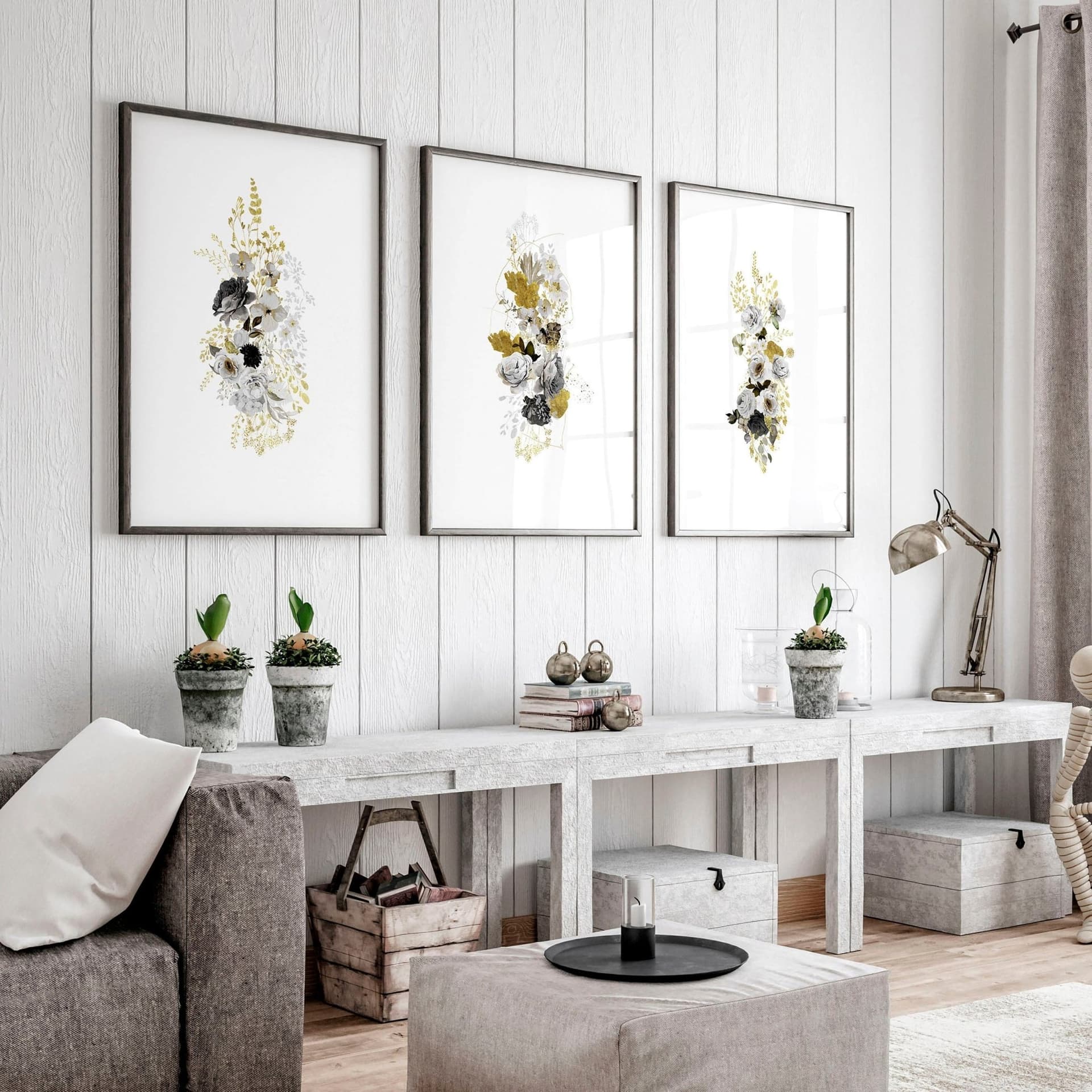
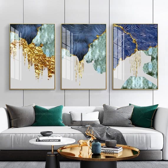
A beautifully styled mockup of a print hanging above a linen sofa is great for communicating lifestyle and aesthetic. It shows buyers how the art could look in a real home. But it does almost nothing to communicate actual dimensions.
The Problem with Scale in Styled Photography
Human perception of scale in photographs is notoriously unreliable. A 5x7 print can look enormous when hung above a small decorative shelf. An 18x24 can look modest when placed between two large windows. Unless the buyer already knows the room or the furniture in your mockup, they have no reliable way to estimate size.
This is especially true for lifestyle mockups with minimal context clues. A print floating against a white wall with no furniture around it gives the viewer no reference point at all. That ambiguity feels fine to you as the seller because you know the dimensions. To the buyer, it feels uncertain, and uncertain buyers do not always click "add to cart."
How Confusion Translates to Lost Sales
When buyers cannot quickly confirm that a product fits their needs, they do one of three things: they send you a message and wait, they scroll on to a competitor who makes the information more obvious, or they convince themselves it probably will not work and leave your shop entirely.
None of those outcomes are good for you. The buyer who messages you might convert eventually, but you have introduced friction and delay into the process. The buyers who leave quietly are the ones you never even knew you could have had.
Text overlays turn a guessing game into an immediate yes. When a buyer can see "8x10 inches" printed clearly on the mockup image, they know instantly whether the product works for them. That clarity shortens the path to purchase.
Takeaway: Assume that your mockup image alone will not communicate size to most buyers. Plan to add text overlays that remove any guesswork from the viewing experience.
What Information to Include in Your Size Overlays
Knowing you need text overlays is one thing. Knowing exactly what to put in them is another. Including too little leaves buyers with questions. Including too much turns your image into a wall of text that competes with your actual artwork.
The Core Details Every Size Overlay Should Include
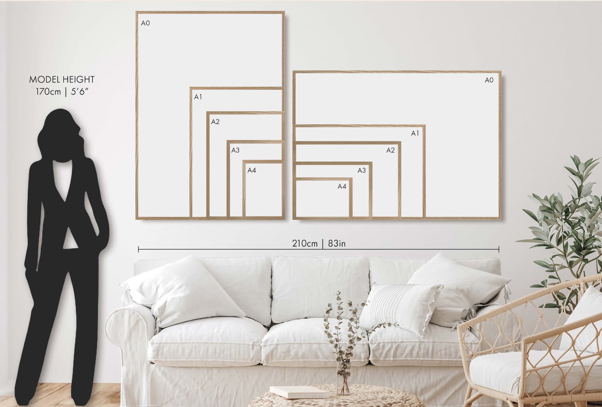
For most digital print listings, you need three pieces of information at minimum: the print dimensions, the unit of measurement, and whether the dimensions refer to the print itself or the frame it fits.
Dimensions seem obvious, but unit of measurement trips people up more than you might expect. A buyer in the United States expects inches. A buyer in Europe may be thinking in centimeters. If you sell internationally, showing both units in your overlay, such as "8x10 in / 20x25 cm," removes a small but real barrier to purchase.
The frame versus print distinction matters a lot for digital downloads specifically. Many buyers want to know whether your 8x10 print will fit in a standard 8x10 frame they pick up at a hardware store, or whether it has a white border that means they should actually get a 10x12 frame. Spelling this out directly in your image saves a lot of back and forth.
When to Show Multiple Sizes in a Single Image
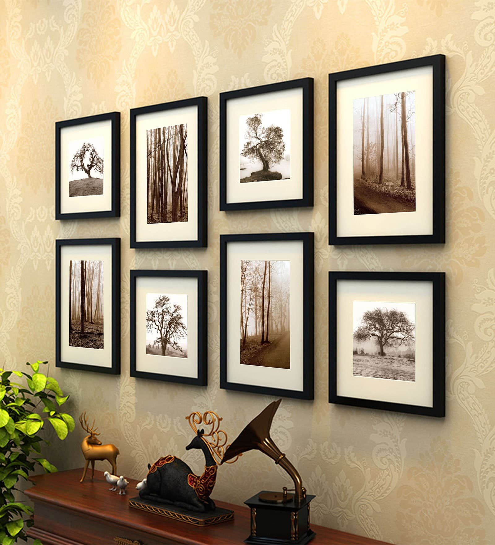
If you sell your artwork in a bundle of multiple sizes, one of the most effective overlay techniques is showing a size comparison chart within a single mockup image. This might be a set of three frames on a wall, each labeled with its dimensions, so buyers can visually compare what each size would look like relative to the others.
This approach is particularly effective because it answers two questions at once: what sizes are available, and how big does each one actually look in context. Buyers love this format because it helps them make a decision without leaving your listing to measure their wall.
If showing multiple sizes in one image feels cluttered, another option is creating one mockup image per size variant and labeling each clearly. This works well when you want each size to have its own styled presentation.
Adding Aspect Ratio or Frame Compatibility Notes
For digital print sellers, aspect ratio information can be just as useful as raw dimensions. If you sell a set of prints that all share a 4:5 aspect ratio, noting that in your overlay tells savvy buyers exactly what they need to know to match the prints to standard frame sizes without doing math.
You can also use overlay text to call out frame compatibility directly. Something like "fits standard IKEA Ribba frame" is a powerful detail because it removes a purchase barrier entirely. The buyer does not need to measure anything or do any research. They already know which frame to grab.
Takeaway: Include dimensions, units of measurement, and frame context as your baseline overlay information. Add size comparisons or frame compatibility notes when you have the space and the information is genuinely useful to your buyers.
Design Principles for Text Overlays That Enhance Rather Than Clutter
The biggest fear most sellers have about text overlays is that they will ruin the clean, professional look of their mockup images. That concern is valid. Poorly executed text overlays can look like an afterthought or like the seller is trying to cram too much into one image.
But well-designed text overlays actually add to the professionalism of an image. They signal that you are organized, detail-oriented, and that you have thought about your buyer's experience.
Choosing the Right Typography and Placement
Font choice matters enormously for text overlays on product images. You want something clean and legible at small sizes, with enough contrast to read against whatever background is behind it. Sans-serif fonts like a simple geometric or humanist typeface tend to work well because they are easy to read quickly and feel modern without distracting from the artwork.
Avoid decorative fonts, scripts, or anything that requires effort to read. The overlay text exists to communicate information fast. If the buyer has to squint or re-read to understand what the text says, it is not doing its job.
Placement should feel intentional. The bottom corner of a mockup image is a natural home for size information because it mimics the way artwork dimensions are often listed on gallery labels. The top corner works too. What you want to avoid is placing text directly over the artwork itself, which competes visually with the print you are trying to sell.
Contrast, Legibility, and Background Treatments
Text that blends into the background behind it is useless. Before you finalize your overlay design, check that your text is legible across all the different mockup backgrounds you use. White text reads clearly on dark frames and muted walls. Dark text works better on light backgrounds.
If your mockups have variable or complex backgrounds, a small semi-transparent pill or rectangle behind the text can solve the contrast problem without looking heavy-handed. Keep the background shape simple and sized tightly to the text so it does not dominate the image.
Another clean option is placing your overlay in a plain white or neutral-colored banner along the bottom of the image. This approach is especially useful when you want to include more than just dimensions, such as the file format, resolution, or a note about instant download.
Keeping Overlays Consistent Across Your Shop
Consistency is what turns individual product images into a recognizable brand. When all your mockup images use the same font, the same placement, and the same style of size label, your shop starts to feel cohesive and professional rather than assembled from random pieces.
Decide on a standard format for your size overlays and stick to it. Something like "8 x 10 in" in a small, light font at the lower right corner of every image is enough to establish a pattern. Buyers who have seen one of your listings and return to your shop later will immediately recognize the format, which builds familiarity and trust.
Takeaway: Keep your overlay typography clean and legible, ensure strong contrast against the background, and standardize your overlay format so your entire shop looks consistent.
How to Add Text Overlays to Mockup Images Without a Design Background
You do not need to be a graphic designer to create professional text overlays on your mockup images. The barrier here is mostly about finding the right tool, not learning a complex skill.
The Old Way: Manual Design Tools and Why They Slow You Down
For a long time, the default solution was to open Photoshop or Canva, load your mockup image, manually add a text layer, position it, choose the font, check the size, export the file, and repeat that process for every single size variant across every single product in your shop.
If you have four size options and twenty prints, that is eighty individual images to produce. Multiplied across seasonal updates and new designs, the time adds up fast. It is also the kind of repetitive, low-creativity work that tends to get pushed to the back of the to-do list, which means sellers end up launching new products without proper size overlays simply because the process feels like too much work in the moment.
Using Mockupanda's Text Overlay Feature
Mockupanda was built with this exact pain point in mind. The text overlay feature lets you add size labels, dimension text, or any custom text directly onto your mockup images as part of the generation process, so you are not doing a separate design pass after the fact.
You choose your font style, set your text content, position it where you want it on the image, and that overlay gets applied consistently across every mockup you generate. If you are creating multiple size variants of the same print, you can set up the text to reflect each size automatically rather than editing it manually for each one.
For sellers who list the same designs in multiple sizes, this means generating a full set of properly labeled mockup images in the time it used to take to do one. The consistency is also built in, so every image that comes out of Mockupanda for your shop has the same overlay style without you having to check each one manually.
Bulk Generation for Shops with Large Catalogs
If you have been selling digital prints for a while, your catalog is probably bigger than you realize. Going back and adding size overlays to every existing listing can feel like a project you never quite have bandwidth for.
Bulk mockup generation changes the math on that. Instead of treating it as a one-by-one task, you can batch process a large set of designs at once, all with your text overlays applied, and update your listings in a single organized session. This is one of the practical advantages of using a tool built specifically for print-on-demand sellers rather than a general-purpose design app.
Takeaway: Use a tool that integrates text overlay creation into the mockup generation step so you are not running two separate workflows. Mockupanda's overlay feature is designed exactly for this use case.
Practical Text Overlay Strategies for Different Types of Digital Print Listings
The right overlay strategy depends on what kind of product you are selling and how your shop is structured. A few specific scenarios are worth walking through.
Single-Size Listings
If you list each size as a separate product rather than using Etsy's variation feature, your mockup image needs to communicate the dimensions of that specific listing clearly. The overlay should show the size prominently because that is the primary differentiator between this listing and the other size options in your shop.
A clean label showing "16 x 20 inches" in the lower corner of the image is enough. You might also consider including a note like "fits standard 16x20 frame" if frame compatibility is relevant to your buyers.
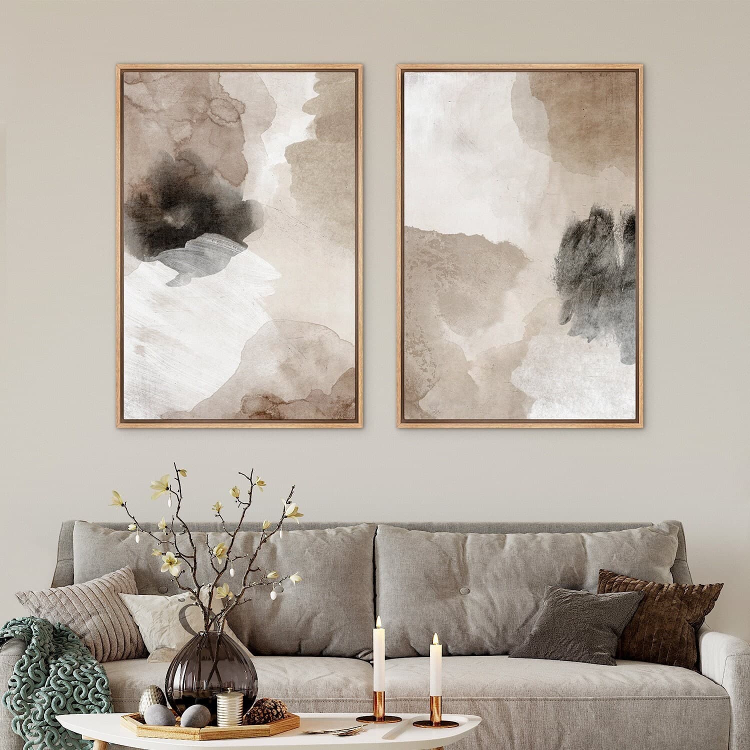
Multi-Size Bundle Listings
When a single listing includes multiple size files, the overlay job is a bit different. You want to communicate all the included sizes without making the image feel like a spec sheet. A simple "Available in 5x7, 8x10, and 11x14" label works well here, or you can use a comparison mockup showing all three sizes side by side with labels on each.
The comparison mockup approach is more work to set up initially but is significantly more persuasive because it is visual. Buyers respond to seeing the sizes rather than just reading a list.
Printable Art with Non-Standard Dimensions
Non-standard dimensions, like panoramic prints or square designs that do not fit common frame sizes, require extra care in your overlays. Buyers are less familiar with these sizes, which means confusion is more likely without clear labeling.
For these products, your overlay should include both the print dimensions and a clear statement about framing options. Something like "12 x 36 in panoramic, custom framing recommended" sets expectations accurately and prevents frustrating post-purchase messages from buyers who ordered a frame that does not fit.
Takeaway: Match your overlay strategy to your listing structure. Single-size listings need clear individual labels, bundle listings benefit from comparison visuals, and non-standard sizes need extra context about framing compatibility.
Testing and Refining Your Text Overlay Approach
Adding text overlays is not a one-and-done task. Like any element of your Etsy shop, it is worth monitoring whether the changes you make actually improve your results.
Using Etsy Stats to Measure Impact
After you update your listings with size overlays, pay attention to your Etsy stats over the following few weeks. Specifically, watch your conversion rate (views to sales) and the volume of buyer messages you receive asking about size.
If your conversion rate improves and your size-related questions decrease, your overlays are doing their job. If you still get frequent size questions, it might mean your overlay placement is easy to miss, or that the information you are showing is not quite answering the right question.
Asking for Buyer Feedback
After a purchase, you can follow up with buyers to ask how they found the shopping experience. A simple question like "was it easy to find the size information you needed?" can surface insights that stats alone will not show you.
You can also look at your reviews. Buyers who mention that your listings were clear and easy to understand are validating your presentation approach. Buyers who mention any confusion in reviews or messages are pointing you toward what still needs improvement.
Iterating on Format and Placement
Do not be afraid to try different overlay formats and see what resonates. You might find that a larger font works better for your specific mockup style, or that adding a light background behind the text improves readability on busy lifestyle images. Small adjustments can have a noticeable effect on how professional and clear your images feel.
The goal is a text overlay that a buyer barely notices consciously but that answers their size question before they even think to ask it. When your overlay becomes that seamless, it is working exactly as intended.
Takeaway: Measure the effect of your overlays through Etsy stats and buyer message volume. Iterate on placement and format based on what you learn, and treat your mockup presentation as an ongoing optimization rather than a finished task.
Bringing It All Together
Communicating print size clearly is one of the highest-leverage improvements you can make to a digital print shop. Most sellers focus on the artwork itself and treat product presentation as a secondary concern. But presentation is often the difference between a browser and a buyer.
Text overlays on your mockup images close the information gap that styled photography leaves open. They tell buyers exactly what they are getting, in the exact moment they are deciding whether to purchase. That clarity builds trust, reduces friction, and moves people from curiosity to confidence faster.
The practical steps are straightforward: decide what size information your buyers actually need, design overlays that are clean and consistent, and use a tool like Mockupanda to add those overlays efficiently as part of your mockup generation process rather than as a separate design task.
Your mockup images are already doing the visual and emotional work of showing buyers how your art could look in their home. Give them the informational layer they need to finish the job.
Keep reading
How to Showcase Poster Sets on Etsy Using Gallery Wall Mockup Templates
How to Use Lifestyle Mockups to Sell Abstract Art to Buyers Who 'Don't Get It' Yet