Why Your Etsy Thumbnail Gets Ignored (And How the Right Mockup Crop Fixes It)

If you've ever uploaded a product you're genuinely proud of and watched it sit there with barely any clicks, you already know the feeling. The listing is live, the price is reasonable, the product is good — but nobody's stopping to look at it. Before you start questioning your niche or slashing your prices, there's a very good chance the real problem is sitting right in your thumbnail.
Etsy is a visual platform first. Buyers are scrolling through a grid of dozens of competing products in seconds, making split-second decisions about what's worth a closer look. Your thumbnail isn't just a photo of your product. It's a conversion tool, and if it isn't cropped and composed correctly, it's working against you before a single person even reads your title.
This post breaks down exactly why Etsy thumbnails get ignored, what the human eye is actually doing when it scans a search results page, and how you can use your mockup crops to fix the problem without needing a photography studio or a design degree.
What Buyers See Before They See Your Product
Most sellers think about their Etsy listing as a page someone lands on. In reality, the first impression happens way earlier, inside the search grid, where your thumbnail is competing for attention alongside dozens of other images simultaneously.
Understanding how buyers actually experience that grid changes everything about how you should be approaching your mockup composition.
The Scroll Behavior No One Talks About
When a buyer types something into Etsy's search bar and hits enter, they don't methodically evaluate each result in order. Eye-tracking research on e-commerce search pages consistently shows that users scan in irregular patterns, jumping between images that catch their peripheral attention rather than moving left to right or top to bottom in an orderly way.
What this means for your thumbnail is that you have a fraction of a second to register as something worth pausing on. The brain processes visual contrast, color, and recognizable shapes before it processes text. Your product title, your price, your star rating — those come after the image has already done its job of either stopping the scroll or failing to.
If your thumbnail is a pale print on a white background with lots of empty space around it, it disappears into the page. If it's cropped tightly around something visually interesting with clear contrast, it has a chance of stopping the eye even mid-scroll.
How Etsy Actually Displays Your Images
Here's something a lot of newer sellers don't realize until they've already uploaded dozens of listings: Etsy crops your thumbnail automatically, and it doesn't crop it the way you'd want.
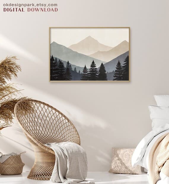
Etsy displays thumbnails at a square ratio in search results. If you upload a landscape or portrait image, Etsy will center-crop it to fit that square. This means anything near the edges of your mockup — the corners of a framed print, the bottom of a beautiful room scene, the negative space you carefully composed — gets chopped off.
The result is often an awkward, accidental crop that removes exactly the parts of your image that made it look professional. A beautifully staged mockup of a framed print in a living room can end up showing just the middle third of the frame with the edges cut off, making it look like a floating rectangle with no context.
The fix isn't complicated, but it requires you to think about your mockup crop before you upload, not after.
Actionable takeaway: Before you upload any new listing image, preview how it looks cropped to a square. Most phones let you do this in your camera roll. If the centered square crop doesn't look intentional and appealing, adjust your mockup composition before uploading.
The Most Common Thumbnail Mistakes Digital Print Sellers Make
After looking at thousands of Etsy listings in the digital print and wall art space, the same composition mistakes come up over and over. None of them are about the quality of the actual artwork. They're all about how the mockup is framed and cropped.
Too Much Empty Space Around the Product
This is the most common one. Sellers want to show the full product, so they zoom out to include the entire print with generous breathing room on all sides. The logic makes sense in isolation, but in the context of a thumbnail grid, it makes your product look tiny and unimpressive.
When your art print is a small rectangle floating in the center of a large image, two things happen. First, the product itself becomes hard to read at thumbnail size, which means buyers can't actually see what makes it special. Second, all that surrounding space signals low value. Premium products fill the frame. Think about how luxury brands photograph products — close, detailed, confident.
Tightening your crop so the product fills most of the frame isn't just a style preference. It communicates quality and makes your artwork actually legible at small sizes.
Staging That Looks Great at Full Size But Falls Apart Small
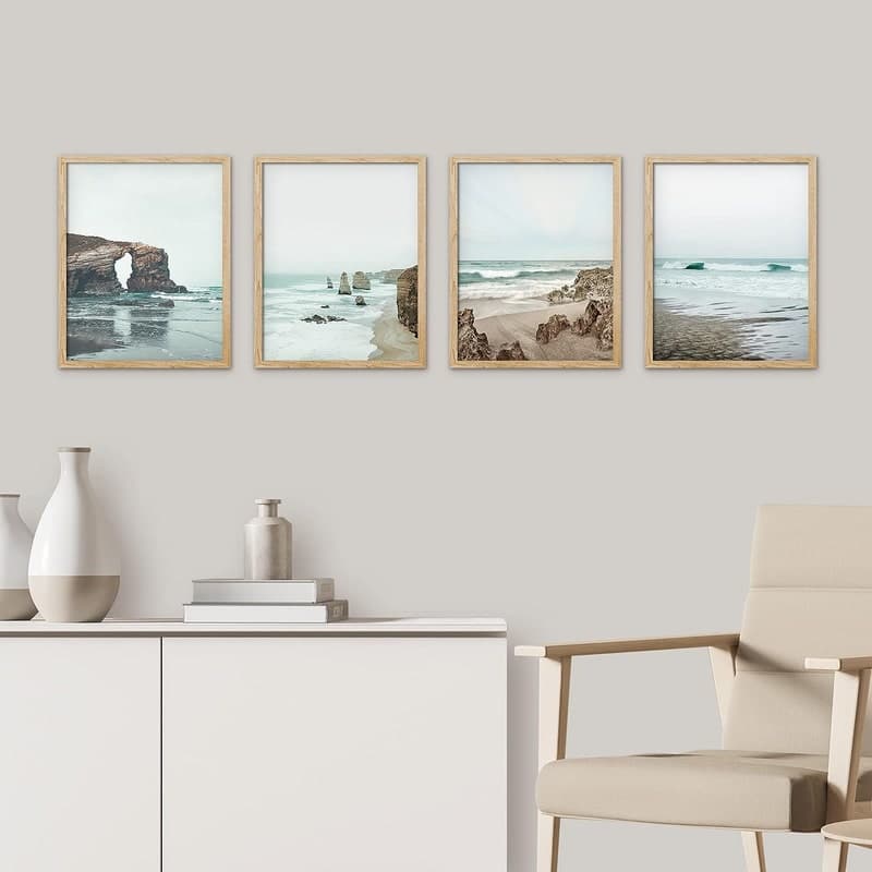
A lot of sellers fall in love with lifestyle mockups that show a print beautifully styled in a full room scene — a gallery wall, a cozy reading nook, a sun-drenched kitchen. These look stunning at full size. At 200x200 pixels, they often just look busy and hard to read.
The problem is depth. When you have a wide room shot, your actual product is a small element within a larger scene. At thumbnail size, the eye doesn't know where to go, and the print itself is too small to appreciate.
Lifestyle mockups absolutely have their place — they're excellent for secondary listing images where a buyer has already clicked and wants to imagine the product in a real space. But your primary thumbnail usually needs to be closer, simpler, and more focused on the product itself.
Ignoring the Visual Weight of Your Competition
Here's an exercise worth doing before you finalize your thumbnail strategy. Search Etsy for your exact product type. Look at the first two pages of results. What are the thumbnails that stand out to you doing differently from the ones that blend in?
In most wall art and digital print categories, the sellers getting the most clicks are using tight crops with strong contrast, clear legible art, and mockup frames that read instantly even at small sizes. The ones that disappear are usually zoomed out, using pale or pastel mockup backgrounds that match Etsy's white background, or showing lifestyle scenes that are too complex to read quickly.
Your thumbnail doesn't exist in a vacuum. It competes visually with whatever is next to it on that search page, and you can use that to your advantage by intentionally choosing crops and mockup styles that create contrast against what your competitors are doing.
Actionable takeaway: Do a competitor thumbnail audit this week. Search your main product keyword on Etsy, screenshot the first two rows of results, and honestly evaluate where your listing lands visually. If it blends in, that's valuable information about what to change.
How Mockup Crop Directly Affects Your Click-Through Rate
Click-through rate on Etsy — the percentage of people who see your thumbnail in search results and actually click on it — is one of the most important signals the algorithm uses to decide how much to show your listing. A thumbnail that converts casual browsers into curious clickers doesn't just make you more money directly. It also tells Etsy's system that your listing is relevant and appealing, which means more organic exposure over time.
This is why getting your crop right isn't a minor cosmetic detail. It has compounding effects on your shop's visibility.
The Psychology of What Makes a Thumbnail Clickable
Visual psychology research gives us some pretty reliable principles for what makes an image stop the eye. Contrast is the big one — the human visual system is wired to notice things that stand out from their surroundings. Familiar shapes read faster than complex ones. Faces and eyes attract attention almost involuntarily. And partial images create curiosity in a way that fully visible, complete images don't.
That last point is particularly relevant to cropping. There's good evidence that images cropped in ways that feel slightly zoomed in, where the viewer can tell there's more to the product than what's shown, create more curiosity and more clicks than images that show everything at once. This doesn't mean cutting your product in half, but it does mean that a tight, slightly intimate crop often outperforms a distant, show-everything composition.
For wall art sellers specifically, this might mean cropping to show just the framed print with minimal surrounding space, or zooming in on a particularly striking detail of the artwork in one of your secondary images to draw the eye.
Aspect Ratio and Where Etsy Crops Your Image
As mentioned earlier, Etsy displays thumbnails as squares in search results. But Etsy recommends uploading images at a 4:5 or 2:3 portrait ratio for listings. The catch is that when your portrait image gets center-cropped to a square for the search grid, you lose the top and bottom.
The safe zone for your most important visual content is the center square of your image. If your product is positioned anywhere toward the top or bottom edges of your original image, there's a real chance it gets cropped out in the search grid.
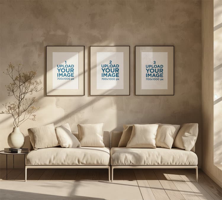
The practical fix is to compose your mockups with the main subject centered vertically, and to always preview the square crop before uploading. Better yet, create your mockups at a square ratio from the start if the primary goal is a strong thumbnail. You can always create separate portrait versions for the secondary listing images where full image display matters more.
Testing Your Thumbnails Without Guessing
One of the most underused features available to Etsy sellers is A/B testing your listing photos. You don't need a formal experiment. You can simply update your primary thumbnail, note the date, and watch your click-through rate in Etsy's stats over the following two to three weeks.
Etsy's built-in analytics show you views (how many times your listing appeared in search) and visits (how many times someone clicked). The ratio between those two numbers is essentially your click-through rate. If you change your thumbnail and visits go up relative to views, you've found an improvement.
This kind of iterative testing is genuinely how the sellers with the best-performing shops operate. They treat their thumbnails as something that can always be improved, not something that's set once and forgotten.
Actionable takeaway: Check your Etsy stats for your five lowest-converting listings this week. Look at views versus visits for each one. If views are decent but visits are low, your thumbnail is the first thing to fix.
What a Good Mockup Crop Actually Looks Like
All of this theory is most useful when you can see it applied practically. Good mockup crops for Etsy thumbnails follow a fairly consistent set of principles, and once you know them, you'll start seeing them everywhere in high-performing shops.
The Tight Frame Approach
For most digital print and wall art products, the highest-converting thumbnail approach is a tight frame that shows the product filling roughly 70 to 85 percent of the image. The mockup background is visible enough to give context — you can see the frame edge, the mat, maybe a sliver of a wall behind it — but the print itself is large, clear, and legible.
This approach works because it lets buyers immediately see and evaluate the actual artwork at thumbnail size. If your print has beautiful typography, intricate illustration, or a striking color palette, a tight crop lets those qualities register even at small sizes. A distant crop makes all of those selling points invisible until after the click.
For framed prints specifically, showing the complete frame including all four edges is usually worth preserving, even in a tight crop. The frame is part of what's being sold, and cutting it off can make the thumbnail confusing. The goal is tight but complete.
Using Negative Space Intentionally
Not every product benefits from the tightest possible crop. Some artwork, particularly minimalist prints, botanical illustrations, or prints with deliberate white space as part of the design, can look cluttered or awkward when cropped too tightly.
For these products, the key is to make the negative space feel intentional rather than accidental. The difference is usually in the mockup itself — a clean, styled mockup with a simple background makes white space look like an artistic choice. A plain product photo with lots of empty white makes the same amount of space look like a framing error.
A simple room mockup, even a very minimal one with just a wall texture, a suggestion of a shelf or ledge, and good lighting, does a lot to make negative space feel purposeful. The context signals to the buyer that this is a styled product being presented intentionally, not just a design file someone screenshotted.
Matching Your Crop to Your Product Category
Different product types have different thumbnail conventions that buyers have been trained to expect. Going against these conventions too aggressively can confuse buyers even if your image is technically well-composed.
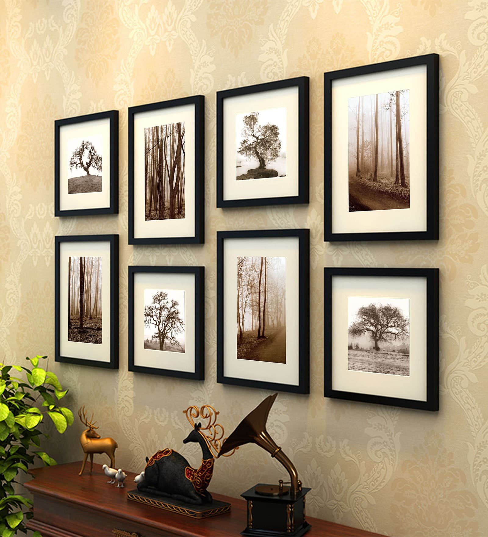
For single art prints, tight frame crops with the print filling most of the square are consistently the strongest performers. For sets (like a trio of prints sold together), showing all three pieces in the thumbnail helps buyers immediately understand what they're getting. For digital download products where there's no physical object, a mockup that shows the file displayed in a realistic context, like on a wall or inside a frame, converts dramatically better than showing a flat digital file or a folder icon.
The point is to think about what a buyer in your category is used to seeing and what information they need to make a fast decision. Your crop should answer the most important questions immediately: What is this? What does it look like? Would it work in my space?
Actionable takeaway: Look at your three best-selling products and your three worst-selling products. Compare the thumbnail compositions. You may find a pattern that tells you exactly what crop style is working for your specific audience.
Using Mockup Tools to Get Your Crops Right Consistently
Knowing what a good crop looks like in theory is one thing. Actually producing well-cropped mockups consistently across dozens or hundreds of listings is another challenge entirely, especially when you're running a shop solo and time is always the constraint.
This is where having the right mockup tool makes a real practical difference.
Why Manual Cropping in Photoshop Doesn't Scale
A lot of digital print sellers start out creating mockups manually in Photoshop or Canva. They download a mockup template, drop in their artwork, adjust the size and position, export, and repeat. For five listings, this is manageable. For fifty listings, it becomes a serious time drain. For sellers running a shop with hundreds of products, it's simply not sustainable.
The bigger problem with manual workflows is inconsistency. When you're doing each mockup by hand, small variations in crop, scale, and positioning accumulate. Your shop starts to look visually inconsistent, which undermines the professional impression you're trying to create. Buyers notice this even when they can't articulate why a shop looks polished or amateur.
Bulk mockup generation solves both problems. Instead of treating each mockup as an individual manual task, you set your composition and crop once and apply it consistently across your entire product range.
Building a Repeatable Mockup System
The most efficient approach for Etsy sellers is to define a small set of mockup styles that represent your brand, get the crop and composition right for each one, and then use those as templates across your catalog.
For example, you might decide that your primary thumbnail is always a tight frame mockup with your print in a simple white frame on a light neutral wall, cropped so the frame fills about 80 percent of the square image. Your second listing image is always a lifestyle room shot showing the print in context. Your third image shows the print flat on a surface to display the artwork detail clearly.
Once you've defined this system, every new product you add to your shop gets the same treatment. The consistency builds a cohesive visual identity for your shop, and the repeatable process means you can add new listings far faster than if you were making individual decisions about each one.
Tools like Mockupanda are built specifically for this kind of workflow. Rather than manually adjusting each mockup in a general-purpose design tool, you can generate bulk mockups that apply consistent cropping and framing across your entire product catalog in a fraction of the time. For sellers who are adding new products regularly, that time difference compounds quickly.
When to Refresh Your Thumbnails
Your mockup crops aren't a set-it-and-forget-it decision. Etsy's visual trends shift over time, and what reads as polished and current in one year can start to look dated a couple of years later. The rise of warm, earthy home aesthetics changed what kinds of mockup backgrounds performed best. Shifts in frame styles, mat styles, and room staging conventions all filter down into what buyers find appealing.
A practical habit is to audit your shop's visual presentation every six months. Look at your thumbnails with fresh eyes and compare them to what top sellers in your category are currently showing. If your mockups look noticeably older or less polished, a batch refresh is worth the investment of time. With a bulk generation workflow, this becomes a half-day project instead of weeks of manual work.
Actionable takeaway: Choose one mockup style that represents your best-performing product type, get the crop and composition exactly right, and build your next ten listings using that consistent template. Track the performance over thirty days compared to your older listings.
Putting It All Together
Your Etsy thumbnail is doing a job before any buyer ever reads your listing title, checks your price, or looks at your reviews. It has a fraction of a second to stop a scroll, communicate value, and earn a click. Getting that job done consistently comes down to understanding how buyers actually see search results pages, respecting how Etsy crops your images, and composing your mockups with the thumbnail grid in mind rather than just how the image looks at full size.
The core principles aren't complicated. Tighter crops usually outperform distant ones. Your most important visual content needs to be in the center of your image to survive Etsy's square crop. Lifestyle scenes that look great at full size often fall apart at thumbnail size. And consistency across your listings builds the kind of shop visual identity that premium buyers trust.
The sellers who crack this aren't necessarily better designers or photographers. They just think about their thumbnails more strategically, test what's working, and use tools that help them apply what they learn consistently at scale.
If you've been wondering why your listings aren't getting the clicks they deserve, start with your crops. It's one of the highest-leverage changes you can make to your shop today, and unlike SEO or advertising, the results show up fast.
Keep reading
How to Create a Cohesive Etsy Shop Front Using Mockups With a Consistent Color Palette Across All Listings
How to Showcase Poster Sets on Etsy Using Gallery Wall Mockup Templates