How to Style a Gallery Wall Mockup to Sell Multiple Prints as a Bundle on Etsy
Selling a single print on Etsy is one thing. Selling a curated set of five prints as a cohesive gallery wall bundle is a completely different business model, and for a lot of digital print sellers, it is the move that finally tips their shop into consistent, meaningful revenue.
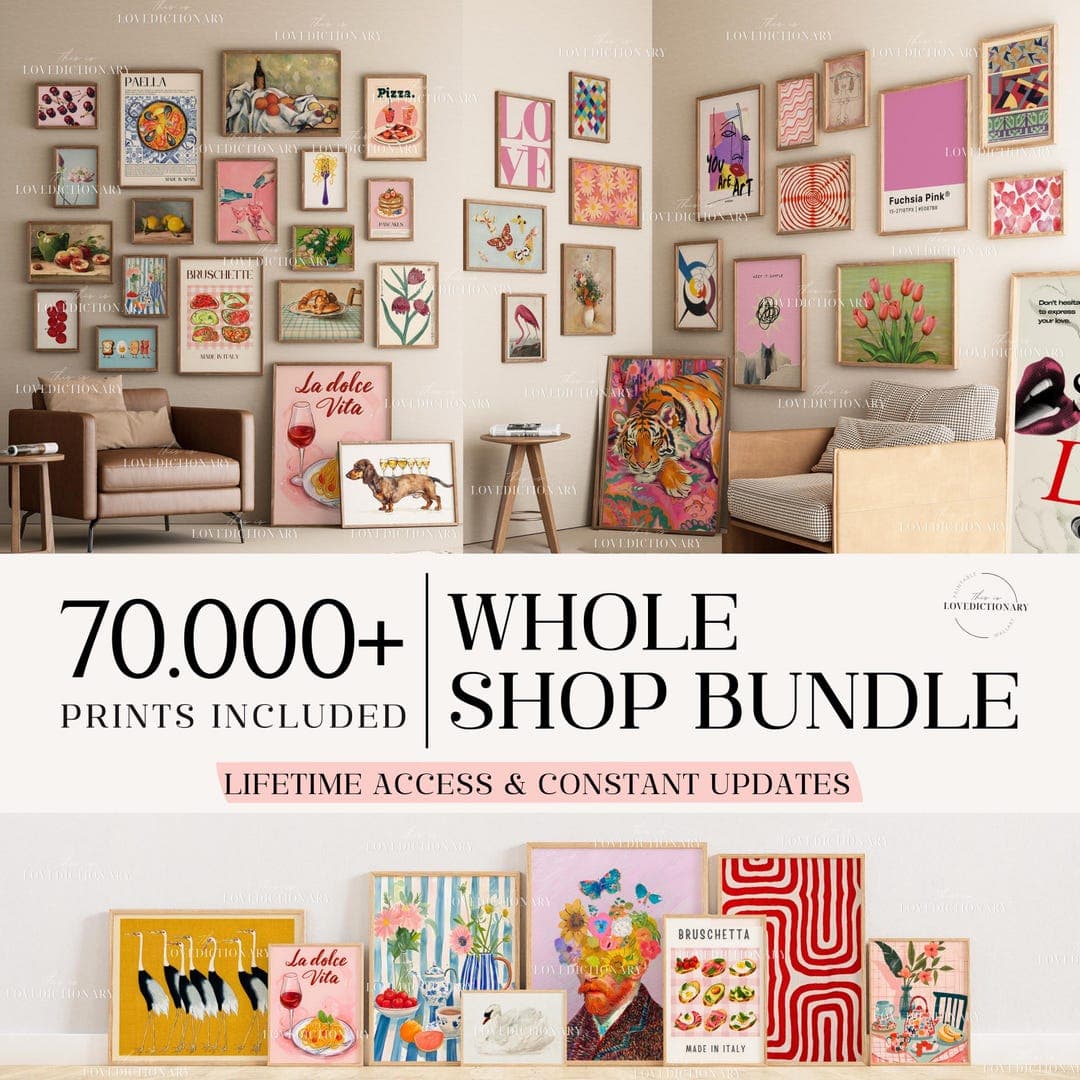
The problem most sellers run into is presentation. A bundle listing with five separate thumbnail images or a flat, uninspired grid of prints does not tell a visual story. Buyers are not just shopping for art — they are shopping for a feeling, an aesthetic, a version of their home that does not exist yet. Your job is to show them that version in a single image.
That is where gallery wall mockups come in. A well-styled gallery wall mockup can do in seconds what five paragraphs of listing copy cannot. It shows the buyer exactly how the prints look together, hung on a wall, in a real-seeming room. And when you do it right, it dramatically increases the perceived value of your bundle, justifies a higher price point, and gives buyers the confidence to click Add to Cart.
This guide walks you through the entire process: from choosing the right prints to group together, to composing a mockup that feels like a real interior, to using tools that make the whole thing fast and repeatable.
Why Bundle Listings Outperform Individual Print Listings
The psychology of the complete solution
Buyers on Etsy are browsing with intent, but most of them do not know exactly what they want until they see it fully realized. When someone searches for botanical prints or boho wall art, they are not thinking in units. They are imagining a corner of their bedroom or a hallway that finally feels pulled together.
A bundle listing answers the question they have not yet figured out how to ask: what goes with what? You are doing the curatorial work for them. You are saying, here is a set of five prints that belong together, sized and styled to work as a group. That is a service, and people pay for services.
This is also why the gallery wall mockup image is so critical to bundle sales. The listing thumbnail is your pitch. It needs to immediately communicate: this is a complete thing, it is beautiful, and it belongs in your home.
Higher average order value without more traffic
If your individual prints sell for $4 to $6 each as digital downloads, a five-print bundle at $18 to $22 is a significantly better outcome per transaction. You are not tripling your traffic to triple your revenue. You are just restructuring what you sell and how you present it.
The mockup is what makes the bundle feel worth the premium. A professional gallery wall image signals quality, curation, and intentionality. It makes $20 feel like a bargain compared to what a buyer would spend hunting down five separate prints from five different shops and hoping they somehow work together.
Actionable takeaway: Before you build your next listing, look at your existing print catalog and identify three to five prints that share a color palette or visual theme. That is your first bundle. The only thing standing between you and listing it is a strong mockup image.
Choosing Which Prints to Bundle Together
Cohesion over variety
The most common mistake sellers make when building bundles is grouping prints by theme without checking whether they actually work visually as a set. Botanical is a theme. But a dark moody botanical print paired with a light watercolor botanical paired with a bold graphic botanical does not automatically work as a gallery wall. The tonal range is too wide.
When you are selecting prints for a bundle, start with color. Pick two or three anchor colors that run through every piece in the set. Then look at line weight and style. Delicate illustrations sit well together. Bold typography sits well with geometric shapes. Mixing illustration with heavy type often creates visual tension that reads as messy rather than curated.
You do not need all five prints to be identical in style. You need them to feel like they could have come from the same creative world.
Sizing strategy for a realistic gallery wall
Real gallery walls work with a mix of sizes. A set of five identically-sized prints lined up in a grid looks orderly, but it can also feel flat and corporate. Consider structuring your bundle with a size hierarchy: one or two larger anchor pieces (like an 8x10 or 11x14), a couple of medium prints, and maybe one smaller accent piece.
This gives your mockup visual weight and rhythm. It also opens up more interesting composition options when you go to arrange the layout. Buyers who see a gallery wall with mixed sizes immediately understand how it could work in a real space, which makes the purchase feel less risky.
Actionable takeaway: When you build a bundle, lay out the prints side by side at their correct relative sizes before you start composing the mockup. If everything looks harmonious at that stage, you are starting from a strong place. If something feels off, swap it out now rather than discovering it once the mockup is done.
Composing a Gallery Wall Layout That Reads Well in a Mockup
Layout styles and when to use them
There are a few go-to gallery wall layouts that work consistently well in mockup images, and each sends a slightly different signal to buyers.
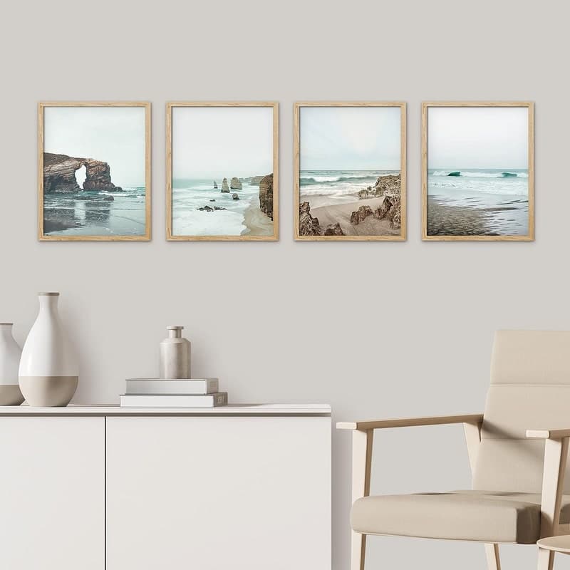
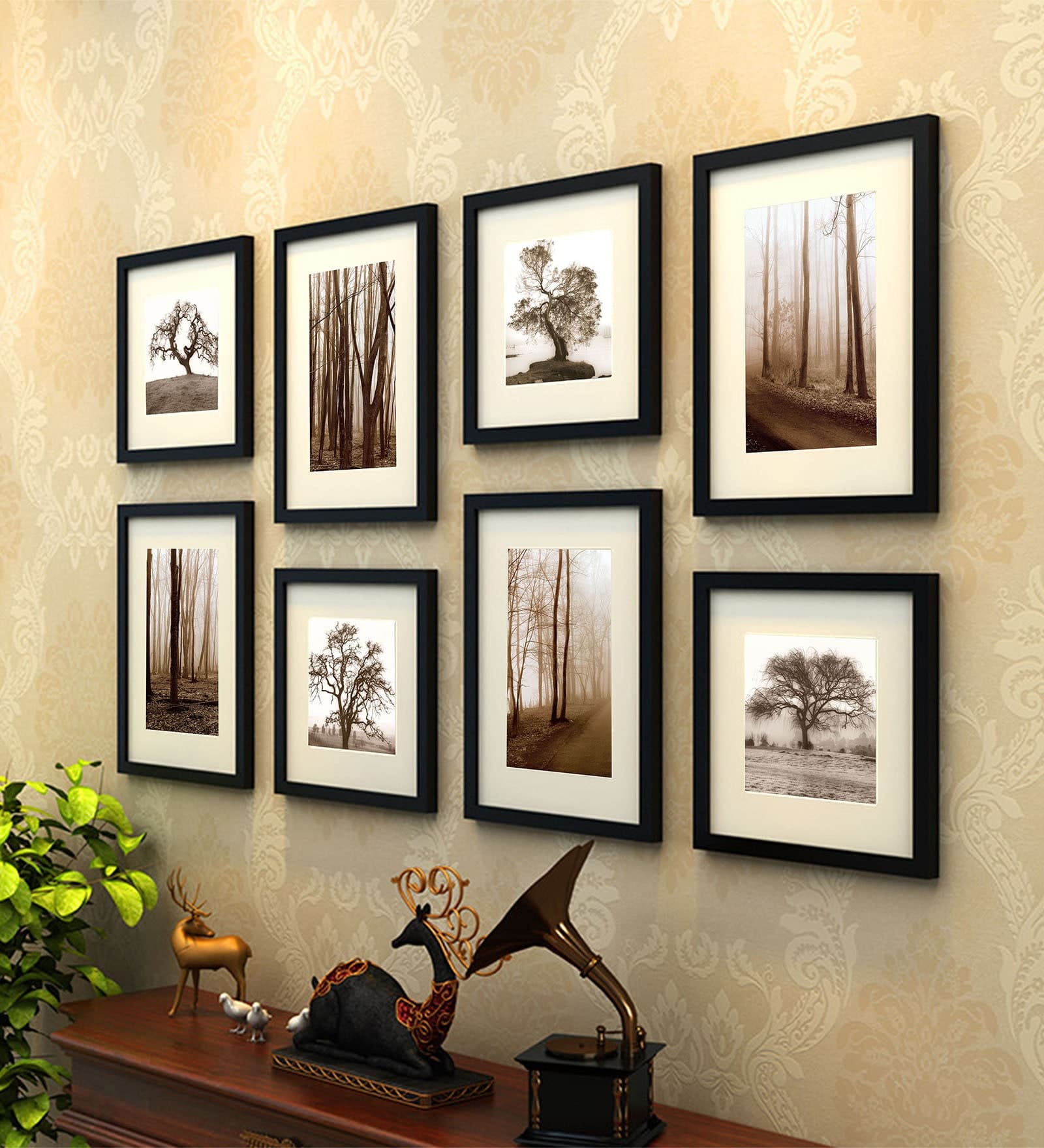
The symmetrical grid is clean and modern. A 2x2 or 2x3 arrangement of same-sized prints reads as intentional and minimal. It works well for Scandinavian aesthetics, modern home decor, and black-and-white art sets. The limitation is that it can feel a bit expected.
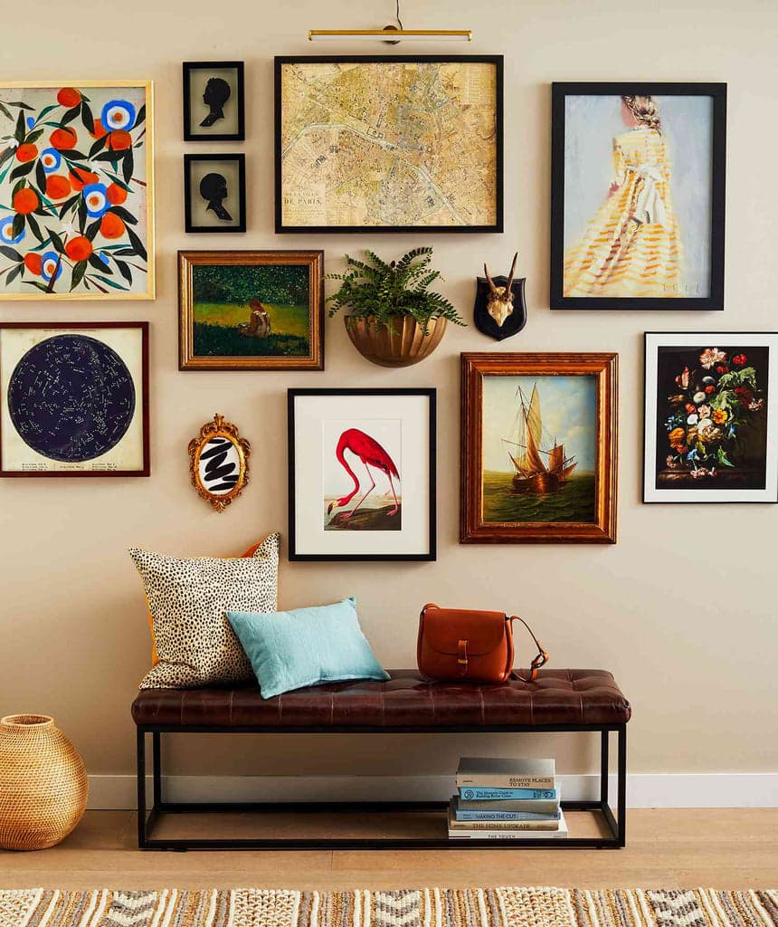
The salon-style arrangement is the one with prints at varying heights and sizes clustered around a visual center. It feels more eclectic, layered, and lived-in. This works beautifully for boho, vintage, and maximalist aesthetics. It is also more complex to compose in a mockup, so you need a tool that lets you place frames precisely.
The horizontal row is underrated. Three or five prints lined up in a horizontal strip at consistent height reads as elegant and architectural. It is perfect for prints that are meant to go above a sofa, bed, or console table. If your bundle is clearly designed for that kind of placement, a horizontal row mockup signals that context immediately.
Spacing, proportion, and visual balance
Whatever layout you choose, spacing matters more than most sellers realize. In a real gallery wall, frames are typically hung two to three inches apart. In a mockup, this spacing needs to look plausible at the scale of the room. If your frames are crammed together or floated too far apart, the image reads as fake, and buyers lose confidence.
Balance is about visual weight, not just symmetry. A large dark print on the left needs something of similar visual weight on the right, even if the sizes are different. A very light, airy print surrounded by bolder pieces will look lost. Squint at your layout before you finalize it. If one area feels heavy or empty, adjust before you generate the mockup.
Actionable takeaway: Sketch your intended layout on paper before you open any software. A simple rough drawing of which frames go where, with approximate relative sizes, will save you a lot of repositioning time and help you arrive at a more intentional composition.
Using a Mockup Tool to Make Gallery Wall Images Fast
What to look for in a mockup generator for bundles
Not every mockup tool handles multi-print gallery wall setups well. Some tools only let you drop one image at a time into a pre-set frame. That works fine for single listing images, but for a gallery wall bundle you need more flexibility: the ability to populate multiple frames in one scene, ideally with a range of room backgrounds and frame styles that match your aesthetic.
You also want speed. If you are a seller with a growing catalog, you cannot spend forty-five minutes per listing composing, exporting, and re-exporting mockups every time you add a new bundle. The tool needs to be fast enough to make the process sustainable.
Mockupanda was built specifically for this kind of workflow. It lets you generate multiple mockups in bulk, supports the specific use cases that digital print sellers actually face, and does not require design software experience to get professional results. For sellers putting together gallery wall bundles, being able to quickly test different frame configurations and room backgrounds without starting from scratch each time is a genuine time saver.
Creating consistency across your bundle listings
If you plan to sell multiple bundles, visual consistency across your shop matters. Buyers who find one of your listings and then browse your shop should immediately feel like they are in a coherent, curated space. That means using the same or similar room backgrounds, consistent frame styles, and a consistent approach to the overall composition.
Pick two or three room backgrounds that work well for your aesthetic. A light linen wall for minimal prints, a warm beige interior for earthy tones, a dark moody room for bold or maximalist art. Rotate those settings across your bundles rather than trying something completely different for every listing. This builds brand recognition and makes your shop look like a real, thoughtful business rather than a collection of unrelated listings.
Actionable takeaway: Create a simple mockup style guide for yourself. Write down which backgrounds you use for which aesthetic, what frame styles you default to, and what your standard spacing and layout choices are. This takes ten minutes and will save you hours of indecision across future listings.
Writing the Listing to Match the Visual Story
Leading with the transformation, not the specs
Your mockup image sells the dream. Your listing copy needs to continue that conversation rather than immediately dropping into file format details and print dimensions. Lead with what the buyer gets: a complete gallery wall solution, a curated set designed to work together, a way to instantly elevate a blank wall without hunting for matching prints.
Something like: Transform a blank wall into a styled gallery display with this curated five-print set. Each piece is designed to work together in color, scale, and style, so all you need to do is print and hang.
Then move into the practical details: what is included, what sizes are provided, what file formats, how to download, and recommended printing specs. But always lead with the story.
Pricing your bundle to reflect the value
A common mistake is pricing bundles as a simple per-print discount. If each print is $5, five prints become $20 with a small discount to $18. That is fine, but it positions the bundle as a volume deal rather than a curated solution. Consider pricing based on the value of the curation itself.
You did the work of selecting prints that work together, testing the layout, styling the mockup, and presenting it as a complete room solution. That is worth more than five individual prints. A five-print gallery wall bundle that is beautifully presented and clearly styled for a specific aesthetic can comfortably sell for $22 to $28, even if the individual prints are $5 each. Your mockup image is what justifies that gap.
Actionable takeaway: Review your current bundle pricing and ask whether it reflects the curation value or just the unit volume. If your mockup image is strong, test a higher price point. A professional gallery wall mockup gives you the visual evidence to justify it.
Turning One Bundle Into a Shop-Building Strategy
Building a bundle family from a single print set
Once you have one strong bundle, you can get significant mileage from it by creating variations. Take the same five prints and offer them in different size configurations: a small set for a bathroom or office nook, a larger set for a living room feature wall. Offer the same prints in both framed and unframed mockup versions if your aesthetic supports both. Create a landscape orientation version and a portrait orientation version of the same bundle.
Each of these is a separate listing with its own SEO footprint, its own thumbnail, and its own chance to surface in Etsy search. You are not creating new art for each listing. You are presenting the same core product through different lenses, and every lens is a potential entry point for a new buyer.
Using bundle mockups for social and ad content
A well-composed gallery wall mockup is not just for Etsy. It is exactly the kind of image that performs well on Pinterest, which remains one of the strongest organic traffic drivers for digital print sellers. A gallery wall styled in a real-seeming room, pinned with a description that matches common search terms like boho living room art or above the bed gallery wall, can drive traffic to your listing for months.
If you run ads on Etsy or experiment with Pinterest ads, bundle mockup images typically outperform single-product shots because they show more value in a single frame. The image does more work, which means better click-through rates without a bigger ad budget.
Actionable takeaway: When you create a gallery wall mockup for a new bundle listing, export a version sized for Pinterest (1000x1500 pixels works well) and pin it the same day you publish the listing. Do this consistently and you will start to build an organic traffic channel that compounds over time.
Final Thoughts
Gallery wall bundles are one of the highest-leverage moves available to digital print sellers on Etsy. They increase average order value, reduce the number of sales you need to hit your revenue goals, and give buyers a complete solution that individual print listings simply cannot offer.
But the bundle is only as convincing as the mockup image you put in front of it. A flat grid of unframed prints does not tell the story. A thoughtfully composed, professionally rendered gallery wall mockup, styled in a room that matches your buyer's aesthetic, does exactly what your listing copy cannot: it makes the purchase feel obvious.
Start with what you already have. Look at your existing prints, find a cohesive set of three to five, compose a layout, and build a mockup that shows buyers what their wall could look like. Then price it to reflect the value you are delivering, write copy that leads with the transformation, and put it in front of the right audience.
The prints are already done. The only thing left is the presentation.
Keep reading
How to Create a Cohesive Etsy Shop Front Using Mockups With a Consistent Color Palette Across All Listings
How to Showcase Poster Sets on Etsy Using Gallery Wall Mockup Templates