What Mockup Styles Are Actually Selling in the Top 1% of Etsy Wall Art Shops Right Now
Why Your Mockup Style Is a Sales Decision, Not a Design Decision
Most Etsy sellers think about mockups as a design task. You pick a frame, drop in your art, export the image, and move on. But the shops pulling in consistent five and six-figure revenue on Etsy aren't thinking about mockups that way at all. They're treating every listing photo as a conversion tool, and they're choosing mockup styles based on what makes a buyer feel something, not just what looks clean.
Etsy is a visual marketplace. When a potential buyer lands on your listing, they're not reading your title first. They're not checking your price first. They're reacting to the image. That reaction happens in less than a second, and it either pulls them in or sends them scrolling. The mockup style you choose determines which of those two things happens.
So before we get into the specific styles that are working right now, it's worth understanding the psychology behind why any mockup converts in the first place.
The "I Can See It in My Home" Effect
The single most powerful thing a mockup can do is help a buyer visualize your print on their wall. This sounds obvious, but most sellers underestimate how literally this needs to happen. Buyers aren't great at mental projection. Showing them a clean flat-lay of a framed print on a white background asks them to do a lot of imaginative work. Showing them that same print hanging above a linen sofa with a throw pillow and a plant nearby does the work for them.
The shops that dominate search results in the wall art category understand this deeply. Their mockups don't just show the product. They show the product already living in a home, already belonging somewhere, already making a room look better. That's the feeling that converts.
Aspiration Over Documentation
There's a difference between a mockup that documents your product and one that sells a lifestyle. Documentation tells buyers what the product looks like. Aspiration tells them who they could be if they had it in their home.
Top-performing Etsy wall art shops lean heavily into aspirational mockups. The rooms look curated but not sterile. They feel real enough to be attainable but styled enough to be inspiring. When you're choosing your mockup style, ask yourself: does this image make someone want to live in that room? If the answer is yes, you're on the right track.
Actionable takeaway: Before you upload your next set of listing photos, ask yourself whether each image helps a buyer see the print in their actual home or just documents that the print exists. If it's the latter, consider reshooting or replacing with a lifestyle-style mockup.
---
The Mockup Styles Dominating Top Etsy Wall Art Listings Right Now
After looking closely at the shops consistently ranking in wall art search results, a few clear patterns emerge. These aren't random aesthetic choices. They reflect what buyers in this category are responding to right now.
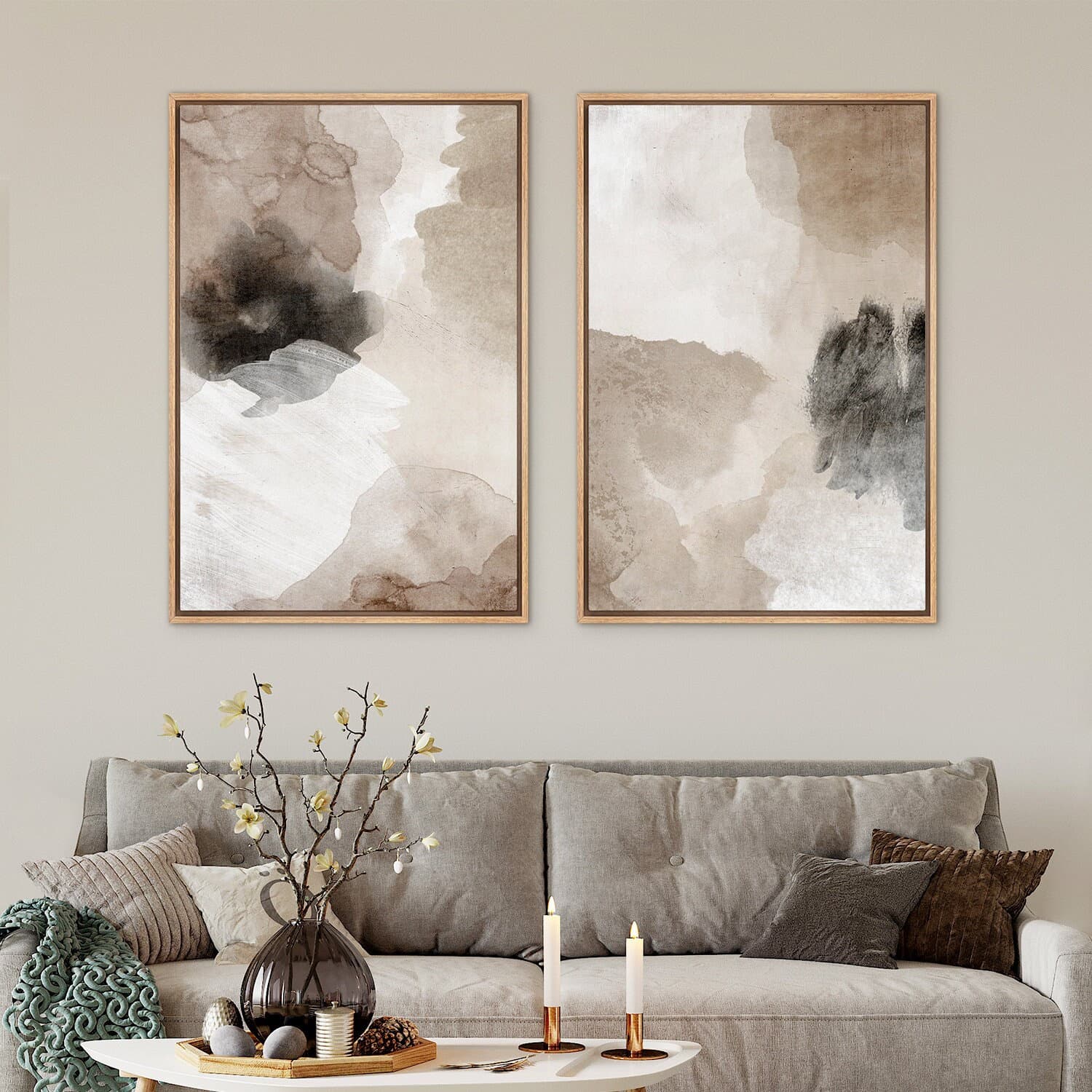
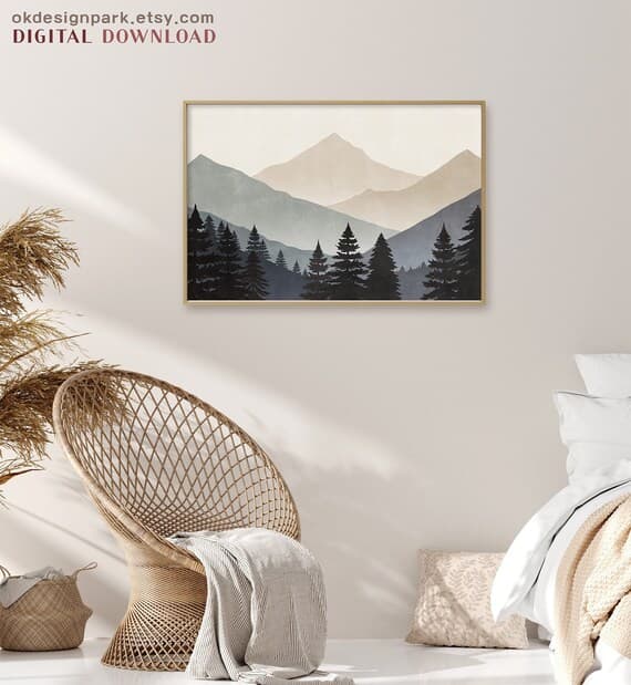
Warm, Lived-In Interior Scenes
The clean white studio mockup had its moment, but in 2024 and into 2025, the highest-converting wall art listings are using warm, textured interior scenes. Think warm-toned wood floors, cream or beige walls, linen furniture, soft natural light coming in from the side. These rooms feel like real homes, not showrooms.
This style works because it aligns with the dominant aesthetic trend in interior design right now, which leans toward warm neutrals, organic textures, and what designers call "quiet luxury." When your wall art mockup sits inside that aesthetic context, it signals to buyers that your product belongs in a modern, tastefully decorated home.
The specific details matter a lot here. A mockup with a wooden floor, a vintage-style rug, and a single plant in the frame will outperform an identical composition on a plain white background almost every time, assuming the art itself is comparable. The context is doing selling work.
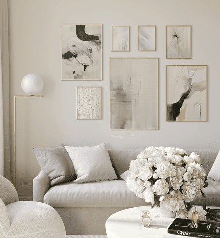
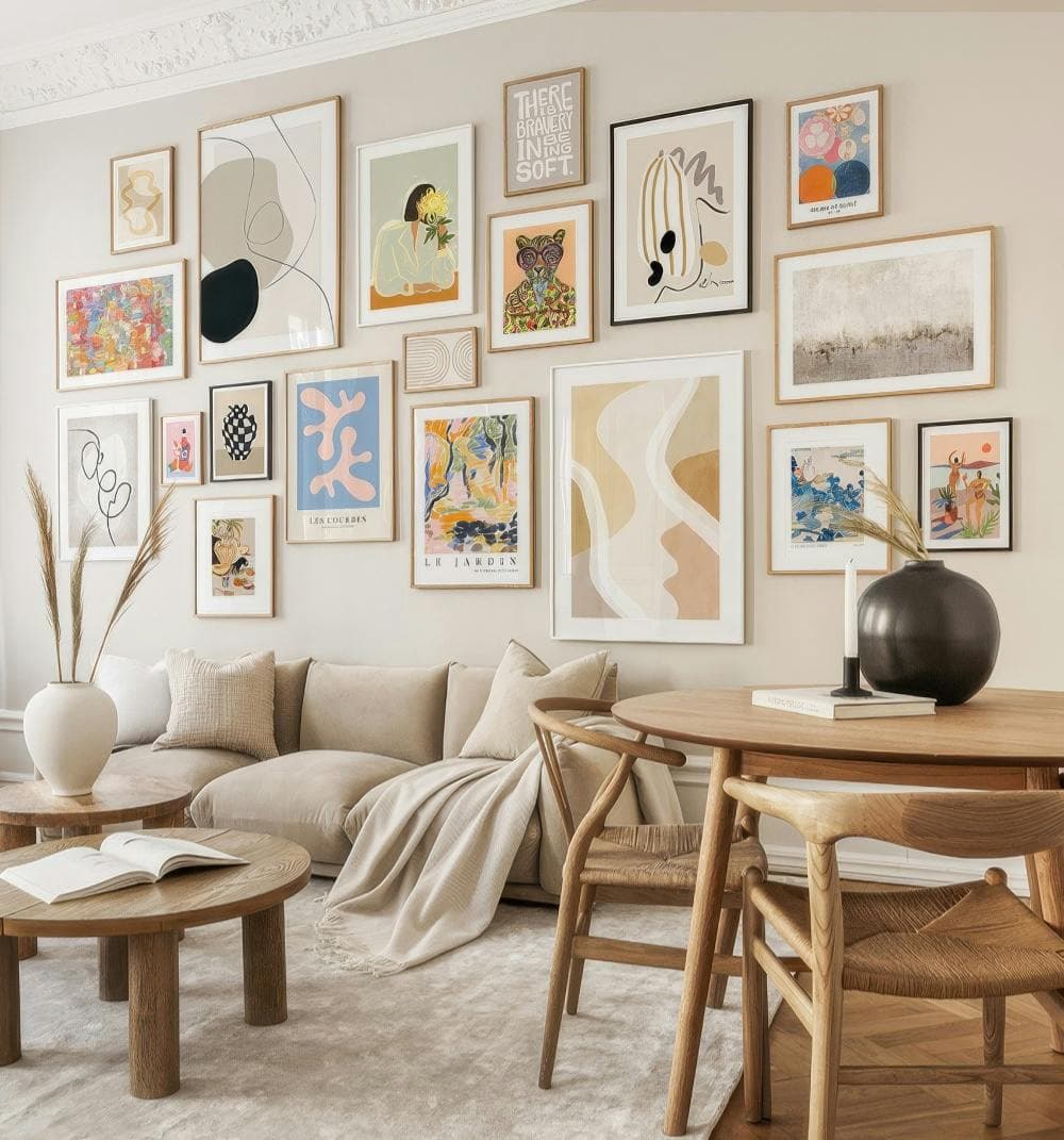
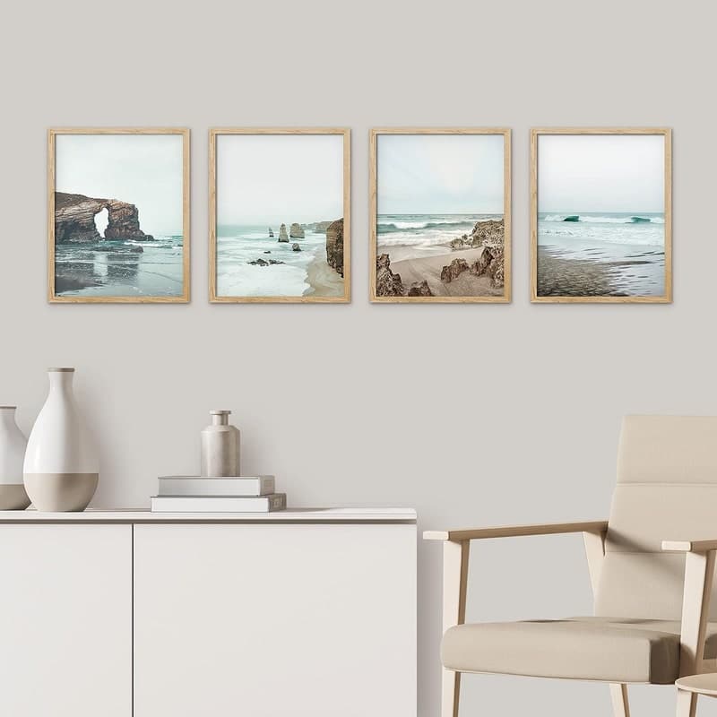
Multi-Frame Gallery Wall Arrangements
Gallery walls have been trending for several years, but what's changed is how the top shops are using them in mockups. Rather than showing a single print in isolation, they're showing groups of two, three, or five prints arranged together on a wall. This does several things at once.
First, it shows buyers how to use the product, which reduces purchase anxiety. A lot of buyers who love a print aren't sure how to hang it or what to pair it with. A gallery wall mockup answers both questions before they even think to ask them.
Second, it creates a natural upsell. When a buyer sees five prints that look great together, they often buy more than one. The best shops in this space sell sets and use gallery wall mockups as a visual argument for why you want the whole set, not just one.
Third, it creates a more substantial-looking listing. A gallery wall mockup fills the frame with more visual information, which tends to look more premium in search results than a single print floating on a wall.
Bedroom and Home Office Scenes
The living room has traditionally been the default room for wall art mockups, but there's a growing shift toward bedroom and home office scenes in high-performing listings. This makes sense when you think about where buyers are browsing Etsy. A lot of people are shopping on their phones late at night, often from their bedrooms. A cozy bedroom scene with a warm lamp, neutral bedding, and a framed print above the headboard speaks directly to the space they're already in.
Home office mockups are performing well for a specific category of wall art: motivational quotes, botanical prints, and minimalist abstract designs. The work-from-home culture has created a real market of buyers who want to make their home offices feel more personal and inspiring, and if your art fits that brief, showing it in a home office scene gives buyers a specific, practical reason to buy it.
Actionable takeaway: If you've been defaulting to a single-frame white background mockup, try replacing at least two of your listing photos with warm interior scene mockups. Test a gallery wall arrangement if your art could be sold as a set, even if you don't currently offer one.
---
What the Best Shops Get Right About Frame and Print Presentation
Beyond the room setting, the way the print itself is presented inside the mockup has a significant impact on perceived value. This is where a lot of sellers lose points even when their room setting is strong.
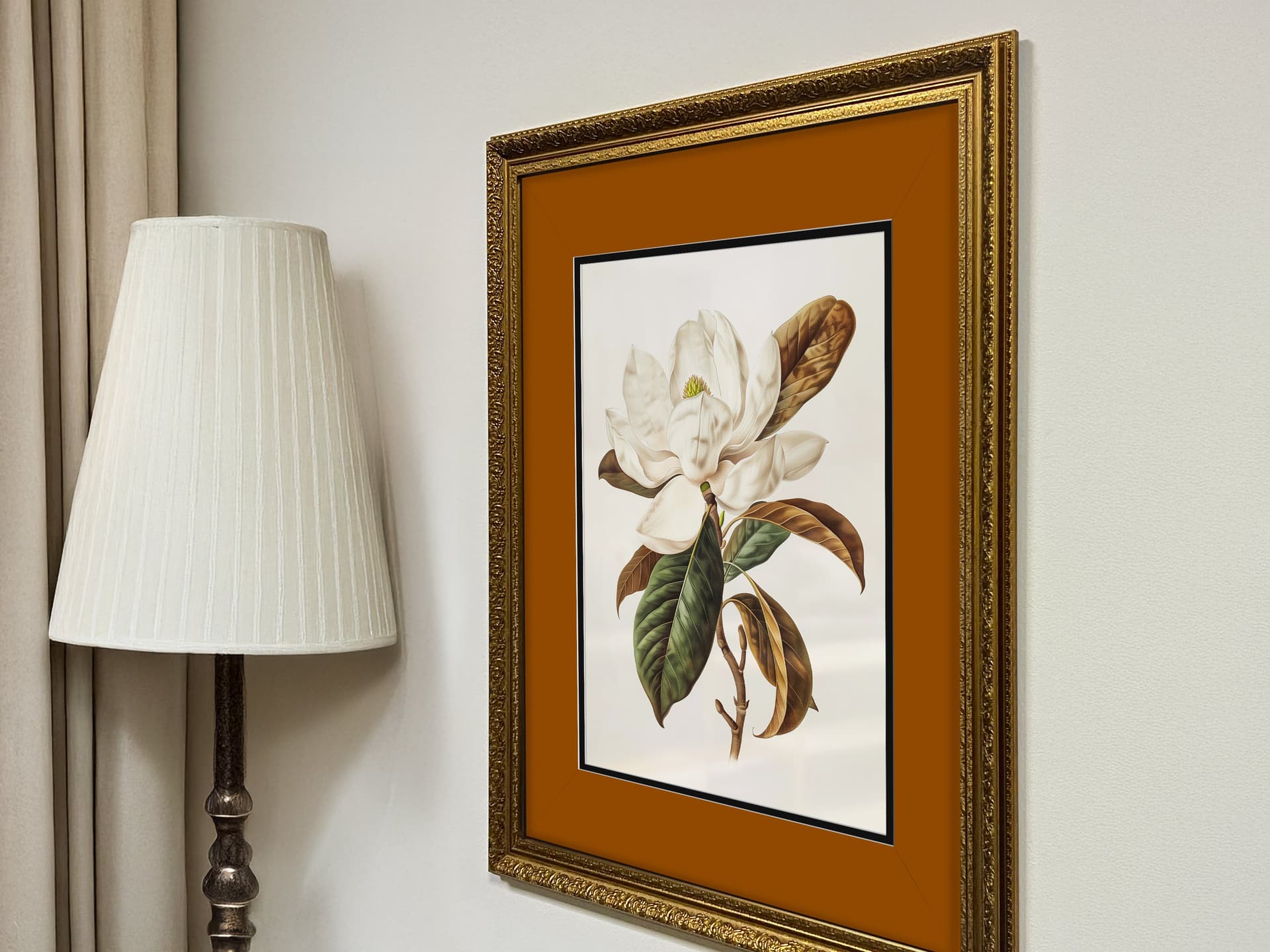
Frame Choice Signals Price Point
The frame in your mockup sends an immediate price signal. A thin black metal frame reads modern and affordable. A chunky oak frame reads rustic and handmade. A slim brushed gold frame reads premium and elegant. None of these is wrong, but they need to match both the art and the audience you're targeting.
Top shops in the wall art category often offer multiple listings for the same print, each showing it in a different frame style. This isn't just for variety. It's to capture different buyer intent and different price-point expectations. A buyer looking for a gift at a certain price point responds differently to a gilt frame than a buyer furnishing a minimalist apartment.
If you only show your prints in one frame style, you're artificially limiting the number of buyers who can imagine your work in their space.
Mat Boards and White Space Communicate Value
One of the most reliable signals of premium positioning in wall art mockups is a generous mat board. When you show a print with a wide white or cream mat inside the frame, it communicates museum-quality presentation. It also makes the art itself look more intentional and considered.
Many sellers skip the mat entirely, or use a very narrow one, because they want the art to fill the frame. But from a buyer's perspective, the mat is part of what they're paying for. It's a presentation decision, not a space issue. Top shops consistently use wider mats in their mockups, and it shows in how professional their listings look compared to sellers showing the same quality of art without one.
Consistency Across All Listing Photos
This is less about a specific mockup style and more about how the best shops use their full set of listing photos. Etsy gives you up to ten images per listing, and the shops getting the most sales use all of them, or close to it. More importantly, they maintain a consistent visual language across all ten photos.
Consistency here means consistent color grading, consistent frame style, consistent mood. When a buyer clicks through all your listing photos and they feel like they belong together, it builds trust. When the photos feel like they came from five different sources with no unifying aesthetic, it creates subtle doubt about whether you know what you're doing.
Actionable takeaway: Audit your existing listings and check whether your frame choices match the price point you're targeting. If you're selling premium-priced prints, switch to mockups with elegant frames and wide mat boards. Make sure your full set of listing photos has a consistent visual tone.
---
The Role of Lifestyle Context in High-Converting Listings
Wall art mockups that show just the art are competing on art quality alone. Wall art mockups that show the art inside a complete lifestyle context are competing on aspiration and emotion. The latter is a much easier race to win.
Seasonal and Contextual Styling
The most sophisticated Etsy wall art shops update their mockup styling with the seasons and with cultural moments. A botanical print that was shown in a bright, airy summer room gets new mockups in autumn with warm amber tones, dried grasses, and a candle on the shelf below it. It's the same print, but the context makes it feel current and relevant.
This matters because Etsy search isn't static. Buyers searching for "fall home decor" or "cozy bedroom art" are in a specific emotional state, and a mockup that matches that state converts better than one that feels out of season. Refreshing your mockups a few times a year to reflect seasonal styling doesn't require changing your art at all. It just requires showing it in a new context.
Styling Props That Tell a Story
The best mockups aren't just rooms. They're rooms with stories. A small stack of books on the shelf beside the print. A coffee mug on the side table. A pair of reading glasses. These tiny details create the impression of a life being lived in that space, and they're what separates a mockup that feels like a stock photo from one that feels like a real home.
You don't need to own or photograph these scenes yourself. When you're generating mockups, look for templates that include these lifestyle details rather than sterile room shots with nothing but furniture. The presence of small personal objects makes a huge difference in how warm and real the image feels.
Showing Scale Accurately and Convincingly
One of the most common complaints in Etsy wall art reviews is that the print was smaller than expected. This is often a mockup problem. If the scale of the print in your mockup image doesn't accurately represent how big it will look on a real wall, buyers get a nasty surprise when it arrives, and that translates directly into negative reviews and returns.
Top shops solve this in two ways. First, they use mockups where the room proportions are realistic, so the print looks the correct size relative to a normal wall. Second, they include a scale reference image in their listing photos showing the print next to a common object or indicating dimensions visually.
Buyers who understand exactly what size they're getting before they purchase have higher satisfaction rates and are more likely to leave positive reviews, which feeds back into your shop's search ranking.
Actionable takeaway: Look at your mockups and ask whether they tell a story or just show a product. If they feel cold or empty, find templates with lifestyle styling details. And always include at least one photo that clearly communicates the scale of the print.
---
How to Actually Produce These Mockup Styles Without a Design Background
Knowing what mockup styles convert is useful. Being able to actually produce them efficiently is what separates sellers who act on this knowledge from those who don't. This is where a lot of sellers get stuck, because generating professional lifestyle mockups used to require Photoshop skills, expensive subscriptions, or paying a designer.
Bulk Generation Saves the Shops That Sell at Volume
If you have a catalog of even 20 or 30 digital prints, creating mockups one at a time is genuinely painful. Each print needs multiple listing photos, which means each new product requires you to manually composite your art into five to ten different room scenes. For a 30-product catalog, that's potentially 150 to 300 individual image exports before you even start listing.
This is exactly the problem that Mockupanda was built to solve. Instead of manually placing each piece of art into each scene, you can generate mockups in bulk, selecting your mockup styles once and applying them across your entire catalog in a fraction of the time. For sellers who are constantly adding new products or refreshing seasonal mockups, this isn't a convenience. It's the difference between keeping up with your shop and falling behind.

Choosing the Right Templates for Your Art Style
Not every lifestyle mockup template will suit every type of wall art. A maximalist gallery wall scene works beautifully for eclectic botanical prints but might overwhelm a minimalist line drawing. A cozy bedroom scene is perfect for calming watercolor art but might feel tonally off for bold graphic prints.
The most efficient way to work is to build a small library of three to five mockup styles that consistently suit your art's aesthetic, and rotate through those for every new product. This creates visual consistency across your shop, which builds brand identity, and it means you're not spending time testing new templates every time you add a product.
With a tool like Mockupanda, you can save template preferences and reuse them across your catalog, which makes this kind of systematic approach practical rather than aspirational.
Text Overlays for Seasonal Promotions and Ad Creatives
One thing top Etsy shops do that most smaller sellers don't is create mockup variations specifically for advertising. When you're running Etsy Ads or promoting on Pinterest and Instagram, the image you use in your ad doesn't need to follow the same rules as your listing photo. It can include text overlays, seasonal messaging, or promotional callouts.
A wall art mockup with a simple text overlay like "New Spring Collection" or "Digital Download, Instant Access" communicates key information at a glance in a feed where buyers are scrolling fast. This is something Mockupanda supports directly, letting you add text layers to your mockup images without needing a separate design tool.
Actionable takeaway: If you have more than 10 products in your shop, stop creating mockups one at a time. Switch to a bulk generation workflow. Identify three to five mockup styles that suit your art and build your whole catalog around that consistent set. Use text overlays for ad creatives to communicate key product details without relying on buyers to click through to your listing.
---
Putting It All Together: A Simple Mockup Audit for Your Shop
None of this is useful if it stays theoretical. Here's a practical way to take everything in this post and turn it into a concrete improvement for your shop this week.
What to Look For When You Review Your Listings
Open your Etsy shop and look at your listings the way a buyer would, not as the person who made the art. Look at each listing's first image and ask: does this make me want to live in that room? Does it tell me where this print belongs in a home? Does it feel warm and real, or cold and generic?
For each listing, count how many photos you have. If you have fewer than five, that's an immediate opportunity. The top-performing listings in competitive categories almost always have seven to ten photos, using the full space to show the print in multiple contexts and at multiple scales.
Note which mockup styles you're using. Are they all the same room? All the same frame? All the same angle? If yes, there's room to add more variety, which gives buyers more visual information and more moments to feel that "I can see this in my home" response.
A Prioritized Improvement Order
If you're looking at a full catalog and feeling overwhelmed, start with your best-selling listings. Improving the mockups on your top five products will have a faster impact than overhauling your entire catalog at once. Get those five listings to a strong standard, then work outward from there.
For each of those five listings, aim to have: one warm interior lifestyle scene as the hero image, one gallery wall arrangement if the print could be part of a set, one close-up detail shot showing texture or mat presentation, and one scale reference image. That's four photos that answer the most important questions a buyer has before purchasing.
Refreshing for Seasonal Relevance
Finally, put a quarterly reminder in your calendar to review your top listings and consider whether the mockup styling is still seasonally appropriate. You don't need to redo everything every three months. Just check whether your hero images still feel current, and update the two or three listings that feel most out of sync with the current season or design trend.
This is a small habit that compounds significantly over time. Sellers who refresh their mockups regularly tend to see more consistent traffic because their listings feel current, not like they were set up once and forgotten.
Actionable takeaway: Do a mockup audit of your top five listings this week. Check for lifestyle context, frame and mat presentation, number of photos, and scale clarity. Prioritize replacing any flat white-background-only listings with warm interior scene mockups. Use a bulk generation tool to make this process fast enough that you'll actually do it.
---
The gap between a shop that sells occasionally and one that sells consistently isn't usually the art. It's the presentation. The top 1% of Etsy wall art sellers have figured out that their listing photos are sales tools, and they invest in getting those tools right. With the right mockup styles and a workflow that makes generating them fast and repeatable, there's nothing stopping you from closing that gap.
Keep reading
How to Create a Cohesive Etsy Shop Front Using Mockups With a Consistent Color Palette Across All Listings
Why Etsy Buyers Judge Your Entire Shop Quality From the First Mockup They See