Why Your Print Mockup Background Color Is Hurting Your Etsy Conversion Rate
You spend hours on your artwork. You write a careful product description. You research your keywords. And then you slap your design onto the first mockup template you find, accept whatever background color comes with it, and wonder why your conversion rate is sitting at 1.2 percent.
The background color of your mockup is not a neutral decision. It is an active one, and if you are not making it deliberately, it is probably costing you sales. Shoppers on Etsy make snap judgments in under a second. The overall impression of your listing thumbnail, including the tone and feeling created by its background, is part of that judgment.
This post explains exactly what is happening psychologically when someone sees your mockup, which background choices signal cheap versus premium, how to match your background to your niche and audience, and how to start testing properly so your changes actually improve results.
The Psychology Behind What Buyers See First
Before a shopper reads your title or checks your price, they see your image. The brain processes color and contrast before it processes text or fine detail. That means the palette of your mockup, especially the dominant background, sets the emotional tone for everything that comes after.
Color Creates Expectation Before Anything Else
When someone searches for "minimalist art print" on Etsy and sees a grid of listings, the ones with clean white or soft warm backgrounds immediately read as contemporary and considered. The ones with busy, dark, or oddly saturated backgrounds create a tiny friction, a feeling that something is slightly off, even if the shopper could not articulate why.
This is not about one background color being universally better than another. It is about alignment between the color context you create and the aesthetic your target buyer already has in their head. A gothic or Halloween print will look completely wrong on a bright white linen background. A soft botanical print will look undercut and cheap on a stark black background. The mismatch creates cognitive dissonance, and cognitive dissonance leads to clicking away.
The Contrast Trap in Etsy Search Results
Etsy search results show listings in a grid. Your thumbnail is competing with every other result on that page simultaneously. This means contrast matters enormously, but contrast cuts both ways.
If you are selling light-colored or white-border prints and you put them on a white background, your print disappears. The frame blends into the background, the whole image looks washed out, and it simply does not register visually among bolder thumbnails. You lose clicks not because your art is weak but because your presentation is invisible.
On the other hand, if you use an aggressively dark or neon background in a category full of soft, earthy tones, you will stand out, but you will stand out the wrong way. You might get the click out of curiosity, but the buyer who was looking for something to go in their calm, neutral living room has already felt that your shop is probably not the right fit.
The goal is to stand out while staying in the aesthetic lane your buyer is shopping in. That is a tighter needle to thread than most sellers realize.
Actionable takeaway: Open your Etsy shop in a separate browser window, then open a private window and search for your main product keyword as a stranger would. Look at where your thumbnail sits in the grid and whether its background works with or against the overall page. You are not trying to match everyone else. You are trying to belong in the same aesthetic world while being visually distinct.
Which Background Colors Signal Price Point and Quality
One of the most underappreciated facts about mockup backgrounds is that they directly influence a shopper's unconscious perception of what your product should cost. The same artwork presented on two different backgrounds can feel like a $6 print on one and a $28 print on the other.
What Makes a Background Feel Premium
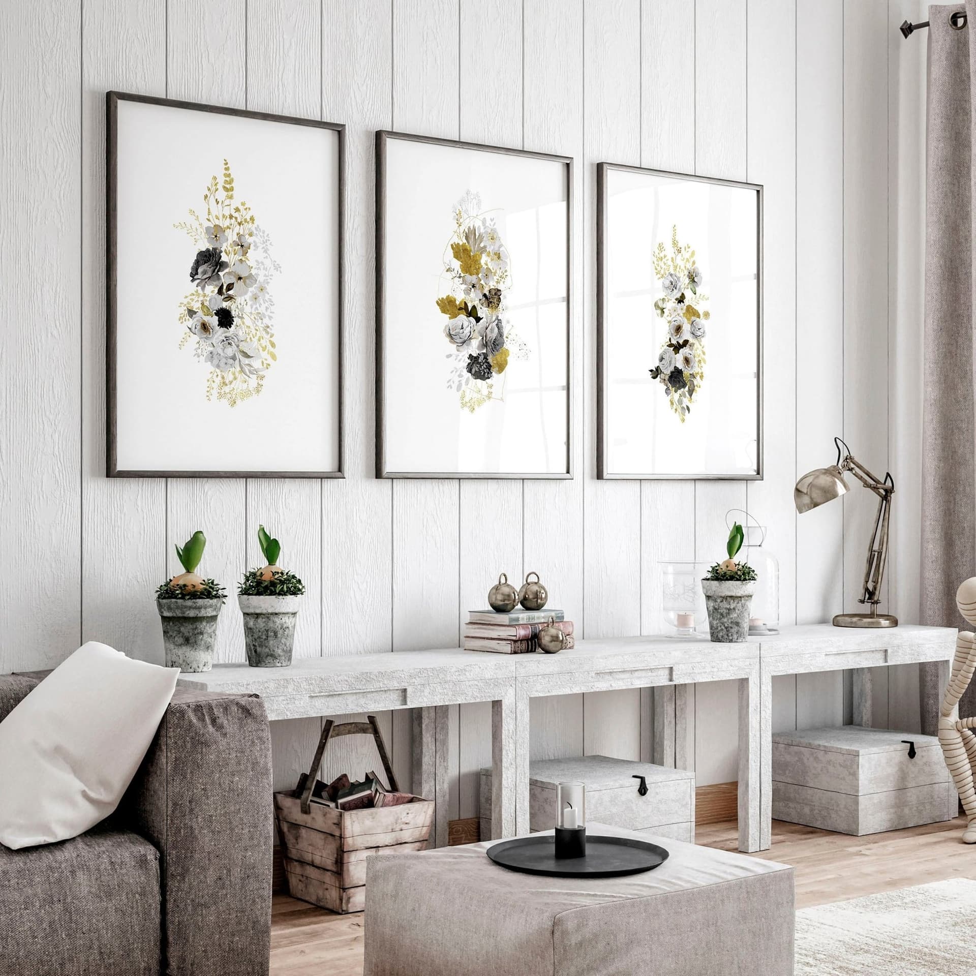
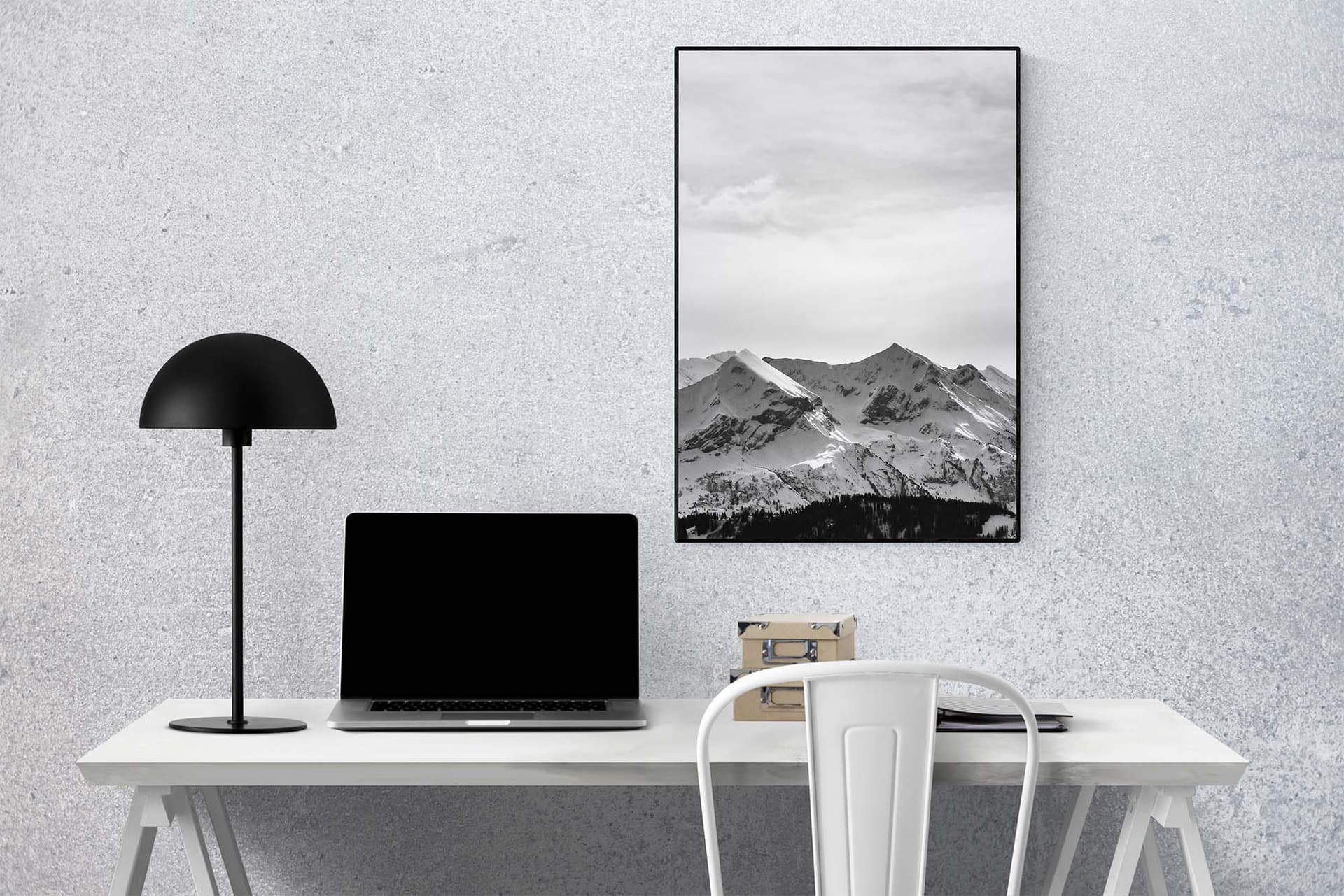
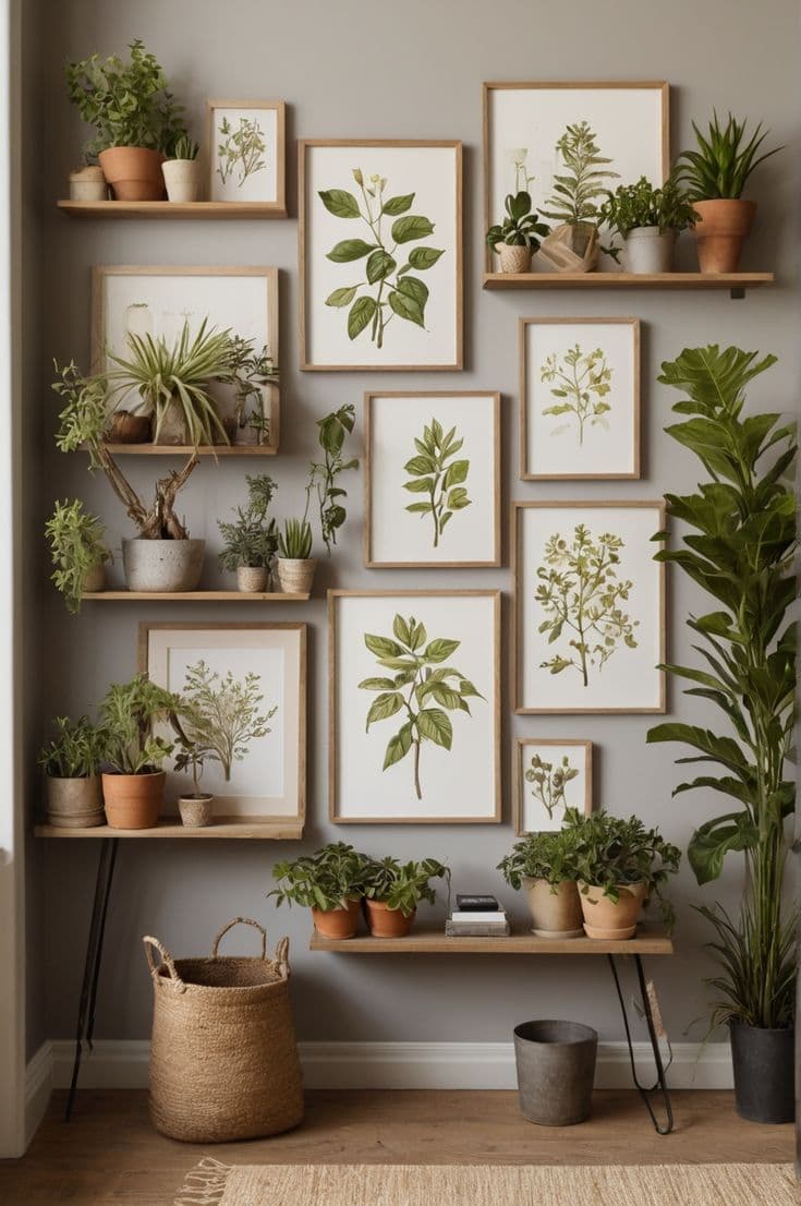
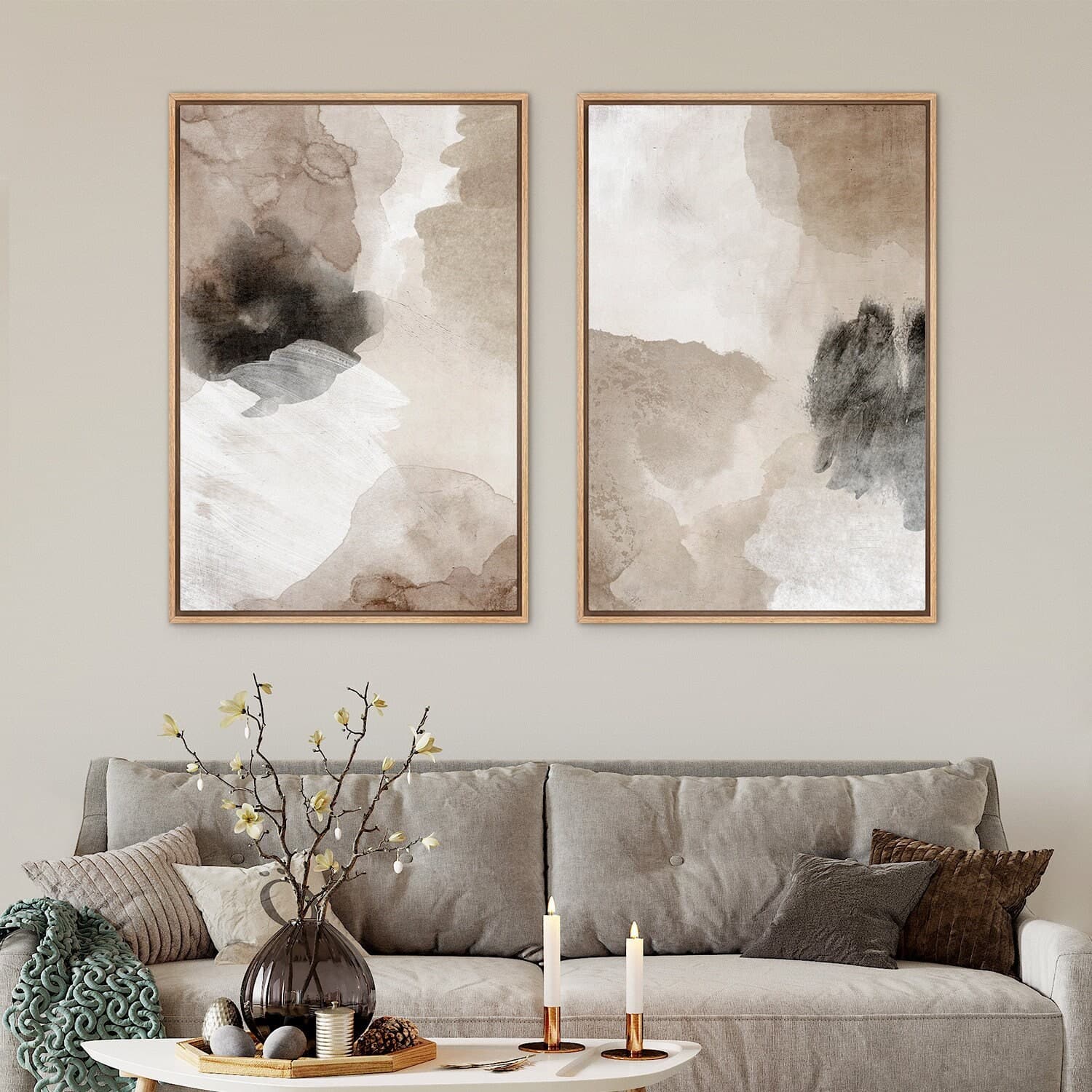
Premium backgrounds tend to share a few characteristics. They are either carefully neutral (true whites, soft ivories, warm grays, or deep charcoals) or they are richly textured in a way that signals quality materials, like linen, plaster walls, or aged wood. What they have in common is that they feel intentional. They feel like someone styled a real room or chose a real surface with care.
Flat, plasticky, or obviously digitally generated backgrounds do the opposite. When a background looks like a free stock photo with blown-out lighting and generic gray gradient, your print inherits that generic energy. It looks like something you could buy anywhere for a few dollars.
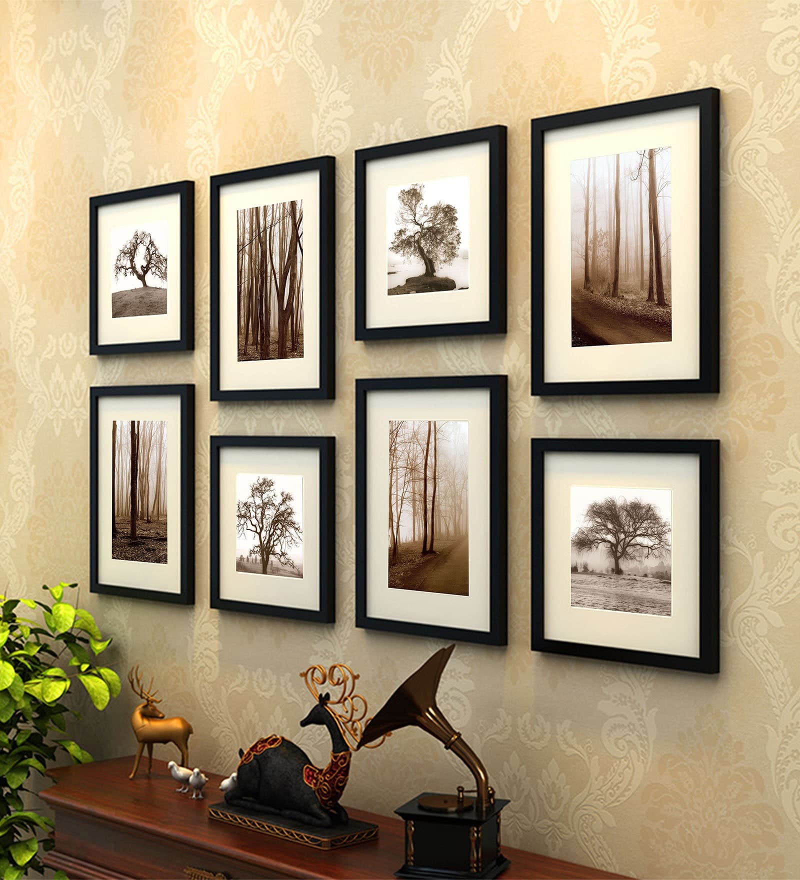
This is why context matters so much in mockups for wall art. A frame hanging on a textured plaster wall next to a small plant and a shelf suggests a real home. A frame floating on a white gradient suggests a product template from 2014.
The Specific Palette Choices That Undercut Sellers
There are certain background choices that come up again and again in Etsy audits, and they consistently suppress conversion rates.
Bright white with no texture is the most common one. It is clean, yes, but it reads as clinical rather than warm, and for wall art specifically, shoppers want to feel how the print will live in their home. A cold white background does not help them feel that.
Supersaturated or neon backgrounds are another common problem. They were trendy in certain corners of graphic design for a while, and they occasionally work in very specific product categories, but for most print sellers they feel jarring and signal that the seller has not thought carefully about presentation.
Inconsistent backgrounds across your shop also create a problem that is not about any single color but about the overall impression. If your shop has some prints on white backgrounds, some on warm cream, some on lifestyle photo mockups, and some on dark wood textures, the shop feels visually incoherent. That incoherence makes buyers trust you slightly less, because a cohesive shop signals professionalism.
Actionable takeaway: Look at three to five Etsy shops in your niche that have strong sales histories. Screenshot their thumbnails and compare the dominant background tones. You will almost always find consistency, both within each shop and across successful shops in the same niche. Use that as a starting point for your own palette decisions.
How to Match Your Background to Your Niche and Buyer
There is no universal answer to which background color is best. The right answer depends entirely on who your buyer is and what aesthetic world they live in. Here is a practical framework for thinking through it.
Mapping Your Buyer's Home Aesthetic
Most print buyers are shopping for something specific to their space. They have a mental image of their home, or at least the room they are decorating, and they are filtering every listing through the question "will this look right in my space?"
Your mockup background is a shortcut for helping them answer that question. If your buyer has a Scandinavian-influenced home with white walls, oak furniture, and linen textiles, a light warm background with a simple oak frame is speaking directly to their visual world. If your buyer is into maximalist, dark academia styling with forest green walls and gold accents, that same white background feels foreign and unhelpful.
So before you choose a background, describe your buyer's home in three words. Use those words to guide your mockup choices. "Bright, airy, minimal" points you toward whites and warm creams. "Cozy, earthy, rustic" points you toward warm taupes, terracottas, and wood textures. "Moody, dramatic, eclectic" gives you permission for darker, richer backgrounds.
Niche-Specific Background Recommendations
Here are some common print-on-demand niches with specific background guidance based on what tends to perform well.
Botanical and nature prints generally perform best on soft warm backgrounds, off-white linen, aged plaster, or pale sage walls. These backgrounds complement the organic quality of the subject matter and signal that the print belongs in a thoughtfully decorated space.
Quote and typography prints benefit from clean, high-contrast backgrounds, particularly when the text in the print is detailed. A slightly warm white or pale gray keeps the print legible in the thumbnail while staying elegant. Avoid backgrounds that compete with the typography for visual attention.
Abstract art and more graphic prints can handle a wider range of backgrounds because the prints themselves are less context-dependent. This is where you have the most freedom to experiment with deeper tones or more textured surfaces.
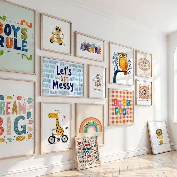
Kids' room prints almost always perform better on bright, cheerful backgrounds, soft yellows, gentle blush pinks, sky blues, or pure white. The background reinforces the playful, warm feeling buyers are looking for in children's decor.
Actionable takeaway: Write down your three-word buyer home description and then compare it against your current mockup backgrounds. If there is a mismatch, that is your first fix. You do not need to redo every listing at once. Start with your top five listings by traffic and update those backgrounds first.
Testing Your Background Choices Without Wasting Weeks
Changing your mockup backgrounds is only useful if you can tell whether the changes are actually working. Most Etsy sellers make changes based on gut feeling and then struggle to interpret what happened. Here is a more structured approach.
The Simple A/B Framework for Etsy Listings
Etsy does not offer native A/B testing the way some platforms do, but you can run informal tests with a bit of discipline. Choose two or three listings with similar traffic levels that are selling the same type of product. Update the mockup background on one of them, leave the others unchanged, and check back in two to three weeks.
The metrics to watch are click-through rate, which Etsy shows in your shop stats as the visits driven by a specific listing relative to its impressions, and of course the conversion rate for that listing. If you change the background and traffic goes up but conversions do not, you have improved discoverability but the background still is not building enough trust or desire. If both go up, you have made a genuine improvement.
Document what you changed and when. It sounds obvious but most sellers make multiple changes simultaneously and then cannot figure out which change drove the result.
Using Bulk Mockup Tools to Test Faster
One of the most practical ways to test multiple background options without spending hours in Photoshop is to use a mockup generator that lets you create multiple versions quickly. Mockupanda, for example, lets you generate batches of mockups with different background contexts in a fraction of the time it would take to do them manually. This matters because testing requires having actual alternatives ready to swap in. If generating a new mockup version takes you 45 minutes, you will avoid testing. If it takes you 3 minutes, you will actually do it.
The ability to iterate quickly on your product presentation is a real competitive advantage on Etsy. Sellers who can test and refine their visual presentation faster than their competitors compound those improvements over time.
Actionable takeaway: Pick one listing this week and create two alternative mockup versions with different background tones. Swap your current image for one of the alternatives and track its performance over the next two to three weeks. You do not need a perfect system. You just need to start generating data.
Creating Shop-Wide Visual Consistency That Builds Trust
Individual listing improvements matter, but the biggest conversion gains often come from thinking about your entire shop as a single visual experience. When a shopper clicks through to your shop page after seeing one listing they like, the overall shop aesthetic either reinforces or undermines the trust they were starting to build.
Why Consistency Converts Better Than Individual Perfection
A single perfect mockup in a shop full of inconsistent backgrounds actually works against you. The shopper notices the quality variation and starts to wonder which version of the shop represents the real product quality. Consistency is a trust signal. It says that the person running this shop has a clear sense of what they are doing and pays attention to detail.
This does not mean every listing needs an identical background. It means your backgrounds should feel like they come from the same family. Choosing two or three backgrounds that work together and rotating through them across your shop creates visual rhythm without being monotonous. A warm white, a soft warm gray, and a light linen texture can all live together in the same shop and feel cohesive while giving each listing its own feel.
Building Your Shop's Visual Identity Around Your Background Palette
Think of your mockup backgrounds as part of your brand identity, the same way you might think about your shop banner or your logo. They communicate something consistent about who you are and what kind of products you make.
Once you have landed on a palette that fits your niche and buyer, apply it systematically. When you add new products, choose backgrounds from your established palette. When you refresh old listings, update them to match. Over time, this consistency becomes a recognizable visual signature that makes your shop feel more established and trustworthy.
Many successful Etsy sellers report that the moment they brought visual consistency to their mockup backgrounds, their repeat customer rate improved alongside their conversion rate. That makes sense. Shoppers who feel a strong sense of brand identity from a shop are more likely to remember it and return.
Actionable takeaway: Go to your shop's listing page as a visitor and screenshot the grid view. Squint at it. Does it feel like a cohesive collection of images from the same source, or does it feel like a random assortment? If it is the latter, identify two or three background tones that fit your buyer's aesthetic and plan to refresh your top 10 listings with those backgrounds over the next month.
Making the Fix Without Drowning in Busywork
Everything above is only useful if you can actually implement it without burning out. The trap many sellers fall into is recognizing that their mockups need work and then treating it as a massive project that lives on their to-do list indefinitely.
Prioritize by Traffic, Not by Perfection
You do not need to fix every listing before you start seeing results. Start with the listings that already receive the most traffic. Those are the ones where a higher conversion rate will have the biggest immediate impact on your revenue. Use your Etsy shop stats to sort listings by visits and work down that list.
For each listing, the question is simple. Does the current background match my buyer's aesthetic, signal the right price point, and make the print visible and clear in the thumbnail? If the answer is no to any of those three, it goes on the update list.
Streamlining Mockup Creation So You Actually Keep Up With It
The reason most sellers have inconsistent or poorly considered mockup backgrounds is not that they do not care. It is that creating new mockups takes time they do not have, so they use whatever is easiest and move on. The solution is to reduce the friction of creating good mockups so dramatically that doing it right is no harder than doing it carelessly.
This is where having the right tool matters. When you can upload your artwork, select your preferred background context, and generate a clean finished mockup in a couple of minutes, the background decision becomes a quick deliberate choice rather than an afterthought. Mockupanda was built specifically with this kind of workflow in mind, letting print sellers generate professional, consistent mockups quickly without needing to open a single design application.
The goal is to make good decisions the easy decisions. When the friction is low enough, you will naturally make better choices about backgrounds because you have the time to think about them rather than just grabbing the first template that appears.
Actionable takeaway: Block out 90 minutes this week specifically to address your top five listings. Use that time to generate two or three background variations for each one using whatever tool gets you there fastest, then choose the strongest version and update the listing. Ninety minutes across five listings is all it takes to start seeing whether background changes move your numbers.
Putting It All Together
Your mockup background is doing a job whether you want it to or not. It is either supporting the value of your art, helping buyers picture it in their home, and signaling that your shop is worth trusting, or it is creating friction, confusion, and doubt.
The good news is that this is one of the most fixable problems in Etsy product presentation. Unlike improving your SEO or building up your review count, updating your mockup backgrounds can happen quickly. It does not require new artwork, a new product, or a major investment. It requires a bit of intentional thinking about who your buyer is, what aesthetic world they live in, and what your current backgrounds are communicating.
Start with your highest-traffic listings. Audit the background choices against the three questions: Does it match your buyer's aesthetic? Does it signal the right price point? Does it make your print visible and clear? Fix the ones that fail those tests, track what happens, and refine from there.
Product presentation is a skill that compounds. Every improvement you make to how your prints look in search results and on your shop page makes the next sale a little more likely. And unlike traffic acquisition, which requires constant effort, a better-presented listing keeps working for you as long as it is live.
Keep reading
How to Showcase Poster Sets on Etsy Using Gallery Wall Mockup Templates
How to Use Lifestyle Mockups to Sell Abstract Art to Buyers Who 'Don't Get It' Yet