The Exact Image Order That Gets More Clicks on Etsy Digital Print Listings
Why Image Order Is a Conversion Strategy, Not Just Housekeeping
When someone scrolls through Etsy search results, they are not reading. They are scanning. Your thumbnail gets roughly half a second of attention before a shopper decides whether to tap or keep scrolling. That means the order of your listing images is not a formatting detail — it is the backbone of your conversion strategy.
Most digital print sellers treat image order as an afterthought. They export a few JPEGs, drag them into the listing upload area, and publish. If sales are slow, they blame the algorithm, the niche, or the price. But very often, the real issue is that the image sequence is not doing any selling.
A well-ordered listing image gallery works like a silent sales conversation. Each image answers a different question the buyer has in their head, in the order those questions naturally arise. Get the sequence right, and you guide the shopper from curiosity to confidence without them even realizing it.
How Etsy Shoppers Actually Browse
Etsy publishes data showing that listings with strong thumbnail images see significantly higher click-through rates than listings with identical SEO. That should not be surprising — shoppers are visual first, logical second. The thumbnail pulls them in, and then the gallery either closes the deal or creates doubt.
Digital print buyers specifically have a few layers of hesitation that physical product buyers do not. They cannot touch the item. They often worry about print quality, file resolution, and whether the print will look as good framed on a real wall as it does on a white background. Your image order needs to address those concerns proactively.
The Cost of Getting It Wrong
A poorly ordered gallery does not just miss sales — it actively loses them. If your third image is the one that would make someone say "oh, that looks beautiful in a home," but most shoppers never make it past the first two images, you are leaving money on the table every single day the listing is live. Fixing image order costs nothing and can lift conversion rates meaningfully without touching your SEO, pricing, or ad spend.
Takeaway: Before you touch anything else in your shop, audit your current listings. Open each one and ask whether the image sequence answers buyer questions in a logical, confidence-building order. If it does not, reorganizing takes ten minutes and could improve your sales immediately.
---
Image One: The Thumbnail Is Your Storefront Window
Your first image is doing more work than all the others combined. It appears in search results, in category browsing, in Etsy ads, and often in Google Shopping. It needs to stop the scroll and communicate the core appeal of your print in a single glance.
What Works in Position One
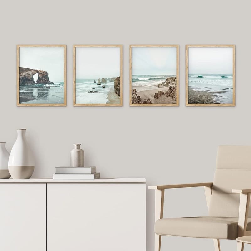
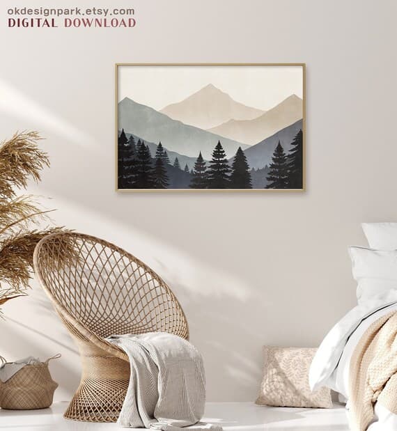
For digital prints and wall art, the single highest-performing thumbnail style is a lifestyle mockup that shows the print in a real, aspirational setting. Think: a framed print hanging above a minimalist linen sofa, or a gallery wall styled with warm natural light and some plants in the corner. This tells the buyer instantly what they are getting and where it could live in their home.
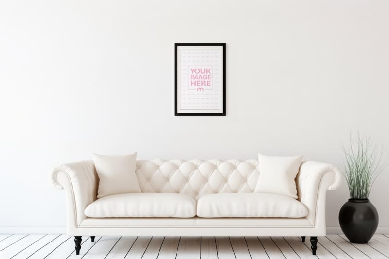
Avoid using your raw digital file as the first image. A flat JPEG on a white background tells the shopper nothing about scale, feel, or how the print will look in real life. It also looks unfinished compared to competitors who invest in proper presentation. Even if your artwork is stunning, a plain file export will underperform against a well-framed room mockup every single time.
The first image should also be as close to square as possible and follow Etsy's recommended 2000 x 2000 pixel minimum. Blurry or undersized thumbnails get automatically downgraded in perceived quality, and Etsy's own interface crops images in certain views — a square image ensures your print is always fully visible.
The Mood Sells Before the Details Do
People do not buy digital prints because of technical specifications. They buy them because the print makes them feel something. Your first image needs to deliver that feeling immediately. Warm, natural light styling tends to outperform stark white studio shots for home decor prints. Botanical prints perform well with wood accents and earthy tones. Typographic prints look polished in clean, modern interior settings.
Match the mood of your mockup to the mood of the print itself. A funny, irreverent quote print works better in a casual, lived-in styled setting than in a formal study. A fine art botanical print belongs in a serene, light-filled room. The mockup environment should feel like a natural extension of what the print is expressing.
Takeaway: Replace any flat-file-on-white thumbnails with lifestyle mockups immediately. Use a room setting that matches the emotional tone of your print, and make sure the image is at least 2000 pixels square so it renders sharply across all devices.
---
Images Two and Three: Build Context and Answer the First Questions
Once someone has clicked through from the thumbnail, they are interested but not yet convinced. Images two and three need to do specific jobs: show the product in enough detail to build confidence, and start addressing the questions that are forming in the buyer's mind.
Image Two: A Second Styled Shot From a Different Angle or Setting
Your second image should be another lifestyle mockup, but ideally from a different perspective or in a slightly different context. If image one showed a single framed print above a sofa, image two could show the same print in a gallery wall arrangement, or styled on a shelf with decorative objects around it. This does two things: it gives the shopper a second visual confirmation that the product looks great in a real space, and it helps them imagine multiple ways they could use it.
This is also the right place to start showing scale. Use props with recognizable dimensions — a standard picture frame, a common plant pot, a recognizable piece of furniture — to help buyers understand how large the print will feel in a room. Scale anxiety is real for digital print buyers, especially because they are purchasing a file they will print themselves or order through a print service. Giving them a clear sense of scale in image two reduces hesitation significantly.
Image Three: The Flat Lay or Close-Up Detail Shot
By image three, shoppers want to get closer to the product itself. A flat lay showing the print art in detail, perhaps displayed as if freshly printed and laid on a clean surface, lets buyers see the colors, the typography, or the illustration up close. This is the image where someone double-checks that the colors are what they expected and that the design detail is as sharp and beautiful as the thumbnail suggested.
For illustrated prints, a close-up crop showing the quality of the linework or color palette works well here. For typographic prints, make sure the text is legible and the font is displayed clearly. Buyers need to be able to read what they are buying, especially for quote prints or personalized designs.
Takeaway: Use image two to show a second styled context or scale reference, and use image three for a close-up or flat lay that lets buyers inspect the design detail. By the end of image three, a shopper should know what the print looks like, where it could go, and roughly what size it would feel at in a room.
---
Images Four and Five: Remove Objections Before They Kill the Sale
This is where most Etsy sellers drop the ball. By image four, the buyer likes what they see but their brain is generating objections. For digital prints, these objections are predictable, and you can address every single one with a well-designed informational image.
The "What Am I Actually Getting?" Image
Digital print buyers are still a mixed group. Some are very comfortable ordering digital downloads and printing at home or through a service. Others are newer to the format and need reassurance. Image four is the perfect place to clearly explain what is included in the download. Use a clean graphic showing the file formats included (PDF, JPEG, PNG), the resolution (300 DPI is the magic number that signals print quality), and the sizes available.
This does not need to be elaborate. A simple, well-branded graphic that says something like "Instant Download, 300 DPI, 5 sizes included: 4x6, 5x7, 8x10, A4, A3" removes the uncertainty that makes first-time digital print buyers hesitate. Without this information, shoppers have to go digging into your listing description, and many will not bother — they will just move on to a competitor who made it clearer.
The Social Proof or Variation Image
If you have multiple color variations of the same print, image five is a great place to show all of them side by side. This works especially well for prints that come in multiple colorways or frame color suggestions. It signals versatility and helps buyers who want options feel like they are getting more value.
Alternatively, if you have strong reviews mentioning your print quality or customer satisfaction, a tastefully designed testimonial graphic works well here. Positive social proof at this stage in the scroll reinforces the decision to buy just before the shopper reaches the "Add to cart" point.
Takeaway: Always include an image that clearly lists your file formats, resolution, and included sizes. Put it in position four or five where it can intercept buyer hesitation right before the purchase decision. Never make a buyer hunt for this information in the description.
---
Image Six: Close the Loop With a Finishing Touch
Etsy allows up to ten images per listing, but for most digital print listings, six to eight well-chosen images outperform ten mediocre ones. Your final image (whether that is six, seven, or eight) should serve as a closing statement that reinforces the purchase decision.
A Printing Instructions or "How It Works" Guide
For digital prints, one of the best uses of your last image slot is a simple, visual guide to how the process works. Something showing: download your file, send to a local print shop or home printer, frame and hang. This removes the last lingering doubt for buyers who are new to digital downloads and are slightly uncertain about the printing step. When you make the process feel easy and obvious, you remove the final barrier to clicking "Buy."
This is also a trust signal. It tells the buyer that you have thought about their experience beyond just the sale, that you want them to succeed in getting a beautiful print on their wall. That kind of seller care comes through even in a simple graphic, and it builds the kind of trust that generates five-star reviews.
A Branded Closing Image
If your shop has a strong visual brand, a clean closing image that includes your shop name and a short tagline can help with brand recall. Buyers who do not purchase immediately sometimes come back later, and a memorable brand impression helps them find you again. This works best for sellers who have a cohesive shop aesthetic and want to reinforce it at the end of the scroll.
Takeaway: Use your final image slot to either explain how the printing process works (great for reducing buyer hesitation) or to reinforce your brand so that shoppers who browse without buying can find their way back to you later.
---
How to Create This Image Sequence Without Design Skills
The image order strategy above only works if the actual images look professional and polished. Here is the honest truth: a poorly executed mockup is worse than no mockup at all. A blurry, badly cropped room scene with harsh lighting sends a signal that you do not care about quality, and that carries over to how buyers perceive your actual product.
The good news is that you do not need Photoshop, a photography studio, or any design background to create the image sequence described in this post.
Bulk Mockup Generation Saves You Hours Per Week
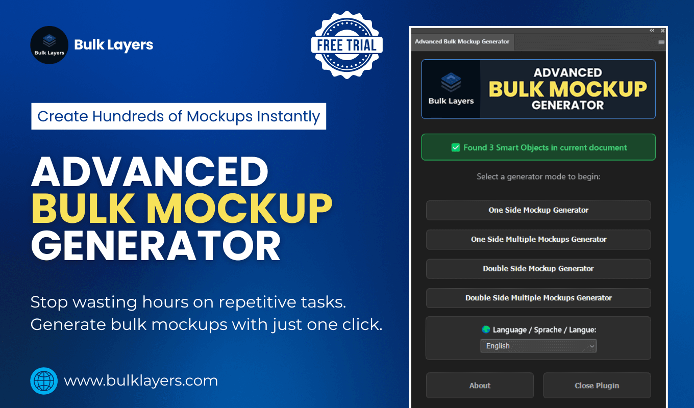
If you are selling multiple prints, or if you are regularly adding new designs to your shop, generating styled mockups manually for each one becomes a serious time drain. Tools like Mockupanda are built specifically for this workflow. You upload your print files, select from a library of styled room mockups and flat lay templates, and generate professional images in bulk without touching any design software.
This matters especially because the image sequence described in this post requires multiple mockup styles per listing: a room lifestyle shot, a scale reference, a close-up detail, possibly a variation grid. Generating all of those manually for ten new prints is a full afternoon. With a bulk generator, it is fifteen minutes.
Informational Graphics Do Not Need to Be Complicated
For images four and five (the file details graphic and the printing guide), a clean, readable design on a plain background is more effective than anything elaborate. Consistent fonts, your brand colors, and clear language are all you need. The goal is clarity, not complexity. Canva's free tier handles this perfectly, and once you create a template for your file details graphic, you can reuse it across every listing in your shop.
The key is consistency. If your lifestyle mockups have a warm, earthy aesthetic and your informational graphics are cold, clinical white with a different font, the gallery feels disjointed. Small sellers who pay attention to this kind of cohesion look significantly more professional than those who treat each image as a standalone asset.
Takeaway: Use a mockup generation tool to handle your room shots and lifestyle images in bulk so you are not recreating the wheel for each new design. Build reusable templates for your informational graphics in Canva so that every listing has a consistent, polished gallery from day one.
---
Putting It All Together: Your Image Order Checklist
Here is the exact sequence summarized so you can reference it every time you create or update a listing:
Image 1: Lifestyle mockup in a styled room setting. Warm, aspirational, mood-matched to the print. This is your thumbnail.
Image 2: Second styled shot from a different angle or setting. Includes a scale reference using real-world props.
Image 3: Close-up or flat lay showing design detail, colors, and typography clearly.
Image 4: Informational graphic listing file formats, DPI, and included print sizes.
Image 5: Color variation grid if applicable, or a social proof testimonial graphic.
Image 6: Printing how-it-works guide or branded closing image.
This sequence is not arbitrary. It mirrors the natural journey a buyer takes from first impression through to purchase decision. It surfaces the right information at the right moment. And it is designed specifically for how digital print buyers think and behave on Etsy.
You do not need to revamp your entire shop overnight. Pick your three best-selling listings, apply this sequence to each one, and watch what happens to your click-through and conversion rates over the next thirty days. The data will tell you everything you need to know.
Keep reading
How to Use Mockup Images in Your Etsy Shop Announcement and Banner to Build Trust Before a Buyer Clicks a Single Listing
How to Create a Cohesive Etsy Shop Front Using Mockups With a Consistent Color Palette Across All Listings