Room Scene vs. White Background Mockups: Which Sells More Wall Art on Etsy?
If you sell wall art on Etsy, you already know that your listing photos do most of the heavy lifting. The print itself might be beautiful, but if the mockup doesn't grab attention in a crowded search feed, buyers scroll right past you.
One of the most common questions digital print sellers ask is whether room scene mockups or white background mockups perform better. And honestly, it's a question worth taking seriously because the wrong choice for your audience can quietly tank your conversion rate without you even realizing why.
The real answer is that both styles serve different purposes, and the sellers who understand those purposes are the ones who dominate their niches. Let's break down exactly when each approach works, what buyer psychology says about both, and how to structure your listing photos so they work harder for you.
Why Your Mockup Style Is a Selling Decision, Not Just an Aesthetic One
A lot of sellers treat mockup photos as a box to check. You need images, so you grab something quick and move on. But buyers on Etsy are making split-second decisions, and your mockup is often the only thing standing between a scroll and a click.
The style you choose, whether it's a warm living room scene or a simple white background, sends a signal to the buyer before they've read a single word of your listing description. That signal shapes their perception of your product's value, its intended use, and whether it fits their life.
The Psychology of Buying Wall Art Online
Buying wall art online has a fundamental friction point: people can't see how it will look in their home. This uncertainty is one of the biggest reasons browsers don't convert into buyers. Your mockup is the tool that resolves that friction.
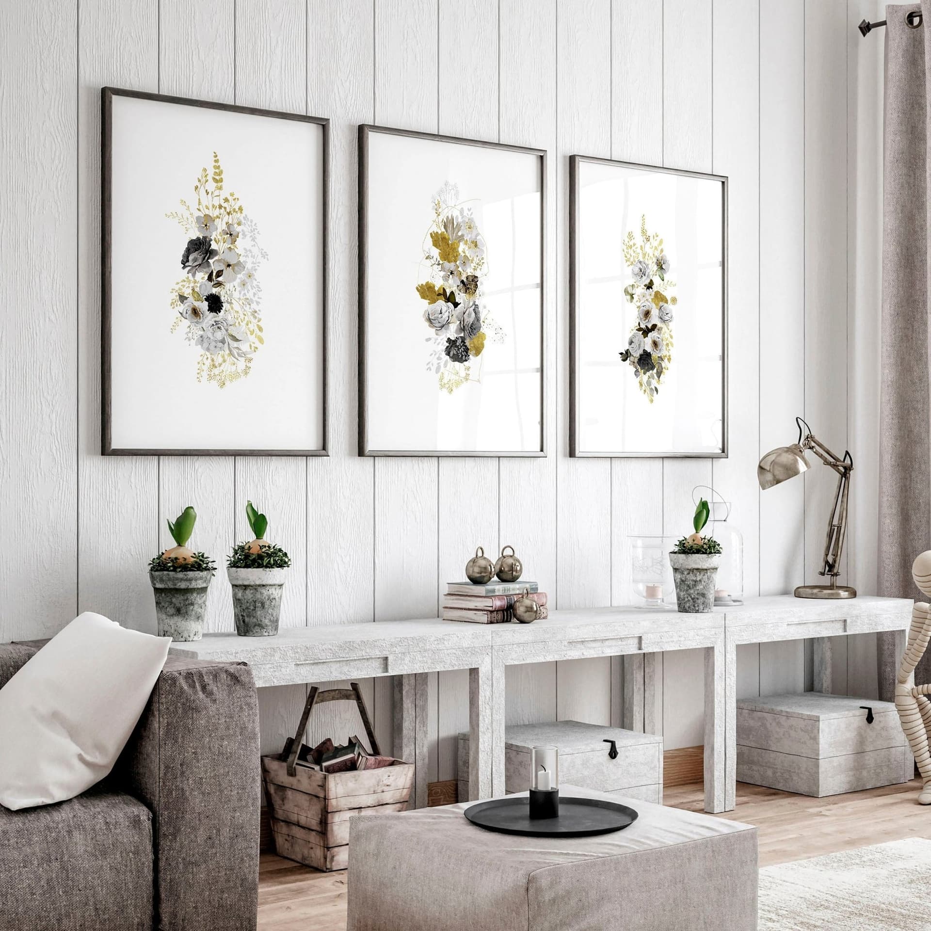
Room scene mockups work on an emotional level. They show the buyer a vision of their life with your print in it. A cozy Scandinavian bedroom with a simple botanical print on the wall doesn't just show the product. It tells a story and lets the buyer imagine themselves in that space. That emotional connection is powerful, and it's why lifestyle photography has dominated physical product retail for decades.
White background mockups, on the other hand, work on an informational level. They remove all distraction and put the product front and center. The buyer sees exactly what they're getting, with no guessing about colors, proportions, or details.
What Etsy's Search Feed Actually Rewards
Etsy's search results show thumbnail images, which means your primary photo needs to pop at a very small size. Room scene mockups tend to have more visual interest and contrast at thumbnail size because they include context, furniture, walls, and styling elements that create depth. This can help your listing stand out in a sea of flat white images.
However, if your niche has a lot of busy room scene photos, a clean white background can actually stand out more by creating visual contrast against the competition. This is worth genuinely testing in your own category by searching for your main keywords and looking at what the top results are using.
Actionable takeaway: Search your top three keywords on Etsy right now and screenshot the first page of results. Count how many listings use room scenes versus white backgrounds. Whichever style is rarer in your specific niche might actually help you stand out more.
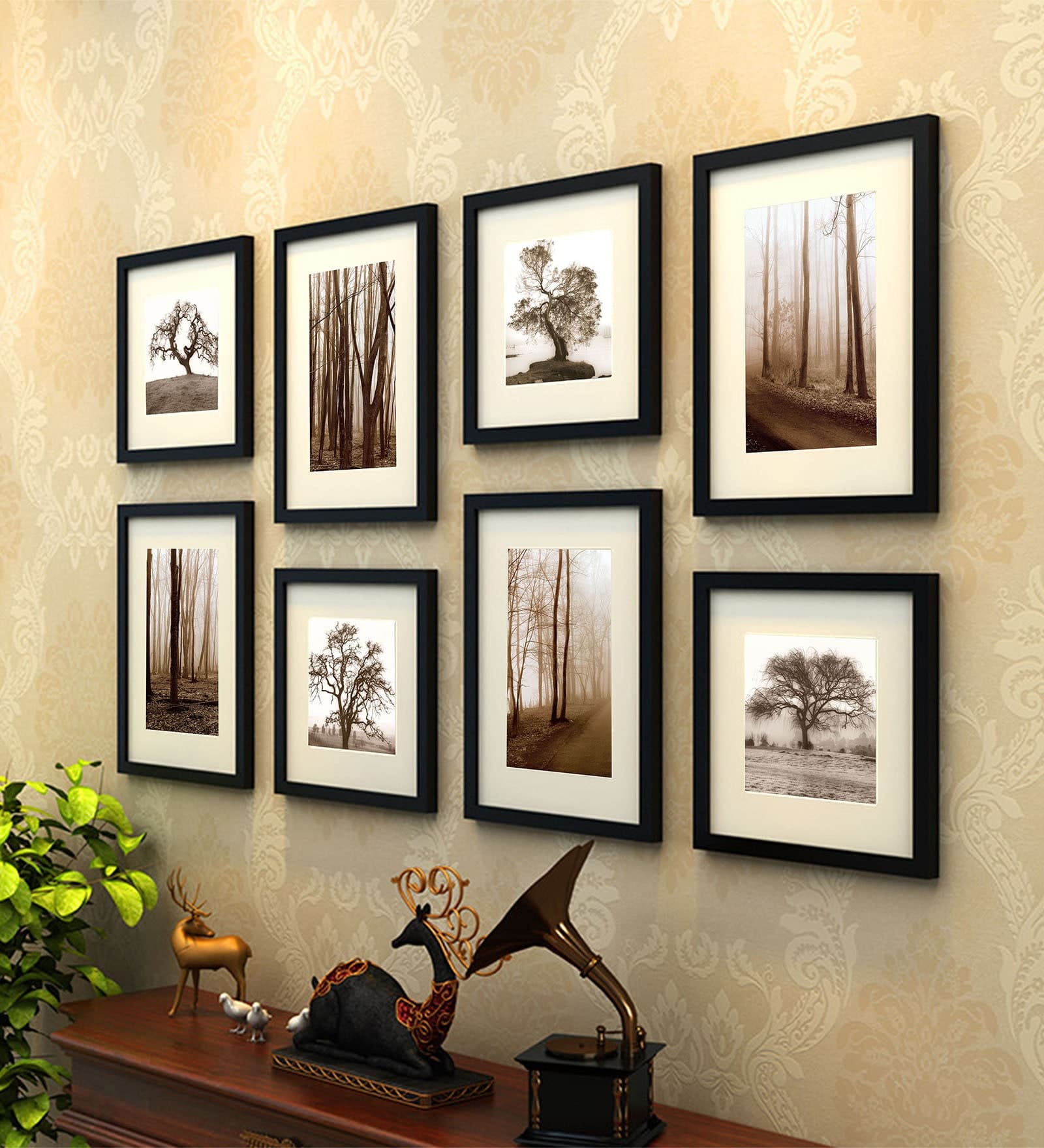
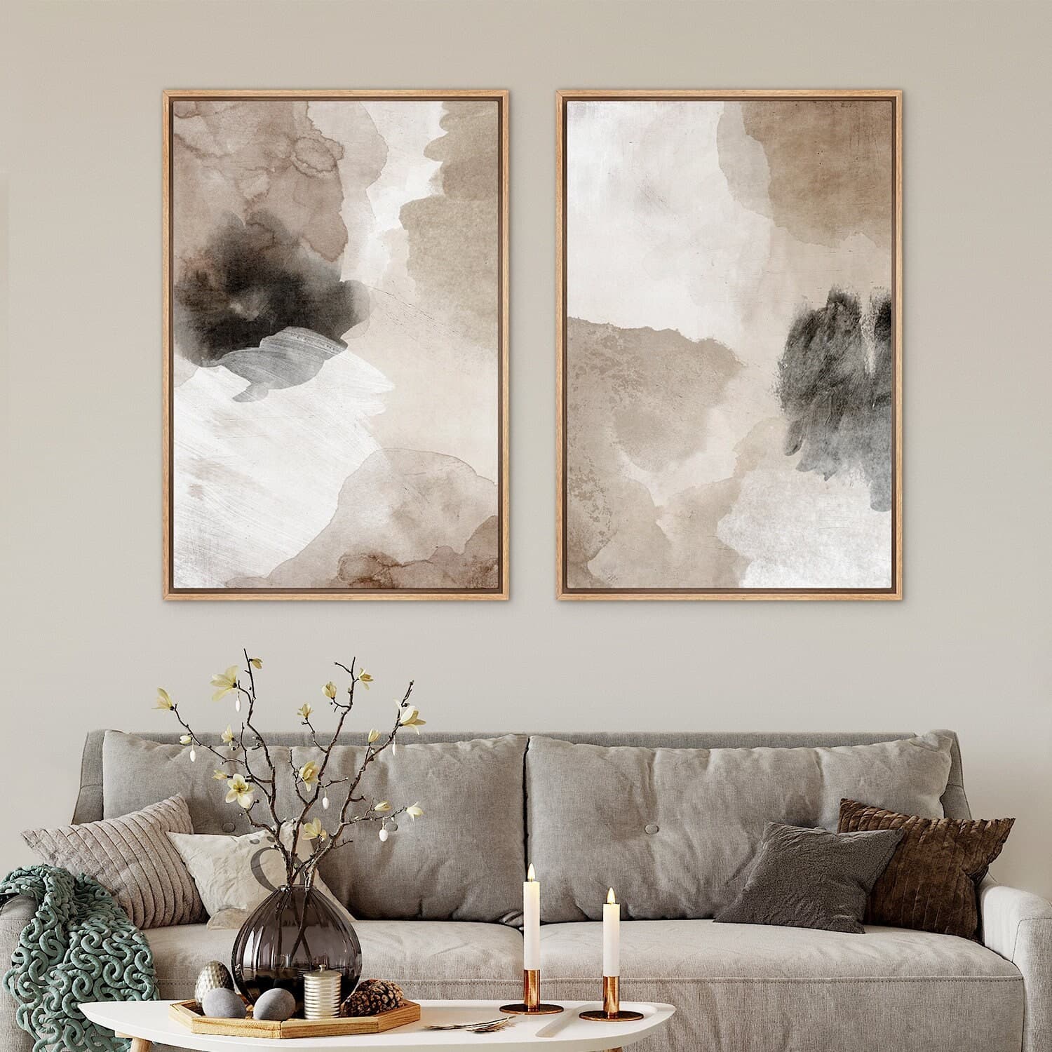
The Case for Room Scene Mockups
Room scene mockups are the go-to choice for most successful wall art sellers, and for good reason. When done well, they justify higher prices, reduce buyer hesitation, and make your print feel like a finished piece of home decor rather than a digital file.
They Help Buyers Visualize Scale and Placement
One of the most consistent complaints buyers have about wall art purchases, both online and offline, is that they misjudged the size. A print that looks large in a listing can feel tiny on a wall. Room scene mockups solve this problem by giving the art real-world context.
When a buyer sees your 18x24 print hanging above a console table next to a lamp, they immediately understand the scale. They know roughly how it would fit on their own wall. This reduces buyer uncertainty, which directly increases conversion rates.
For sellers offering multiple sizes of the same print, using room scenes that show each size in an appropriate setting is especially powerful. A 5x7 print looks right at home in a small desk frame. That same design in a 24x36 needs a living room wall to show its full impact.
They Elevate Perceived Value and Support Higher Pricing
A digital print displayed in a beautifully styled room scene looks like a premium product. The same print on a plain white background can look like a commodity. That perception gap has real consequences for what buyers are willing to pay.
This is one of the core reasons sellers who invest in quality room scene mockups can price higher than sellers using generic or low-effort images. The mockup signals the quality and care behind the product even before the buyer looks at the design itself.
If you're selling art prints for $3 and wondering why buyers balk at $8, your mockup might be the answer. Presenting your work in a thoughtfully styled room scene is one of the fastest ways to shift your shop from bargain territory to boutique territory.
When Room Scenes Work Best
Room scenes are especially effective for art prints designed to be decorative statement pieces, nursery art, gallery wall collections, and any print where the home decor context matters to the buyer. If your target customer is shopping with a specific room in mind, a room scene mockup is speaking directly to their intent.
They're also powerful for seasonal or niche content. A Christmas farmhouse print shown in a styled holiday living room with string lights and a wreath nearby isn't just showing the print. It's selling the feeling of that entire moment.
Actionable takeaway: For your three bestselling or highest-potential listings, make sure at least two of your listing photos use room scene mockups that reflect the actual style and aesthetic of your target buyer. Don't put a minimalist Scandinavian print in a maximalist boho room and expect it to convert.
The Case for White Background Mockups
Despite all the praise for room scenes, white background mockups have a real and important role in a well-structured listing. Dismissing them entirely is a mistake.
They Show the Product Without Distraction
Some buyers don't want to imagine the print on a wall. They want to see exactly what they're buying, with accurate colors and no styling tricks. White background images deliver that clarity in a way room scenes simply can't.
This is especially true for buyers who are purchasing for a specific functional use: a personalized name print for a child's room, a custom map print, or a detailed botanical illustration where the fine lines and color accuracy matter. For these buyers, a clean white background mockup is actually more convincing because it removes doubt about what they'll receive.
They Work Exceptionally Well as Secondary Photos
Even if you lead with a room scene as your primary listing photo, including a white background image as a secondary photo can significantly help buyers who are on the fence. After seeing the styled lifestyle shot, they click through to learn more. At that point, a clear, uncluttered image of the print itself answers the question: but what does it actually look like?
This combination, lifestyle room scene first, clean product shot second, mirrors what successful ecommerce brands do across every product category. The room scene creates desire. The white background builds trust.
When White Backgrounds Have the Edge
If you sell art prints in very specific niches where buyers are deeply familiar with the product and primarily shopping on price and design, white backgrounds can actually outperform room scenes. Think quote prints in bulk, clip art bundles, or pattern prints for crafters. In these cases, buyers know exactly what they want and they want to see the design clearly. Room scene styling can feel like noise.
White backgrounds also tend to photograph more consistently across different designs, which matters if you're producing large volumes of listings. Consistency in your shop's aesthetic, even using clean white backgrounds throughout, can build a sense of brand identity that makes buyers trust you more.
Actionable takeaway: Add at least one clean, white background version of your print to every listing as a secondary or tertiary photo. Think of it as the trust-builder that closes the sale after the room scene has created the desire.
How Smart Sellers Combine Both Styles in One Listing
The sellers consistently outperforming in competitive Etsy categories aren't choosing between room scenes and white backgrounds. They're using both strategically across their listing photo slots.
A Framework for Your Listing Photo Order
Etsy allows up to ten listing photos, which is more real estate than most sellers use well. Here's a photo sequence that performs well across many wall art niches:
Photo one is your primary room scene, styled to match your target buyer's aesthetic. This is the scroll-stopper, the one that earns the click from search results.
Photo two is a close-up room scene or a detail shot showing the print at a slightly tighter angle. This reinforces quality and lets buyers see the design more clearly while still in context.
Photo three is a clean, white or neutral background shot of the print itself, showing accurate colors and the full design without styling distractions.
Photo four is a size comparison, either a flat lay showing the print next to a common object for scale, or a room scene showing different size options side by side.
Photo five and beyond can include lifestyle photos in different room styles to appeal to a broader range of buyers, or photos showing the print in a frame, as part of a gallery wall, or in different color environments.
Matching Your Style to Your Buyer's Aesthetic
The room scene style you choose should feel like a page from your target buyer's home decor inspiration board. A minimalist buyer is turned off by cluttered room scenes. A farmhouse buyer wants shiplap and neutral textures. A maximalist buyer wants bold color and layered styling.
Spending fifteen minutes defining your target buyer's aesthetic before selecting your mockup backgrounds will make every listing photo more effective. If you're not sure who your buyer is, look at the most positive reviews on your top listings and check if those buyers have public accounts on Etsy. Their favorites and purchases often tell you a lot about their style.
Actionable takeaway: Build a mini mockup system for your shop: at least two room scene templates that match your brand aesthetic and one clean background template. When you add a new product, you have a repeatable framework that takes minutes to apply instead of hours.
Creating Quality Mockups Without a Design Background
All of this advice is only useful if you can actually create the mockups efficiently. The painful reality for many Etsy sellers is that building professional mockups used to require Photoshop skills, expensive subscriptions, or outsourcing to designers.
The Time Cost That Kills Momentum
One of the most common traps for growing print sellers is listing bottlenecks. You have fifty designs ready to go but the thought of creating multiple mockups for each one in different styles makes the whole task feel overwhelming. So designs sit in a folder, not earning money.
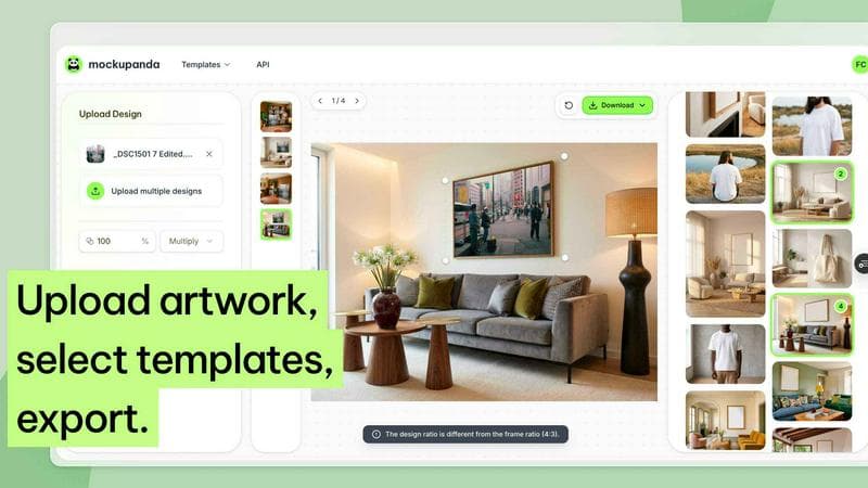
This is exactly the friction that tools like Mockupanda were built to solve. The goal is to get from finished design to polished, varied listing photos without needing design skills or spending hours per listing. Bulk mockup generation is especially valuable here because it means a batch of new designs can go through the full mockup process in one sitting rather than becoming a week-long project.
Choosing the Right Templates for Your Niche
Not every room scene template will work for every type of wall art. The template needs to match the style of the print and the expectations of your target buyer. A clean modern frame against a white textured wall works for minimalist or typographic prints. A rustic wood frame in a warm-toned room works for farmhouse or nature-inspired art.
When building your mockup library, prioritize variety in room style and frame type over sheer volume of templates. Ten templates that genuinely represent your brand and your buyer's taste will outperform fifty generic options you grabbed because they were available.
The text overlay feature in Mockupanda is also worth mentioning here because it lets you add context, like size information, print details, or promotional messaging, directly to your images. This turns a mockup into a more complete listing asset rather than just a product photo.
Actionable takeaway: Identify three specific room scene templates and one clean background template that perfectly match your shop's aesthetic. Build your mockup workflow around those four templates so you have consistency and speed whenever you add new products.
Testing and Improving Your Mockups Over Time
Even if you nail your initial mockup setup, the sellers who keep improving are the ones who treat their listing photos as something to test and refine rather than set and forget.
Using Etsy Stats to Identify Underperforming Listings
Etsy's stats panel shows you click-through rates and conversion rates at the listing level. A listing with lots of impressions but low clicks usually has a photo problem. The primary image isn't compelling enough to earn the click. A listing with decent clicks but low conversions often has a trust problem, and adding a clearer product shot or better scale reference can help.
Make a habit of reviewing these numbers monthly. Identify your five lowest-performing listings by click-through rate and update their primary mockup images. Small, consistent improvements to listing photos compound into significant sales increases over time.
What A/B Testing Looks Like for Etsy Sellers
Etsy doesn't offer a native A/B testing feature, but you can run informal tests by updating a listing photo and tracking whether click-through or conversion rates change over the following two to four weeks. Change only one element at a time, such as swapping a white background primary photo for a room scene, so you know what drove the change.
Keep a simple spreadsheet tracking before and after metrics for each test. Over several months, you'll build a picture of what your specific audience responds to, which is more valuable than any general advice about mockup styles.
Actionable takeaway: Pick one underperforming listing this week. Update just the primary photo, swapping from whatever style you currently have to the other style, either room scene or white background. Note the date and check back in three weeks to see whether click-through rate has changed.
Putting It All Together
Room scenes and white backgrounds aren't competing strategies. They're complementary tools, and understanding how to use each one is what separates sellers who guess at their presentation from sellers who build a deliberate, conversion-focused shop.
Room scene mockups create desire. They tell a story, build perceived value, and help buyers see your print as part of their home. White background mockups build trust. They show the product accurately, reduce uncertainty, and answer the buyer's practical questions.
The most effective Etsy wall art listings use both, with room scenes doing the attention-grabbing work in search results and white background shots providing the detail and clarity that closes the sale.
If you're spending hours creating these mockups manually or struggling with inconsistent quality, the problem isn't your designs. It's the workflow. Getting a streamlined system in place, one that lets you generate quality room scene and clean background mockups quickly for every new product, is the infrastructure investment that makes everything else easier.
Your prints deserve to be presented well. Make sure your mockups are doing them justice.
Keep reading
How to Showcase Poster Sets on Etsy Using Gallery Wall Mockup Templates
How to Use Lifestyle Mockups to Sell Abstract Art to Buyers Who 'Don't Get It' Yet