How to Price Your Digital Prints Higher on Etsy Using Professional Mockup Photography
Why Your Pricing Problem Is Actually a Presentation Problem
If you've been selling digital prints on Etsy for any amount of time, you've probably felt the squeeze. A buyer messages asking if you can go lower. You check your competitors and see the same design selling for two dollars. You start wondering if your work is even worth what you're charging.
Here's the uncomfortable truth: in most cases, the price isn't the real issue. The presentation is.
When a buyer lands on your listing, they spend an average of a few seconds deciding whether to click or scroll past. In that moment, they aren't reading your description, checking your reviews, or thinking about the hours you spent on the design. They're reacting to an image. And if that image looks like a flat PNG on a white background, their brain immediately files your product in the "generic, cheap, probably not worth much" category.
This isn't a judgment on your talent. It's just how visual commerce works. The good news is that fixing this is completely within your control, and you don't need to hire a photographer or learn Photoshop to do it.
The Psychology Behind Perceived Value
Perceived value is the price a buyer believes something is worth before they know the actual price. It's shaped almost entirely by presentation. Think about the difference between a bottle of wine in a paper bag versus the same wine in a sleek box with elegant typography. Same product, different perceived value.
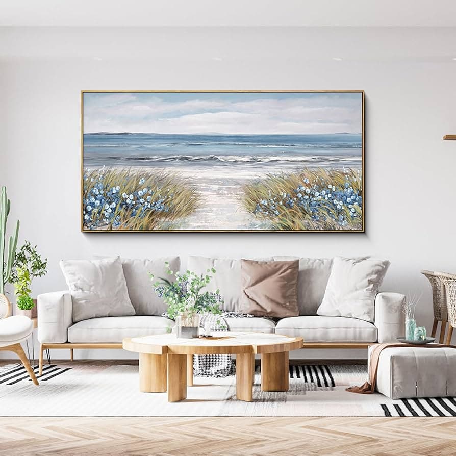
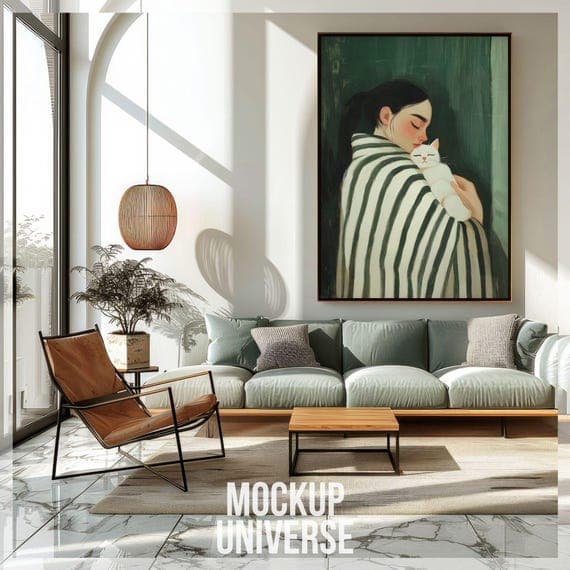
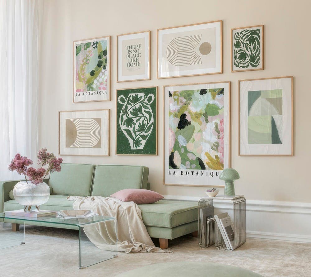
For digital prints, the equivalent of that elegant box is a mockup that shows your print displayed in a real, aspirational environment. A botanical print hanging in a warm, minimalist living room doesn't look like a two-dollar download. It looks like a design decision someone made to elevate their home. That shift in context is worth real money to your customers.
Studies on consumer behavior consistently show that buyers anchor their price expectations to the first visual impression. If your first image looks professional, they expect a professional price. If it looks thrown together, they expect a bargain price. This is why two shops selling nearly identical designs can charge five times the difference in price — and both find buyers.
What Buyers Are Actually Paying For
When someone buys a digital print, they aren't just buying pixels. They're buying a vision of what their space could look like. They're buying confidence that the print will look good on their wall, match their aesthetic, and be worth framing.
A professional mockup does all the selling work of communicating that vision. It shows the buyer exactly where this print could live in their home. It removes the mental effort of imagining scale, color, and context. And when you remove friction from the buying decision, you also remove the hesitation around price.
This is why investing time in your mockup photography, even if it's digital mockups rather than physical prints, is one of the highest-return activities you can do for your shop. It directly converts into both higher conversion rates and the ability to charge more without pushback.
Takeaway: Before you adjust your prices down, adjust your presentation up. Upgrade one listing with a proper lifestyle mockup and watch how differently buyers respond.
What Makes a Mockup Look Professional
Not all mockups are created equal. You've probably seen the difference between a mockup that makes you think "oh, I want that in my home" and one that looks like a frame floating in space with a blurry background. The gap between those two outcomes comes down to a handful of specific qualities.
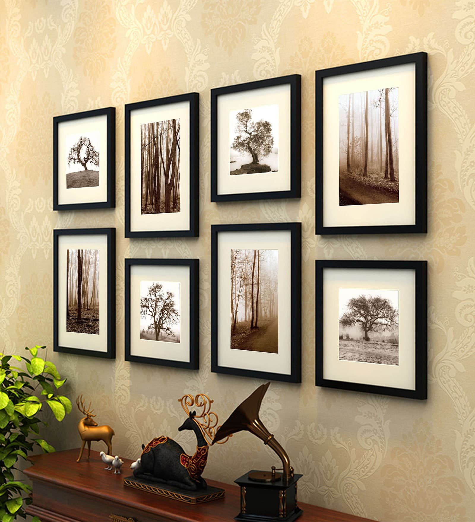
Lighting and Environment Consistency
The single biggest tell of an amateurish mockup is mismatched lighting. If your print looks lit from the left but the room behind it is lit from the right, something feels off even if buyers can't articulate why. The brain is very good at detecting these inconsistencies, and they erode trust in the product without the buyer even knowing it.
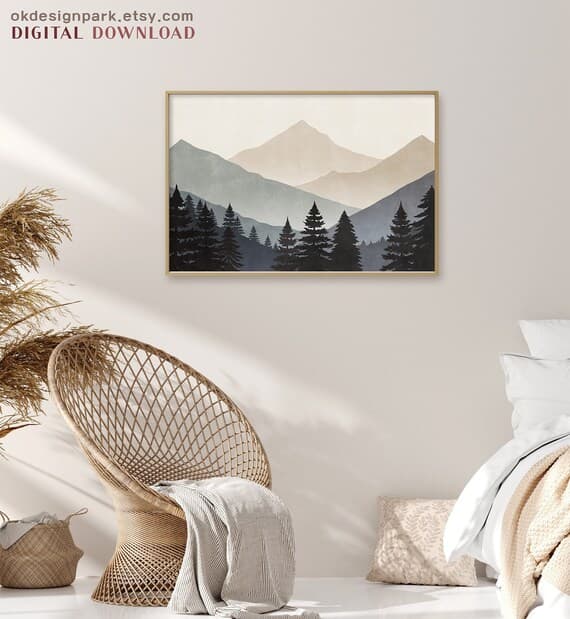
Professional mockups use environments where the natural lighting direction, color temperature, and shadow placement all align with where the product sits in the scene. Warm-toned rooms call for prints with warm shadows. Bright, airy spaces call for softer, cooler shadow edges. When everything is consistent, the print looks like it actually belongs there.
You also want to think about the overall environment matching your brand and your buyer's aesthetic. A bohemian botanical print will convert better in a warm rattan-and-linen setting than in a cold, industrial loft. Your mockup environment is itself a form of targeting.
Scale, Framing, and Context
Scale is something buyers struggle enormously with when shopping for digital prints. They have no idea if your 8x10 design will look delicate or bold on their wall. A good mockup solves this by showing the print in context with real furniture and architectural elements that give a sense of proportion.
A 24x36 print hanging above a sofa looks completely different from that same print squeezed between two shelves. Showing the right scale for the right setting builds confidence in the purchase. And confident buyers are far less likely to negotiate on price.
The framing choice in your mockup also matters a lot. A thin black frame reads modern and sharp. A thick white mat with a natural wood frame reads premium and gallery-quality. If you want to position your prints at a higher price point, choose mockup frames that signal that tier of quality.
Composition and Secondary Elements
The best lifestyle mockups tell a small story. There's a plant in the corner. A book on the table. A coffee mug. These secondary elements aren't clutter, they're credibility. They make the scene feel real and lived-in, which makes it easier for buyers to project themselves into it.
They also subtly communicate the target lifestyle and buyer persona. A workspace mockup with a marble desk, a laptop, and a candle tells a very different story than the same print in a kid's bedroom with a colorful duvet. Match your secondary elements to your buyer, and your mockups will do far more persuasive work than any listing description.
Takeaway: When evaluating your current mockups, check for lighting consistency, appropriate scale, and whether the environment matches your target buyer's aspirational aesthetic. Fix the weakest one first.
How to Build a Pricing Strategy Around Your Presentation
Once your mockups are genuinely professional, you need to update your pricing strategy to match. Upgrading your photos without adjusting your prices leaves money on the table.
Anchoring With a Higher Price Point
Price anchoring is the practice of presenting a higher price first so that your actual selling price feels reasonable by comparison. On Etsy, you can use this in a few ways.
First, consider whether you're offering multiple size options or print bundles. When you list a bundle of three coordinating prints at twenty-five dollars, your single print at ten dollars feels like a great deal by comparison. The bundle exists partly to make the single feel accessible, not just to sell more.
Second, look at your competitors in your specific niche and find the top end of what's being charged for comparable quality. Then look honestly at your mockups. If your presentation is at that top-tier level, you have full permission to price there. Most sellers chronically underprice relative to their actual presentation quality, simply because they haven't updated their self-perception alongside their upgraded photos.
Testing Price Points With Better Photos
One of the most useful things you can do is run a real comparison. Take one of your existing listings, upgrade it with a professional lifestyle mockup, raise the price by twenty or thirty percent, and watch what happens to both views and conversions over the next few weeks.
You'll likely find one of two things. Either the conversion rate stays the same at the higher price, meaning you've just increased your revenue for zero additional work. Or the conversion rate improves, because the better mockup attracted more qualified buyers who were already comfortable paying more for quality.
This is not theory. Etsy sellers who invest in professional presentation consistently report that they can raise prices without a drop in sales. The mockup isn't just making the product look better, it's attracting a different kind of buyer entirely.
Communicating Value Through Your Listing Beyond the Photo
Your mockup opens the door, but your listing details have to walk the buyer through it. Once someone clicks because your photo caught their eye, you need your title, description, and pricing structure to confirm that yes, this is a premium product worth the price.
Use your description to explain what's included, what sizes work best, and what kind of space or mood this print is designed for. Mention print quality, file resolution, and any customization options. These details reduce buyer uncertainty, and reduced uncertainty directly supports higher prices.
Also consider how your shop banner, logo, and overall branding look relative to your prices. A shop charging twenty dollars for a digital print needs to look like a twenty-dollar shop. Cohesive branding across your mockups, thumbnails, and shop visuals tells buyers they're shopping somewhere with standards.
Takeaway: Raise one listing's price by at least twenty percent alongside a mockup upgrade and track the results for four weeks. Let the data tell you what your presentation is actually worth.
Creating Mockups at Scale Without Losing Quality
Here's where a lot of sellers hit a wall. You understand the value of professional mockups. You've even made a few that look great. But you have sixty listings and adding a proper mockup to every single one feels like a full-time job.
This is where bulk mockup generation becomes a genuine business tool rather than a nice-to-have.
Why Batch Processing Changes Everything
Creating mockups one at a time in any design tool is genuinely painful at scale. You open the file, place the image, adjust the perspective, export, rename, repeat. For sixty products across three mockup styles, you're looking at hundreds of individual steps. Most sellers either burn out halfway through or just don't do it at all, which means their listings stay under-optimized indefinitely.
Batch processing lets you upload your designs in bulk and generate multiple mockup variations in one go. Instead of spending a weekend on this, you spend an afternoon. That time saving is real, and it means you can actually keep up with adding new designs without the presentation backlog piling up.
Mockupanda was built specifically with this problem in mind. As a print-on-demand seller, you need to move fast. Listing a new design should take minutes, not hours. Bulk mockup generation is one of those features that sounds like a small convenience but actually changes how sustainable your shop is to run.
Maintaining Consistency Across Your Shop
There's another benefit to bulk mockup generation that doesn't get talked about enough: visual consistency. When all your product images are created through the same tool with the same set of mockup templates, your shop looks cohesive. Buyers who scroll through your listings see a unified brand, not a patchwork of different styles and quality levels.
That consistency is itself a signal of professionalism. It tells buyers that this isn't a side hustle thrown together on a weekend. It's a real shop with real standards. And real standards support real prices.
When you're choosing your mockup templates, think about building a small library of three to five environments that work for most of your designs. A bright minimal living room, a warm bedroom, a workspace, and maybe an outdoor or lifestyle setting. Rotating through these consistently gives your shop variety while maintaining a coherent visual identity.
Staying Current With Seasonal and Trend-Driven Mockups
Etsy search behavior changes with seasons, holidays, and interior design trends. The mockup environments that work best in January for "hygge home decor" are different from what works in April for "spring refresh" searches.
With a fast mockup generation workflow, you can update your featured listing images seasonally without it being a major project. Swap a warm, cozy winter setting for a light, airy spring one. This kind of responsiveness keeps your listings feeling fresh and relevant, which helps with both conversion and search visibility.
The sellers who treat their mockups as a living part of their shop strategy, rather than a one-time setup task, consistently outperform those who don't. It's the difference between a shop that's actively managed and one that's running on autopilot.
Takeaway: If you have more than twenty listings without professional mockups, start batch processing immediately. Pick a tool that lets you upload and generate in bulk, build your template library once, and then apply it to everything in a single session.
Common Mistakes That Undermine Your Pricing Power
Even sellers who understand the importance of mockups often make mistakes that cap how high they can price. These are the most common ones, and all of them are fixable.
Using Only One Product Image
Etsy allows up to ten photos per listing. Using only one is leaving enormous persuasive power on the table. Buyers who are on the fence often scroll through all available images before making a decision. If there's only one, there's nothing to tip them over the edge.
For digital prints, a strong listing image strategy typically looks like this: your lead lifestyle mockup in an aspirational setting, a second mockup in a different environment to show versatility, a zoomed-in detail shot to show texture or print quality, a size guide graphic to address the scale question, and possibly a flat lay showing the print alongside complementary items.
This kind of multi-image approach signals that you've thought carefully about your product and your buyer's needs. That care and professionalism directly supports a higher price.
Choosing the Wrong Mockup Style for Your Niche
Not every mockup style works for every type of print. Minimalist line art prints look incredible in clean, modern Scandinavian settings but can look out of place in a rustic farmhouse setting. Bold, colorful maximalist prints need environments with enough visual richness to hold them, not stark white minimalism that makes them look garish.
Mismatched mockup aesthetics confuse buyers. They can't quite picture where the print would fit in their home, even if it's conceptually appealing. That confusion becomes hesitation, and hesitation becomes a lost sale or a price negotiation.
Spend a few minutes studying the Etsy listings in your specific niche that are converting well at higher prices. Look at the mockup environments they're using. You'll usually find a clear aesthetic pattern, and you should build your mockup library around that same visual language.
Neglecting Your Thumbnail Composition
Your thumbnail is the single most important image in your entire Etsy strategy. It's what buyers see in search results before they ever click on your listing. If your thumbnail doesn't stop the scroll, nothing else matters.
A common mistake is using a full-room lifestyle shot as the thumbnail. These look beautiful when you're inside the listing, but in a tiny search result square, all the beautiful context becomes visual noise and the actual print gets lost.
For thumbnails specifically, you want the print to be the dominant element, with just enough lifestyle context to signal quality and mood. A tightly framed mockup that shows the print clearly, with perhaps one design element of the room visible, tends to perform better in search than either a flat product image or a full room scene.
Test different thumbnail compositions by looking at your listing on a mobile device in Etsy search. That's how most of your buyers are finding you, and it's the format that matters most.
Takeaway: Audit your listings for these three mistakes today. Add more images, check your mockup environment alignment, and zoom in on how your thumbnails look in mobile search results.
Putting It All Together: Your Action Plan
Improving your mockup photography and raising your prices isn't a one-day project, but it doesn't need to take months either. Here's how to approach it systematically.
Start with your five best-selling listings or your five highest-quality designs. These are where upgraded mockups will have the fastest impact on your revenue. Create or generate two to three professional lifestyle mockups for each one using environments that match your target buyer's aesthetic. Then raise the price on each one by at least fifteen to twenty-five percent.
Next, look at your full shop and identify which listings have the weakest product photography. These are your biggest conversion drains. Work through them in batches, using a consistent set of mockup templates so your shop starts to build that visual coherence.
As you go, pay attention to your stats. Look at click-through rates from search, conversion rates within listings, and average order value. These numbers will tell you clearly where your upgraded presentation is paying off and where you still have room to improve.
The sellers who price their digital prints at ten, fifteen, or twenty dollars and above aren't necessarily more talented than those selling at two or three dollars. They've simply understood that on Etsy, visual presentation is the product. Your art is what you made. The mockup is what you're selling.
Invest in making that presentation match the quality of what you've created, and your pricing will follow naturally.
Keep reading
How to Use Mockup Images in Your Etsy Shop Announcement and Banner to Build Trust Before a Buyer Clicks a Single Listing
How to Create a Cohesive Etsy Shop Front Using Mockups With a Consistent Color Palette Across All Listings