Why Shopify Print-on-Demand Stores With Consistent Mockup Styles Across All Products Get More Repeat Buyers
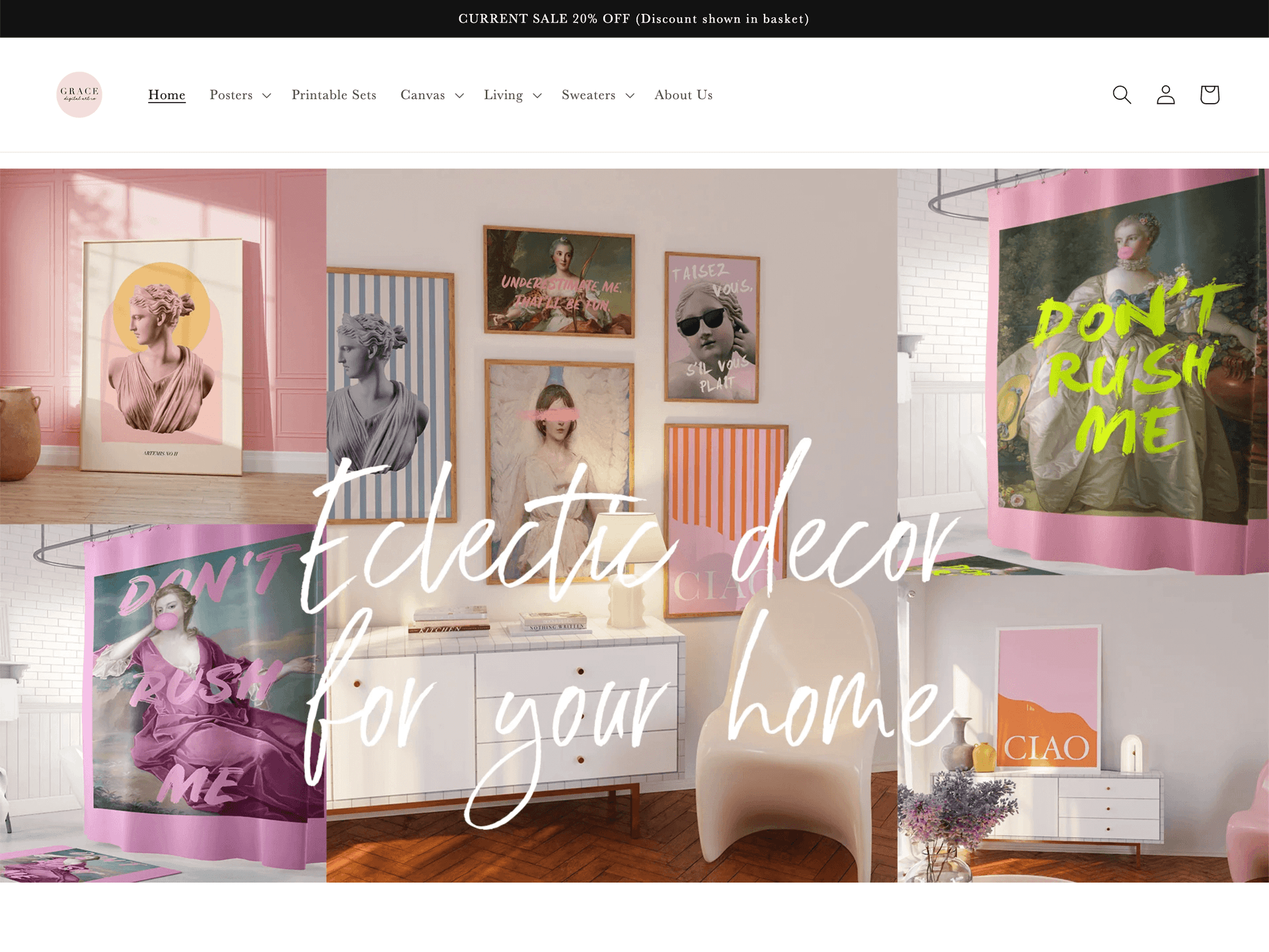
There's a quiet problem happening in thousands of Shopify print-on-demand stores right now. The products are good. The designs are creative. The pricing is fair. But the shop looks like five different people ran it at five different times, because the mockups are all over the place.
One product has a bright white studio shot. The next has a moody bedroom scene. Another one is a flat lay on a wood table. And the newest addition? A generic grey gradient background because the seller ran out of time and just needed to get the listing up.
Buyers notice this. They might not consciously think "this shop lacks visual cohesion," but they feel it. And that feeling, that subtle sense of inconsistency, is often exactly what stops them from bookmarking your shop and coming back next month when you drop new designs.
Consistent mockup styles are not just a nice-to-have aesthetic choice. They are a repeat-buyer strategy. Here's why.
The Psychology Behind Visual Consistency and Brand Trust
Your Store Is Communicating Before a Single Word Is Read
When someone lands on your Shopify storefront, their brain is processing visual information in milliseconds. They're not reading your product descriptions yet. They're scanning the grid of product images and forming an impression of your business based almost entirely on what they see.
A store with consistent mockup styles, same color temperature, similar room aesthetics, matching framing and composition, signals professionalism. It tells the buyer that someone thoughtful is running this shop. That there's a standard being maintained. That they can trust the quality of what they're about to purchase.
A store with mismatched mockups sends the opposite signal. It suggests a lack of attention to detail, which is especially damaging when you're selling decorative wall art or digital prints, products where taste and aesthetic judgment are literally the product.
Trust Is What Brings People Back
First-time buyers take a small leap of faith. They've never ordered from you before. They're relying on your product images to tell them what they're actually going to receive. If those images look professional and consistent, they're more likely to feel confident in the purchase.
But here's the part that matters for repeat business: that initial trust doesn't evaporate after the transaction. It compounds. When a buyer receives their print and it matches the polished aesthetic of your mockups, their confidence in your shop goes up. They know what to expect from you now. And when you launch new designs, they're far more likely to come back because you've already proven you deliver.
Visual consistency in your mockups is one of the easiest ways to set that trust in motion from the very first visit.
Takeaway: Audit your storefront grid right now. If the images don't feel like they belong to the same family, you're working against your own repeat-purchase rate.
How Inconsistent Mockups Actively Hurt Your Conversion Rate
The Scroll Test
Open your Shopify store on your phone and scroll through your collection pages. Do the product thumbnails look like they belong together? Or does the eye keep getting interrupted by images that feel out of place?
This is what buyers experience, and visual interruption breaks browsing momentum. When a buyer is in flow, scrolling through your shop and mentally adding items to a wishlist, every jarring inconsistency snaps them out of that flow. It introduces friction. And friction kills conversions.
Stores that have a tight, consistent visual language keep buyers in that browsing flow longer. Longer browsing sessions correlate directly with higher average order values and higher likelihood of return visits.

Inconsistency Makes Upselling Harder
One of the most valuable things a repeat buyer does is purchase complementary products. They buy a print, love it, and come back for matching pieces to build out a gallery wall. But this only happens if your product images make it easy to envision those pieces together.
When your mockups are all shot in different environments with different lighting and different scales, buyers can't mentally group your products. They can't see how print A and print B would look together in their home, because you've photographed them as if they live in entirely different worlds.
Consistent mockup styling, using the same room aesthetic, similar frame colors, matching wall tones, solves this problem. It lets buyers see your products as a collection, not a random assortment of individual items. That's the difference between a one-time purchase and someone buying three prints at once to complete a set.
The Return Visit Decision Happens in Seconds
When a previous buyer comes back to your shop after a few weeks, they're making a split-second decision: does this shop still feel like what I remember? Is it worth my time to browse?
If your shop has grown in a visually inconsistent way, with new listings that look nothing like the ones they originally loved, you've broken the continuity of their experience. The shop they fell in love with doesn't quite feel the same anymore.
Maintaining a consistent mockup style as you grow keeps that continuity intact. Every new product you add reinforces the identity they already trust.
Takeaway: Think of your mockup style as your shop's handwriting. When it's consistent, people recognize it immediately. When it changes constantly, they lose the thread.
What "Consistent Mockup Style" Actually Means in Practice
It's Not About Using the Same Photo Every Time
Consistency doesn't mean every product has to be in the exact same room with the exact same props. That would get repetitive fast and wouldn't serve buyers who want to see your prints in different contexts.
What it actually means is that your mockups share a common visual DNA. They might use the same color temperature, warm and golden versus cool and clinical. They might always feature natural light. They might always show frames against light-colored walls. They might always use a similar level of lifestyle detail, neither too sparse nor too cluttered.
Think about it like a photographer's style. Two photos can be taken in completely different locations and still be unmistakably from the same photographer because the eye, the light choices, and the composition are consistent.
Your mockup style works the same way. Define the rules, then apply them to every product, every time. If you're still figuring out what those rules should look like for your shop, developing a signature mockup style is one of the highest-leverage things you can spend an afternoon on.
The Parameters Worth Standardizing
Here are the specific variables worth locking in across your mockup style:
Room environment: Are you going for a Scandinavian minimal aesthetic? A warm maximalist living room? A bright studio loft? Pick a lane and stay in it. You can have two or three variations for different product collections, but keep each collection internally consistent.
Lighting tone: Warm light and cool light create very different emotional responses. Warm light feels cozy and inviting. Cool light feels modern and crisp. Neither is wrong, but mixing them randomly across your shop creates visual dissonance.
Frame and product presentation: If you sell framed prints, decide on your go-to frame colors and how you present them. If you sell canvas wraps, decide on the viewing angle. Make these decisions once and apply them consistently.
Scale and cropping: Product images cropped at wildly different ratios or showing prints at dramatically different scales relative to the room feel chaotic in a grid view. Standardize your aspect ratios and your zoom level.
Background complexity: Some mockups are clean and minimal. Others are loaded with lifestyle details. Both can work, but they shouldn't coexist randomly within the same shop.

Why This Gets Hard at Scale (and What to Do About It)
The challenge most print-on-demand sellers face isn't understanding the value of consistency. It's maintaining it when you have dozens or hundreds of products and you're constantly adding new ones.
When you're launching a new design at 11pm and you just need the listing to go live, you grab whatever mockup is fastest. That's human. But those rushed decisions compound into a shop that gradually loses its visual identity.
The solution is to build consistency into your workflow rather than relying on willpower at 11pm. That means having a library of approved mockup templates that you use for every new product, so that consistency is the path of least resistance, not the path that requires extra effort. Batch mockup generation is especially useful here if you're running a high-volume shop or working with multiple designers.
Takeaway: Write down the specific parameters of your mockup style. Color temperature, room type, frame color, aspect ratio. Then treat that list like a checklist every time you create a new listing.
How Consistent Mockups Create a Brand Identity Buyers Remember
Recognition Is the Foundation of Loyalty
Repeat buyers don't just return because they liked your product. They return because they remember you. And memory is largely visual.
When a buyer sees one of your product images in a Pinterest feed or an Instagram post or even a search result, a consistent visual style makes your work immediately recognizable as yours. They don't need to see your shop name to know it's from your brand. The aesthetic itself carries the identity.
This is the level of brand recognition that turns casual buyers into loyal followers who look forward to your new releases. And it all starts with the visual consistency of how you present your products.
Collections Feel Like Collections
One of the most powerful repeat-buyer drivers is a sense of completeness. When a buyer purchases one print from a collection and sees that the other prints in that collection share the same aesthetic presentation, they're drawn to complete the set.
Consistent mockup styling within collections makes this psychological pull much stronger. If all three prints in your botanical series are photographed in the same warm-toned minimal room setting, a buyer who loves the first one can immediately envision all three together on their wall. That vision is what drives the follow-up purchase.
A good approach here is to think carefully about how many mockups you're showing and in what order on each product page, not just across your collection grid. The internal logic of each listing matters as much as the external consistency of your shop.
Your Style Becomes a Reason to Follow
Buyers who love your aesthetic don't just want your current products. They want to know when you release new ones. A consistent visual style gives them a reason to follow your shop, bookmark it, or sign up for your email list because they trust that your future releases will feel like the shop they already love.
This is the long game of visual branding. Every consistent mockup you publish is a small deposit into the bank of buyer loyalty. Over time, that account grows into a base of repeat customers who don't need to be convinced to buy again because they already know exactly what to expect from you.
Takeaway: Think of your consistent mockup style as a signature. Every product you publish is signing your name in the same hand. Over time, that signature becomes recognizable, trustworthy, and worth seeking out.
Making Consistency Achievable Without Spending Hours on Every Listing
Build a Template System, Not a Creative Decision System
The biggest mistake sellers make is treating every new listing as a new creative decision. What mockup should I use for this one? What room feels right? What lighting?
When every listing requires creative decisions from scratch, consistency is almost impossible to maintain at scale. The solution is to make those decisions once, build them into templates, and then apply the templates rather than making fresh decisions every time.
This is exactly where a purpose-built tool like Mockupanda makes a real difference. Instead of hunting through stock photo sites and manually compositing each image, you can work from a consistent set of templates that already embody your brand's visual rules. Drop in the new design, generate the mockup, done. The consistency is built into the process.
Bulk Generation Changes the Economics of Consistency
For high-volume print-on-demand sellers, the math on individual mockup creation simply doesn't work. If each listing takes you 20 minutes to mockup properly, and you're launching 50 new designs a month, that's over 16 hours of mockup work every month. Something will get cut, and it's usually quality and consistency.
Bulk mockup generation flips this equation. When you can apply your consistent template to dozens of designs at once, consistency stops being a time cost and becomes a built-in default. You get the professional, cohesive look across your entire catalog without the hours of manual work.
If you're at that volume and haven't evaluated whether your current tool is actually built for it, it's worth reading about what to look for in a Shopify mockup generator when you're running a high-volume store. The difference between a general-purpose tool and one built for print-on-demand is significant.

Review Your Shop on a Schedule
Even with great systems in place, consistency drifts over time. Mockup styles that felt right six months ago might look dated now. New product categories might have introduced visual inconsistencies. A periodic review keeps things tight.
Set a calendar reminder every quarter to scroll through your entire shop as a buyer would. Look for the outliers. Find the listings that look like they came from a different shop entirely. Update them. This kind of maintenance work pays enormous dividends in the compounding trust it builds with return visitors.
Takeaway: Consistency is a system problem, not a willpower problem. Build templates, use bulk generation tools, and schedule regular shop audits. Make consistency the easiest path, not the hardest one.
The Long-Term Business Case for Visual Consistency
Repeat Buyers Are Exponentially More Valuable Than New Ones
Acquiring a new customer costs five to seven times more than retaining an existing one. This is true in e-commerce broadly, and it's especially true in a crowded marketplace like Shopify print-on-demand where paid traffic costs continue to rise.
Every repeat buyer you earn through a great first impression and a trustworthy visual brand is a customer you don't have to pay to acquire again. They're also more likely to spend more per order, less likely to request refunds, and more likely to refer friends.
The work you do to make your shop visually consistent isn't just an aesthetic exercise. It's a customer retention strategy with real financial returns.
It Compounds Over Time
The interesting thing about building a consistent visual brand is that it gets easier and more valuable over time. Early on, the consistency benefits are modest. But as your catalog grows and your style becomes more established, the cumulative effect becomes powerful.
Buyers who've purchased from you once and had a great experience become buyers who check back regularly. Those buyers tell their friends. Your shop develops a reputation, not just for good designs, but for being a shop that has its act together visually. That reputation is incredibly hard for competitors to replicate quickly.
It Supports Higher Prices
Consistency signals quality, and quality supports premium pricing. When your shop looks cohesive and professional, buyers perceive your products as worth more. They're less likely to haggle, less likely to wait for a sale, and more willing to pay full price because the overall impression of your shop justifies it.
This is especially true in wall art and digital prints, where the perceived value of the product is almost entirely constructed through presentation. Two identical prints, one shown in a haphazard mockup and one shown in a beautifully consistent, well-styled room scene, will sell at very different price points. The design is the same. The presentation is doing all the work.
Mockupanda was built with exactly this in mind: giving print-on-demand sellers the tools to present their work at the level that justifies the prices their designs deserve, without requiring design expertise or hours of manual effort.
Takeaway: Consistent mockup styles are not a luxury for shops that already have everything figured out. They're a foundational business strategy that directly impacts customer retention, average order value, and long-term revenue.
Start Where You Are, Not Where You Wish You Were
You don't need to rebuild your entire shop overnight. Pick your five best-selling products and make sure their mockups are consistent with each other. Then apply that same standard to every new listing you create going forward.
As you have bandwidth, update older listings to match. Use bulk generation tools to make the process fast. Build a template library so you never have to make the same creative decision twice.
Consistency is a direction, not a destination. Every step you take toward a more cohesive visual brand is a step toward a shop that keeps buyers coming back, one that doesn't just sell products but builds a customer base that genuinely looks forward to what you create next.
Keep reading
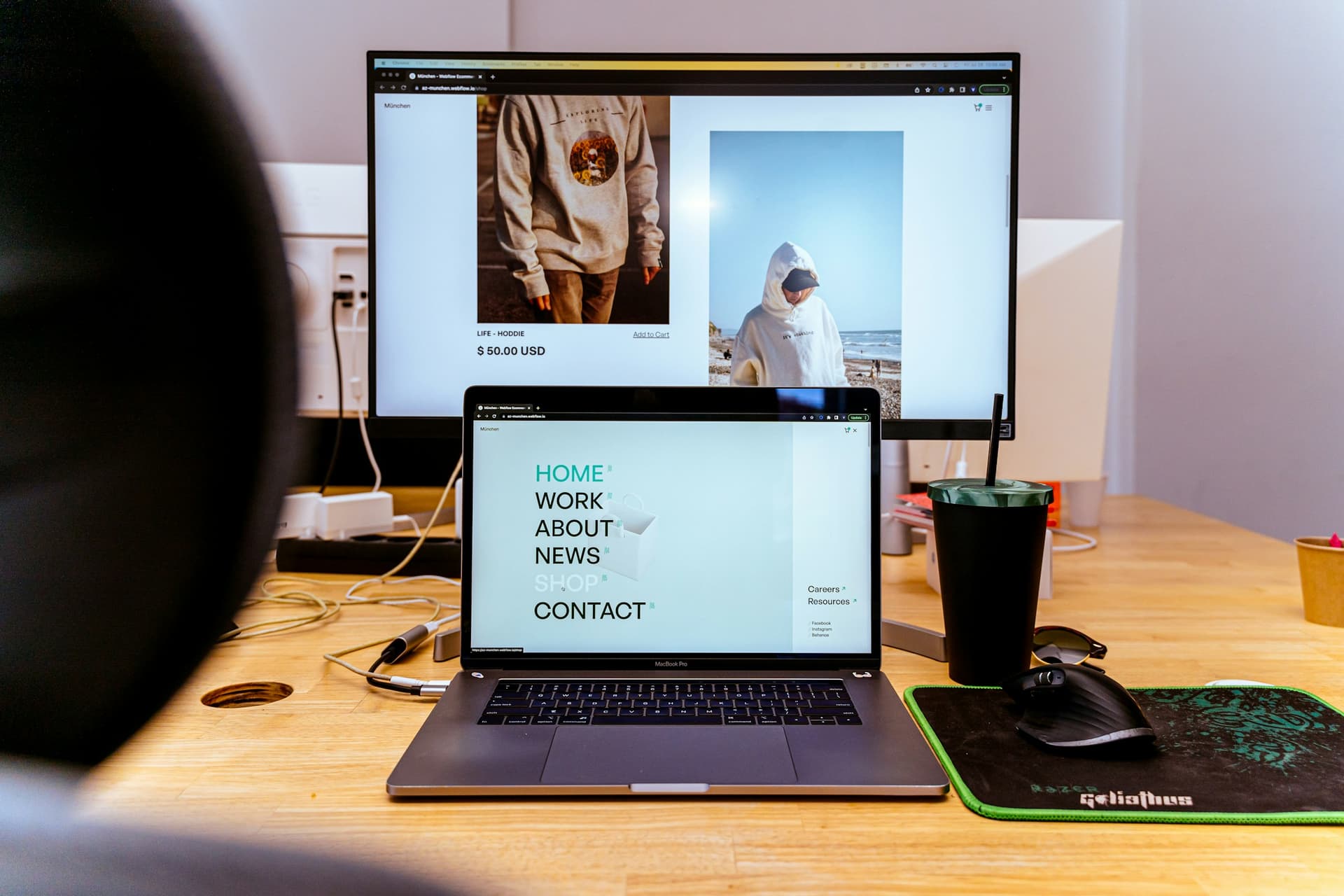
How to Use a Shopify Mockup Generator to A/B Test Product Images and Find the One That Actually Converts
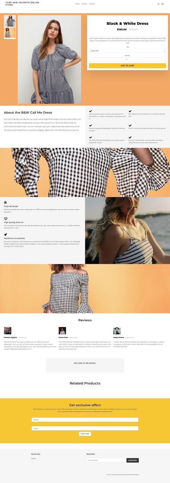
How to Use a Poster Mockup API to Instantly Populate a New Shopify Product Page With All Listing Images on Creation